Eliminating inconsistencies through building a design system
Summary
The Situation
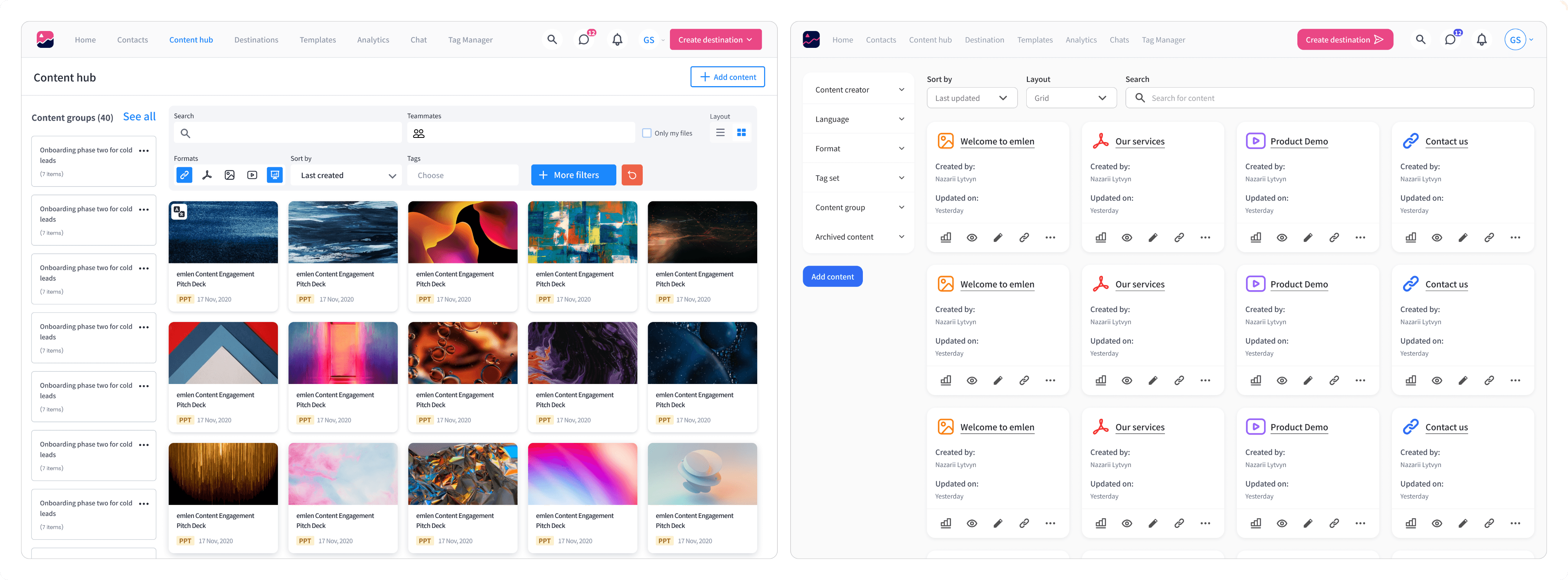
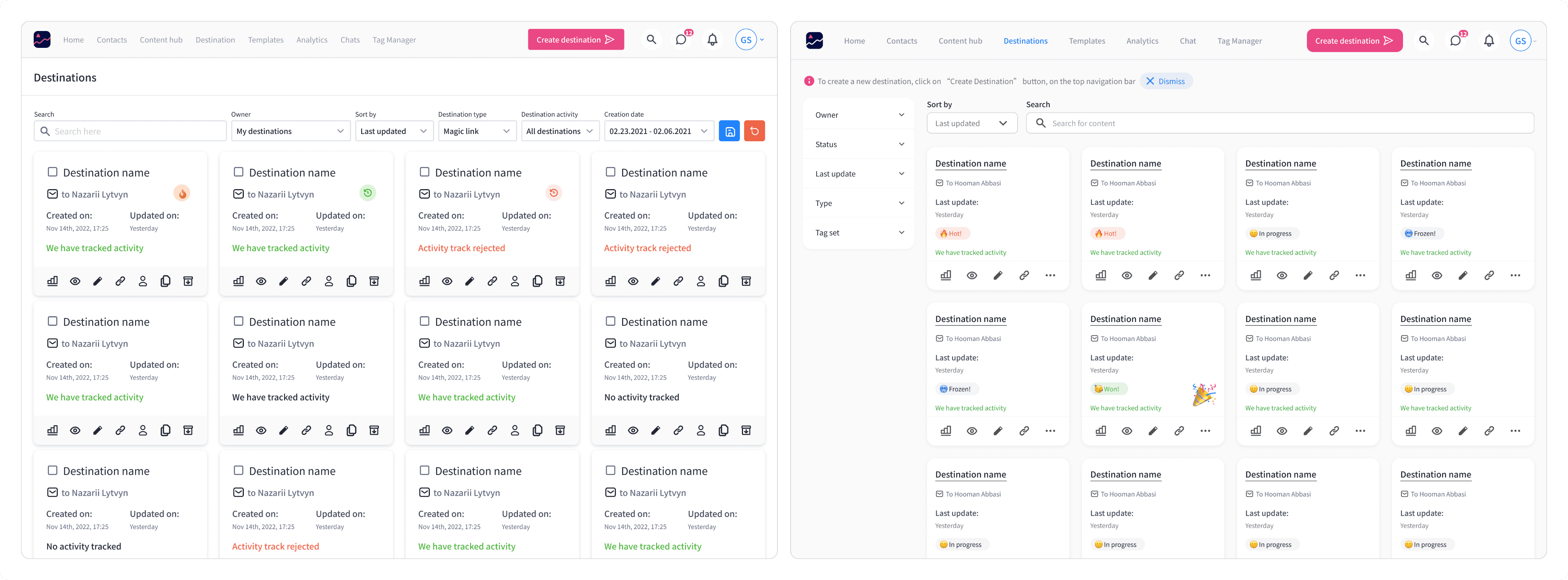
Emlen didn't have an implemented Front-End library that match the design system. Therefore, in a UX audit process, the designers had to perform a UX audit before each release to ensure zero UX issues in post-release.
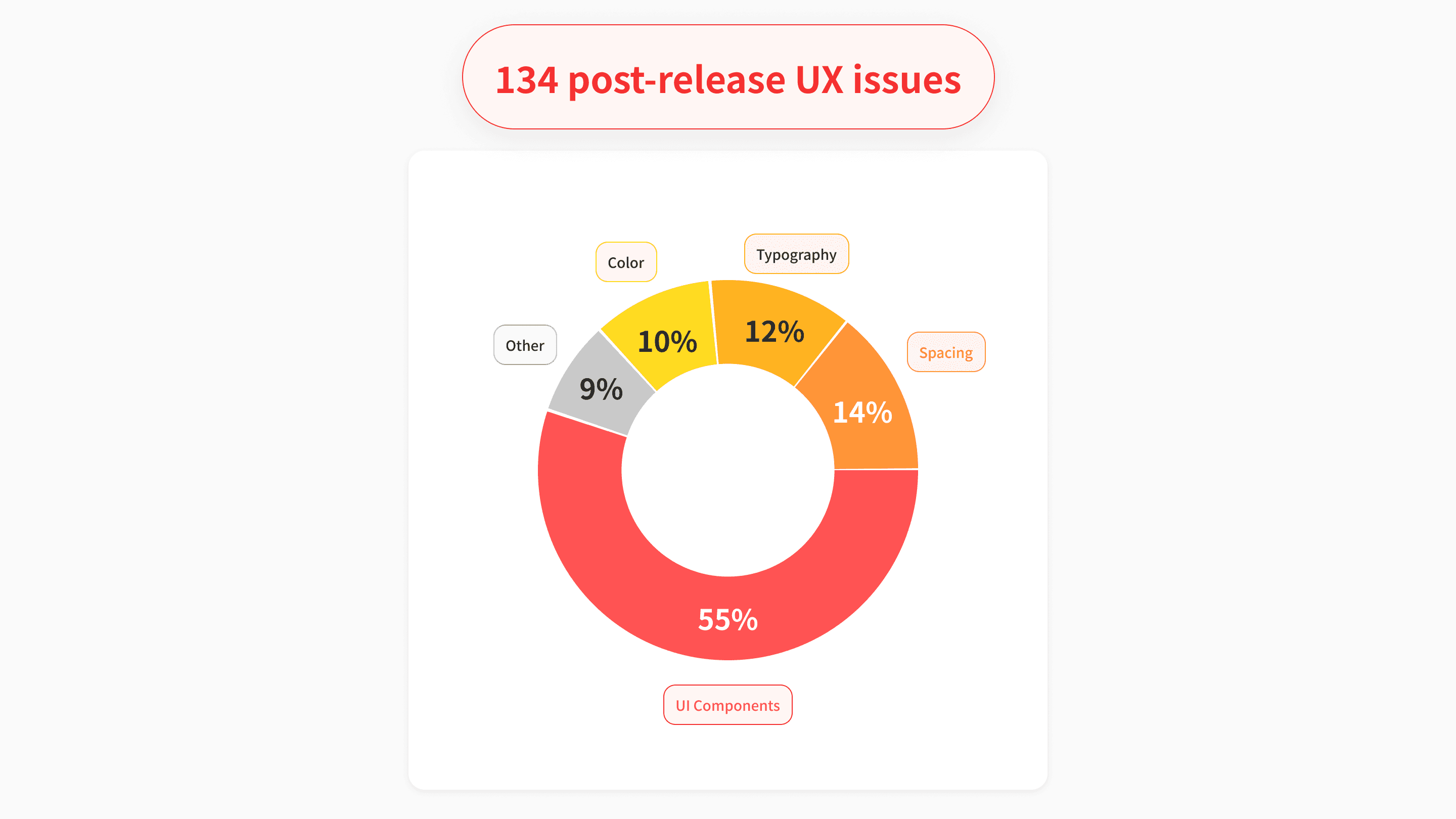
In 6 rounds of UX audits, 134 issues were found. But only a portion of them which were must-have, were resolved. The other ones repeatedly added inconsistency to the product and the code. As shown in the chart below, more than 91% of the issues were related to not having an implemented design system, as 55% were concerned with UI components, 14% spacing, 12% typography, and 10% colors.
Backing up with financial calculations, I pitched our CTO and head of product that implementing a design system in the Front-End library is way more cost beneficial. Therefore, implementing a design system and eliminating inconsistencies by 80% was targeted in the team's OKRs.
" In 6 rounds of UX audits 134 UX issues was found and only a portion of them were resolved."
Discovery: Interview with FE Devs
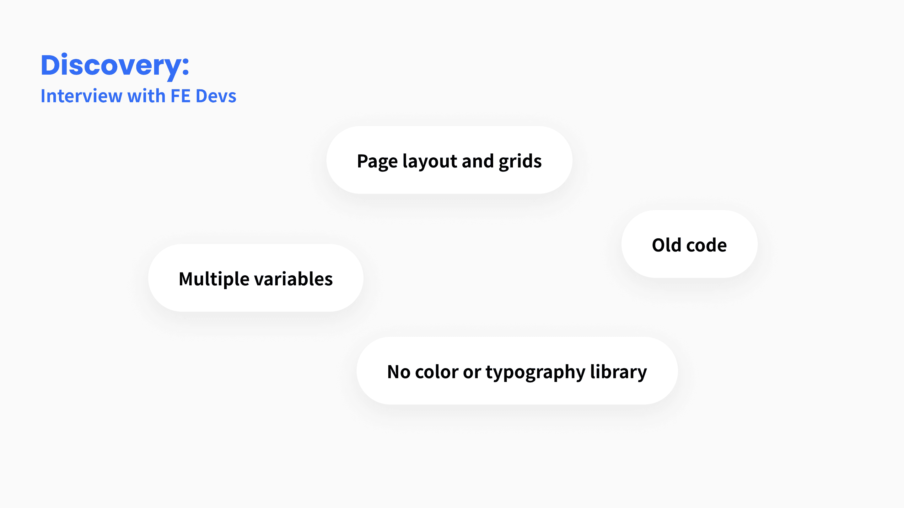
After 1:1 with 5 Front-End developers I categorizes their concerns into 4 segments:
No consistent page layout, and no grid
Multiple variables from the same components throughout the product. Such as 5 instances for filled buttons
Old code in some pages, that needed complete rebuild
No color or typography library
" The FE team considered the cause of the issues in 4 segments. "
" In an ideation call with the designers, we clarified what items are needed in our design system. "
Ideation call with the stakeholders
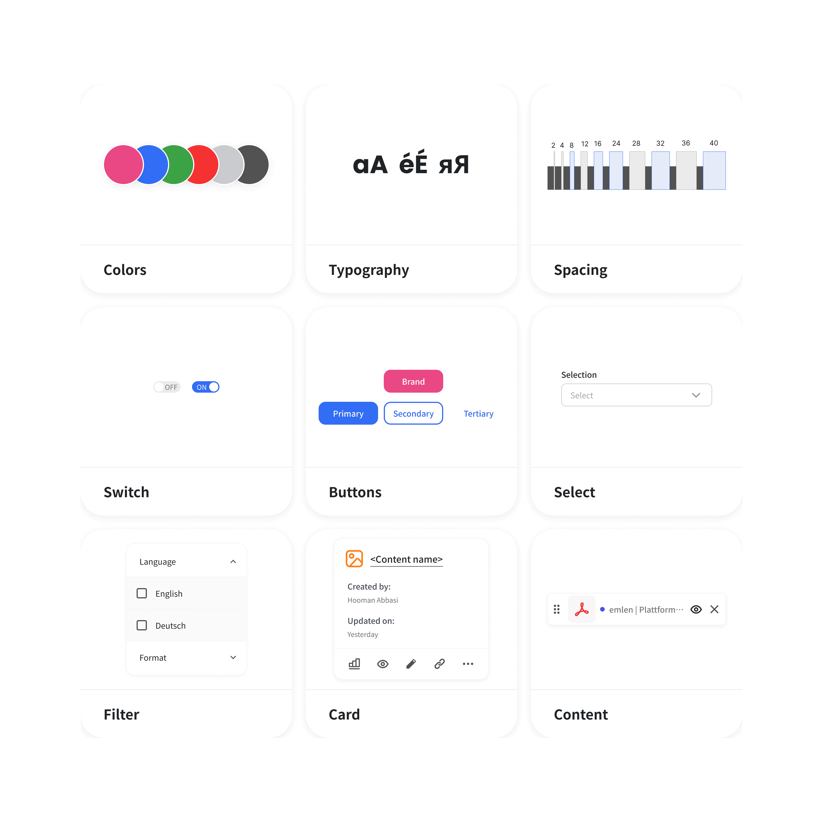
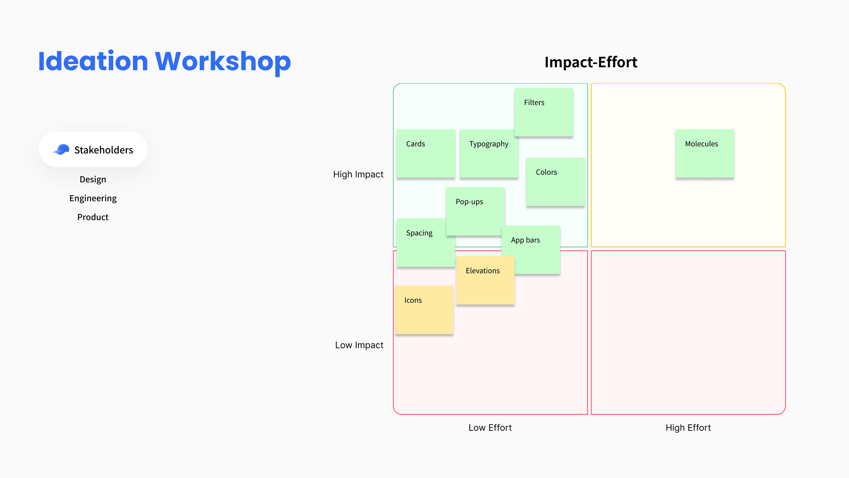
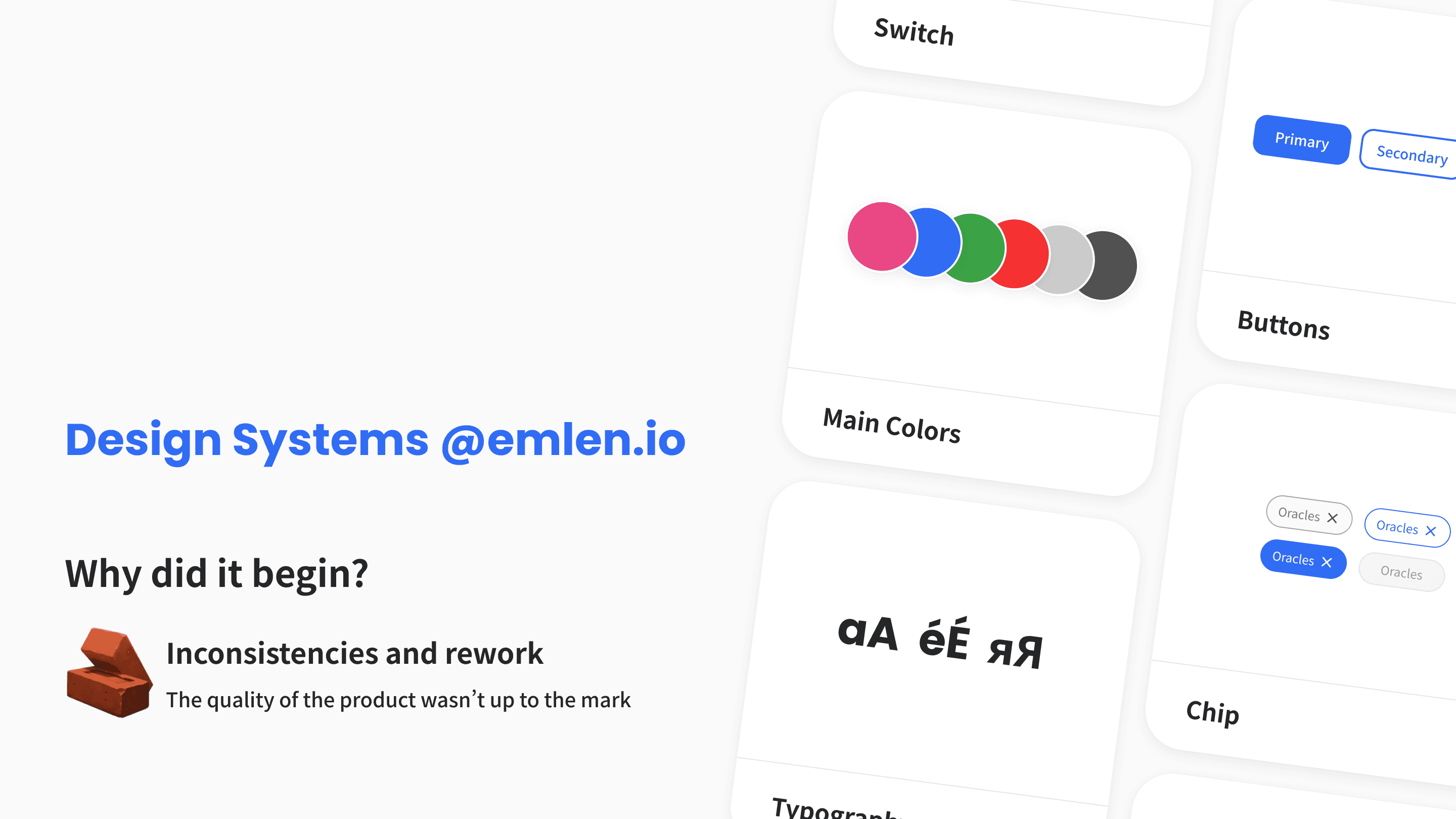
To shortlist the exact items to add into our design system, I arranged an ideation workshop with the Product Designers, Front-End Developers, and Product Managers. Based on the effort and the impact of each item, the followings were shortlisted:
Atoms
Colors
Typography
Spacing
Molecules
Buttons
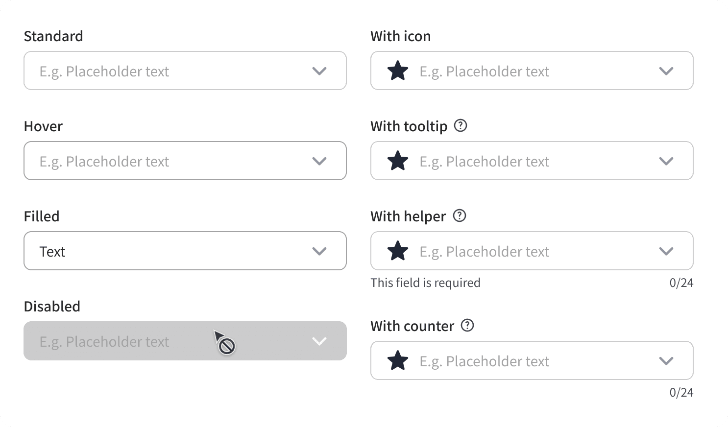
Input fileds
Drop-downs
Chips
Selections
Toggles
Scalable organisms
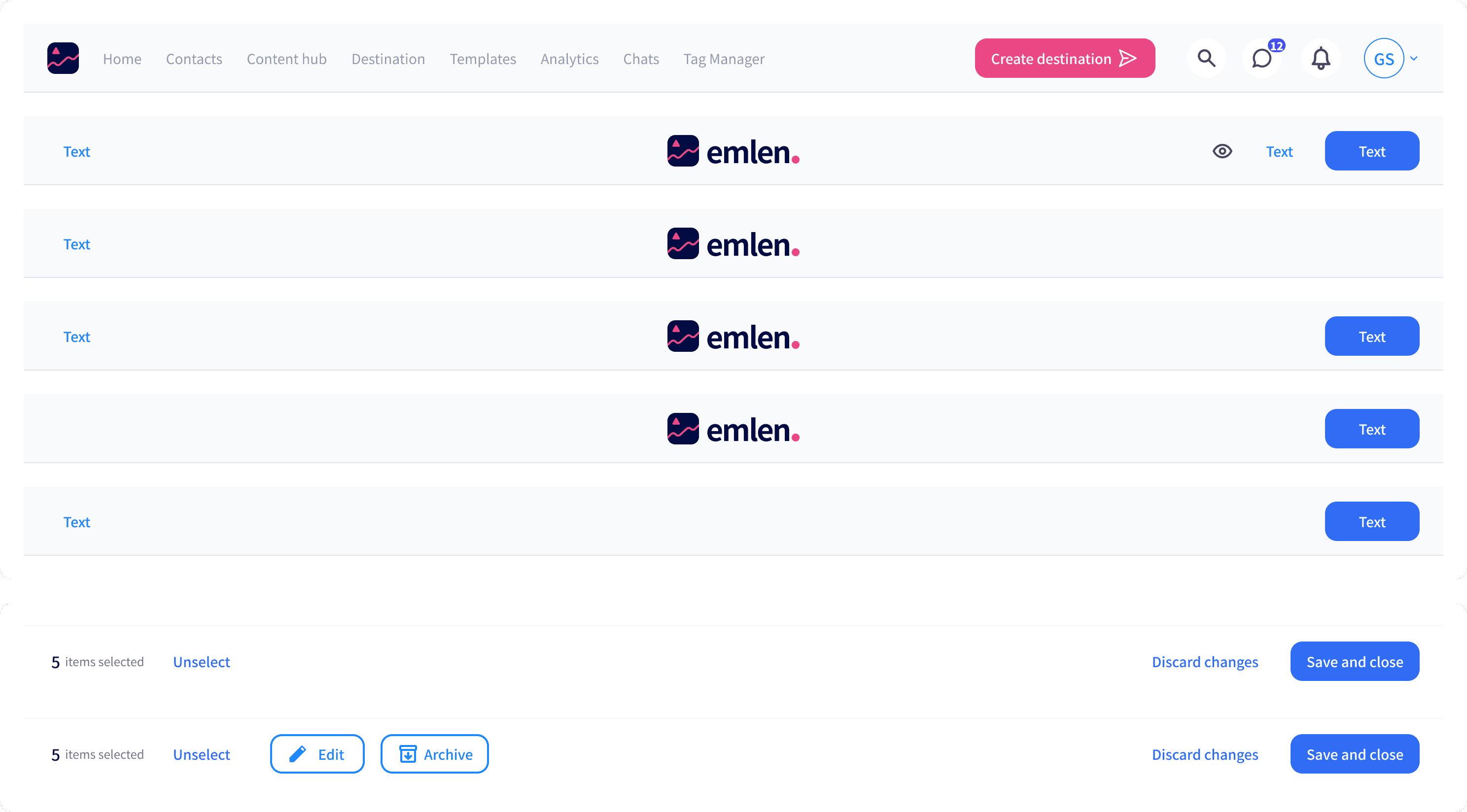
Nav bars (top and bottom)
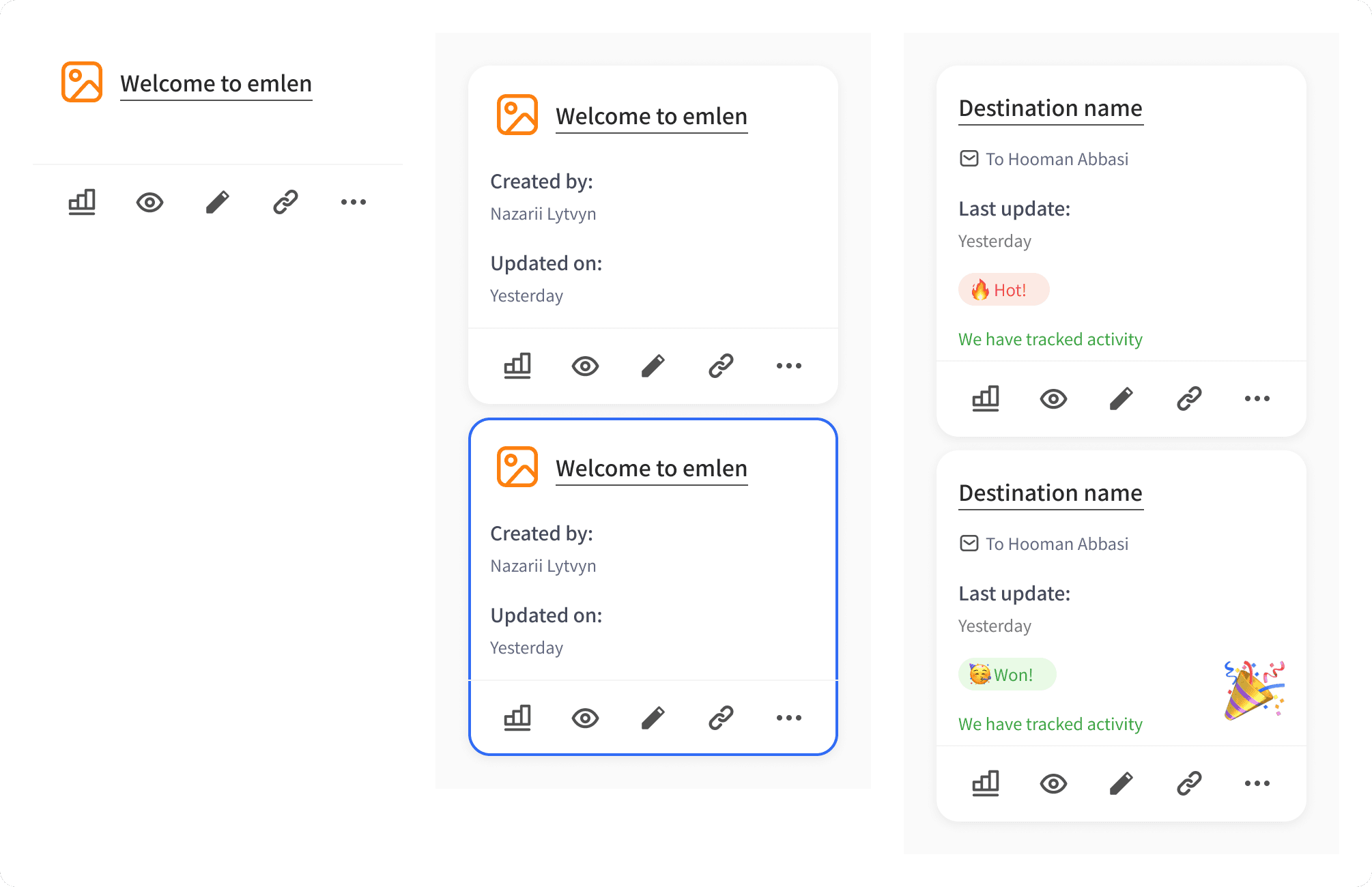
Cards (content, contact, informative)
Filters
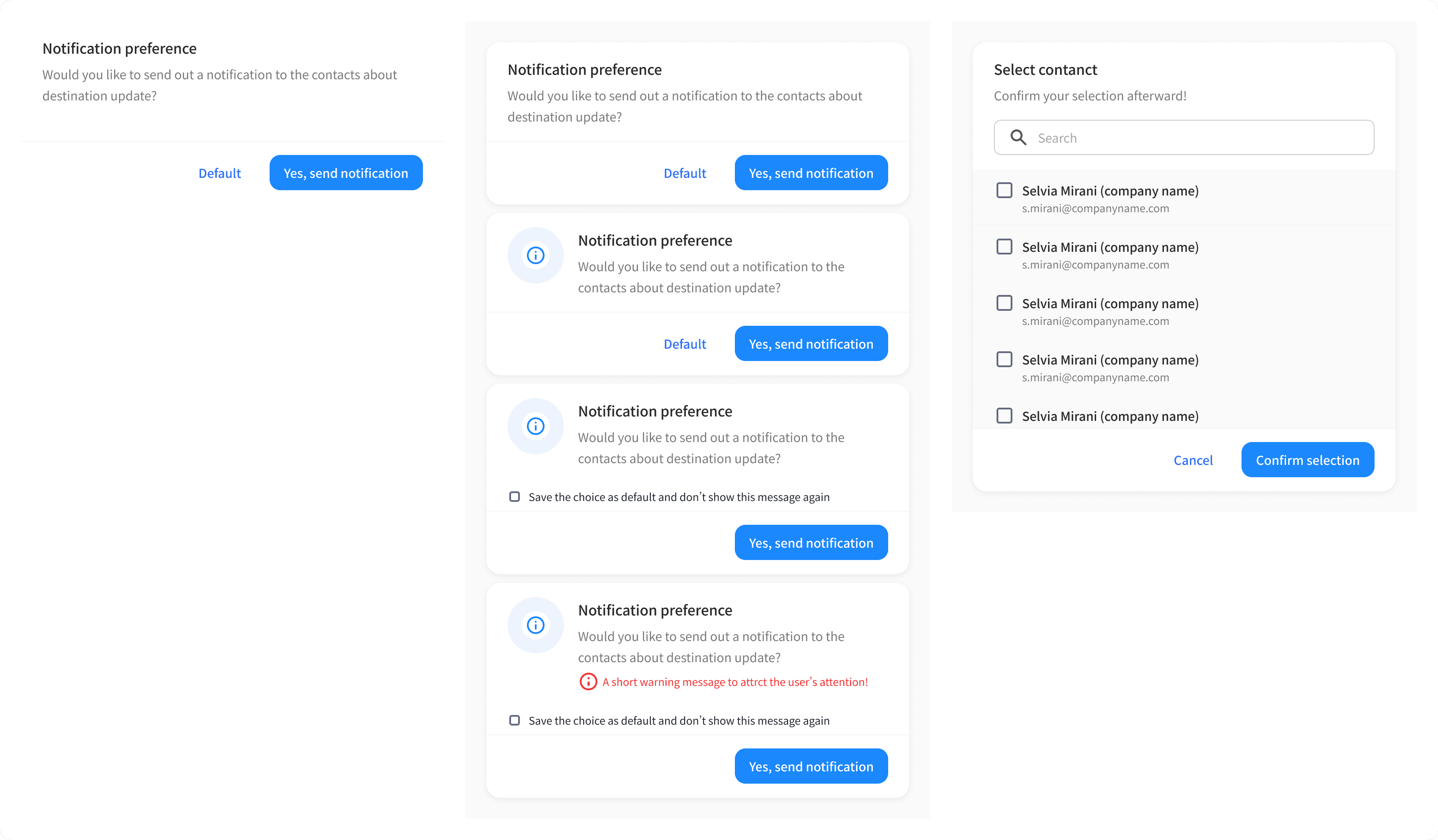
Pop-ups
" Atoms, Base molecules, and most used organisms were shortlisted! "
Implementation plan
In the plan I proposed, I suggested 3 months of designing and testing the design system with the Product Designers while they were using it. After that, we would implement the items in UX Hack workshops from 9:00 to 17:00.
Atoms
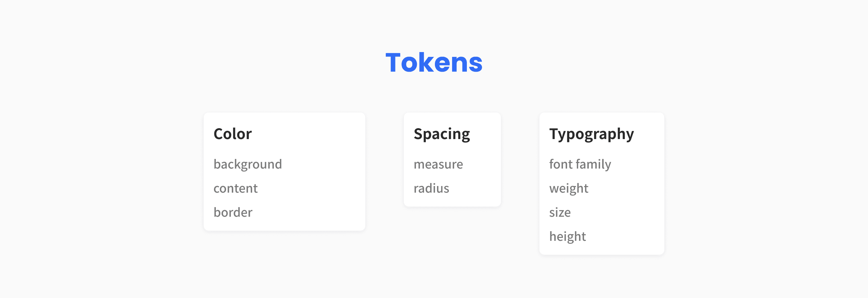
I built tokens for colors, spacing, and typography. Before that we were using styles on Figma. The tokens helped me in the scalability and consistency while building other variables.
Color tokens
I used Base design system of Über as inspiration for the color tokens, as the use-case was similar to ours. I categorized the colors into Background, Content, and Border.
I first started with base colors, then expanded them based on different use-cases and feedbacks from other Product Designers while performing the design tasks.
The pink color, which was the brand color, was only available in Background and only in 1 single button on the top app bar.
Typography
On this date, that I'm publishing this case study (June 6th, 2024), you need to combine Variables and Styles to build a typography library and that adds rework. As shown in the image below, I built Variables for Font-Family, Weight, Size, and Height, then implemented them based on the scaling ratio of 1.15x on the typography styles.
Spacing
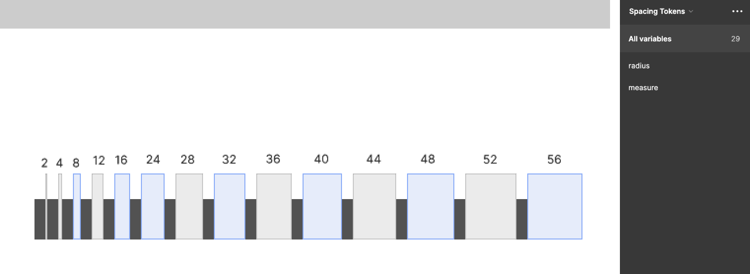
Initially I set the spacing to be a multiple of 8. That said, in actual designs, we needed other spacings in-between such as 12, 4, 2, etc. Therefore, I set 8x as the primary spacing and 4x as the secondary, and 2 as the tertiary one. Based on a feedback from one of the designers, I removed 20 since it was adding horizontal imbalance in the coordinates since we were using 1440 width for our desktop.
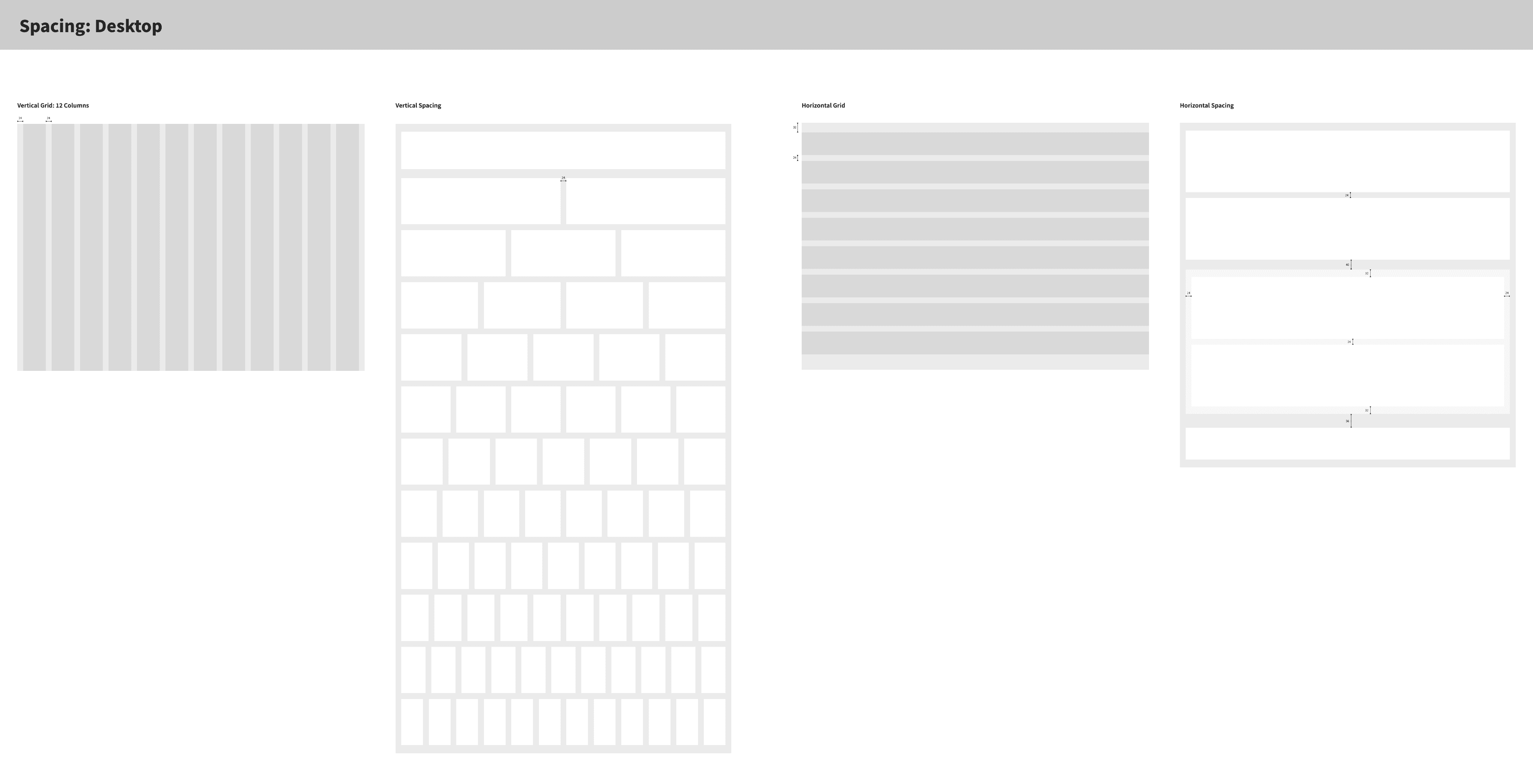
I added 12-column grids with 24 as the margin and gutter. I also added a guideline for inter-component spacing.
The breakpoints were 1080, 1280, and 1512.
Iconography
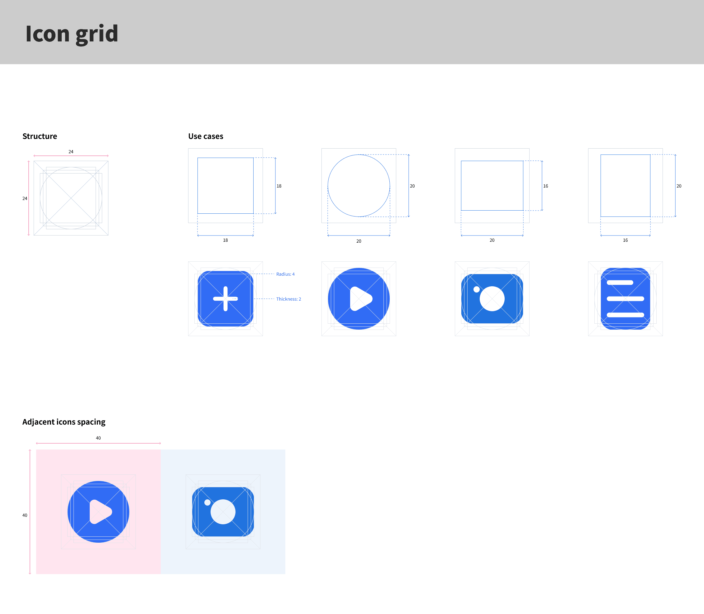
I used material design's icon grid and unified the existing icons based on that guideline. For some icons, it was only about size adjustments, and for the others, it was designing them from scratch.
Molecules
I redesigned the basic molecules in color, radius, and spacing aspects, compared to the legacy components. Since the items were being built from scratch, I wanted to take the initiative and modernize the UI as well.
Organisms
The organisms were built in a way to be scalable. for instance, I had the Filter divided to 2 types: header and item. This approach gave us the flexibility to combine the components to build various organisms through auto-layout.
Implementation
Implementing the design system was tricky! We couldn't replace everything in 1 night, and we couldn't replace components partially since we wanted to avoid further inconsistencies.
Therefore, after a 1:1 with the Front-End Lead, we decided to build a separate code repository, which was a duplicate of the live product, freeze new feature releases for 1 quarter and focus the dev team on operational tasks, and implement the design system.
I proposed UX Hack days: workshops with Product designers and Front-end Developers from 9:00 to 17:00 in an isolated environment.
We started small, based on the implementation effort, to learn and iterated on the first call. Initially, I was given only 5 UX hack days. But after seeing the results, I convinced the leadership team to extend the days to 8 and we fully implemented the design system.
Results
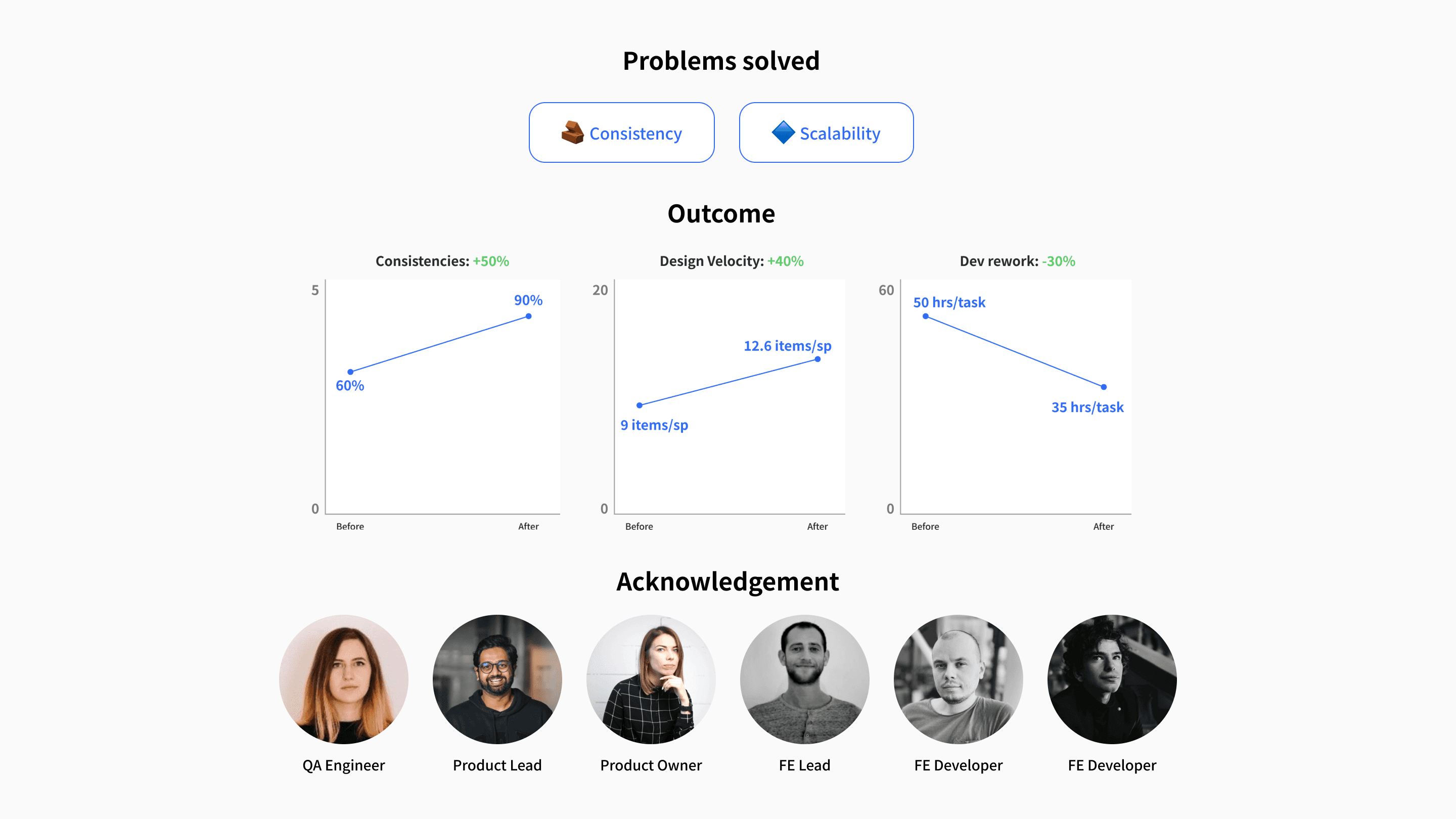
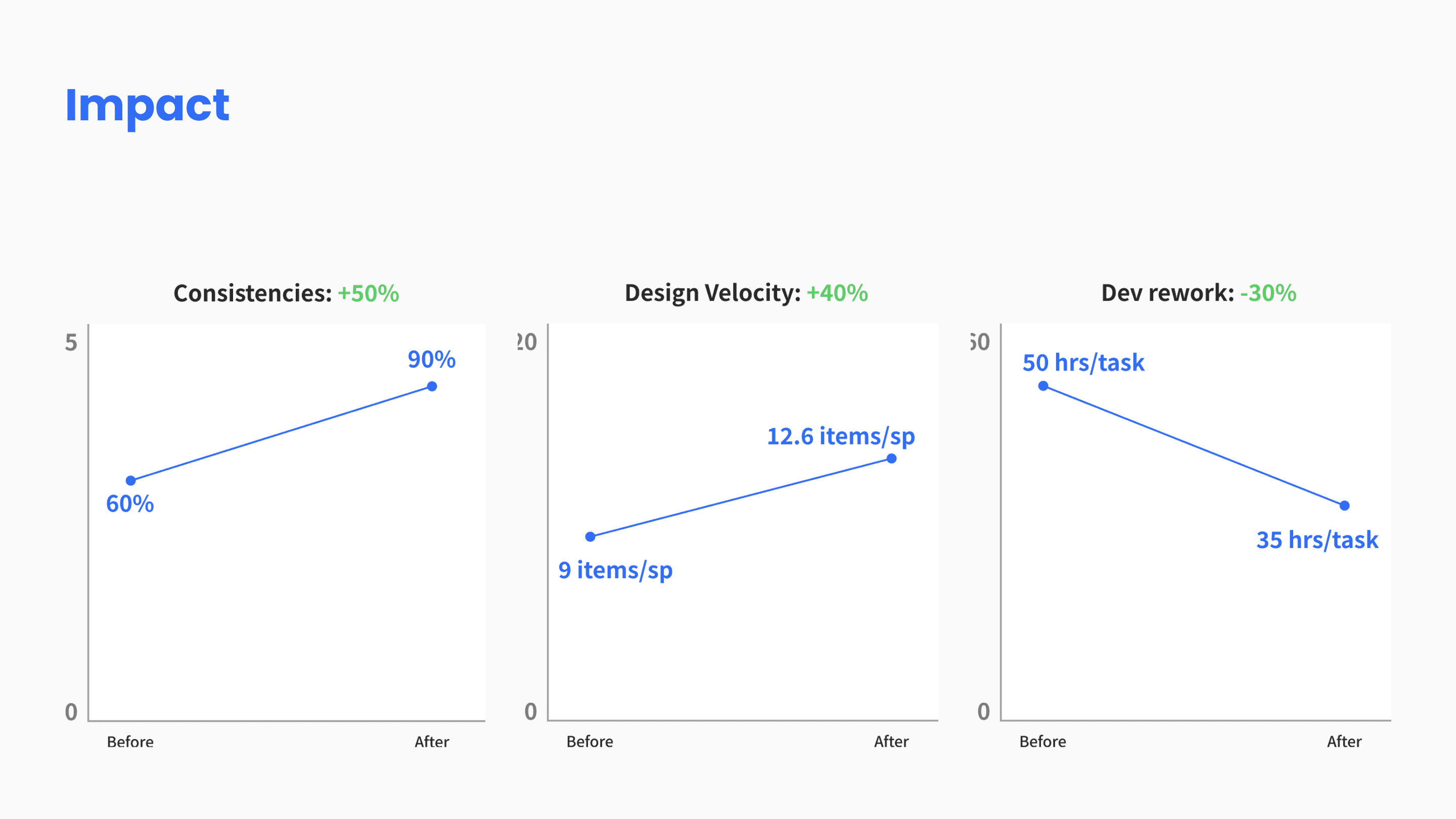
The problems we tackled as a team were inconsistency and scalability. 3 months after the implementation of the design system:
Inconsistencies were reduced by 50% and the product was 90% consistent.
Design velocity was increased by 40%.
Development rework which was done on UX Audit was reduced by 30%.
