No code syncing of multiple content repositories in one click!
Summary
Overview
The case study focuses on the redesign of "Impulse," a SaaS product designed to facilitate content synchronization across multiple CMS systems for non-technical users such as content managers.
Company
Motiv Solutions
Project
B2B SaaS
My role
Freelance Design Lead
Product
Web App
Challenges
The legacy product was working partially with command line and partially with a UI which was hard to navigate. This challenge prohibited scalability of the system and its usability for non-technical users, who struggled with the complexity of using command lines for content synchronization. Therefore, the company had to assign a customer success specialist for each customer to handle their tasks.
Solution
A redesigned user interface was implemented, eliminating the need for command line interactions and simplifying the content synchronization process with a step-by-step walkthrough.
Methods
The approach included user interviews, a design thinking workshop, and iterative moderated usability testing, culminating in a user interface that simplifies tasks and enhances situational awareness.
Result
Decreased the load for the Customer Success agents for onboarding and creating jobs by 90%, by enabling a self-service walkthrough.
Increased the speed of taking actions regarding ongoing sync tasks by 60% by bringing in situation awareness by enhancing information visualization in the dashboard
Increasing product engagement by 40% through redesigning the product's architecture and navigation
The Situation
Impulse is a SaaS product. An integration platform designed to help businesses migrate, deliver, and keep their content in sync across an unlimited number of CMS systems. The main users of the product are content managers and product managers.
The main problem they were facing was scalability. In the legacy product, users were partially using command lines along with a dashboard as their user interface. This approach was complicated for their users (content owners) who weren't technical people. Therefore, They had to hire an agent for each client to handle their syncing tasks among multiple Content Management Systems.
Research
Although I had worked on multiple SaaS projects and also had the experience of working with CMS myself, this project was novel to me. Their business was complicated and we needed knowledge sharing regarding their solution, their target audience and current users, and the value they were bringing to the market.
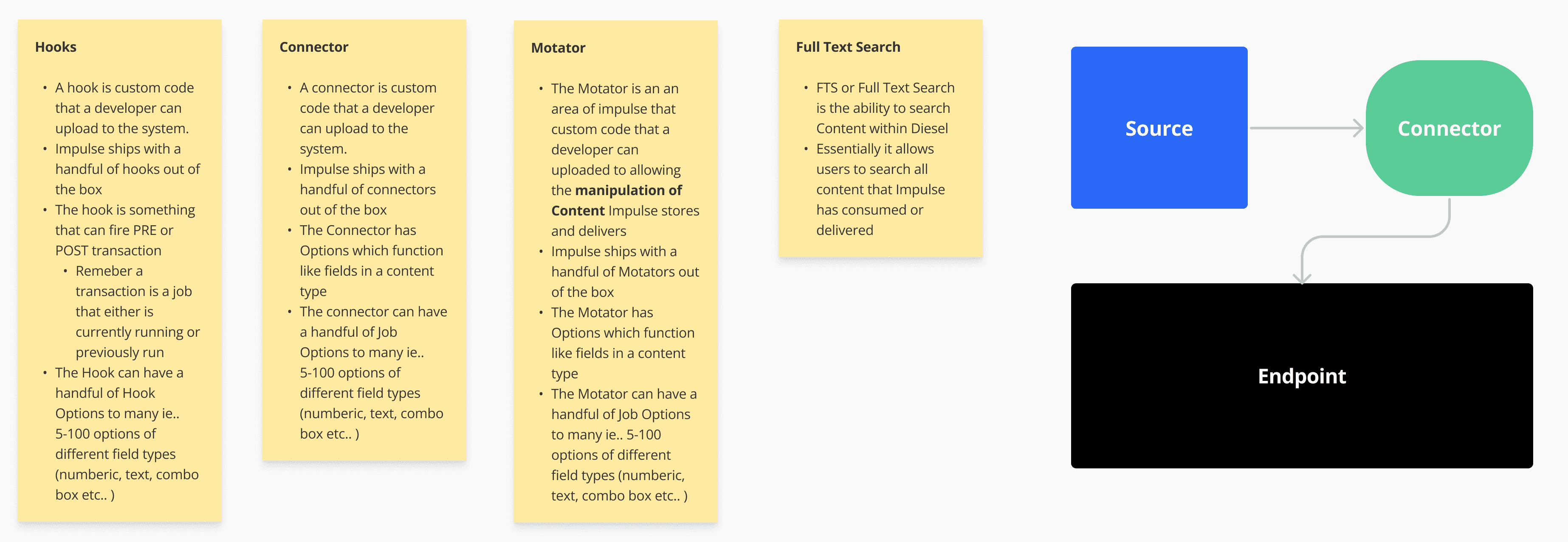
After having 1:1 with stakeholders, I decided to hold a design thinking workshop to gather diverse thoughts and ideas and have a mutual alignment in understanding the problems, the users, and the solutions. The workshop was done remotely on FigJam.
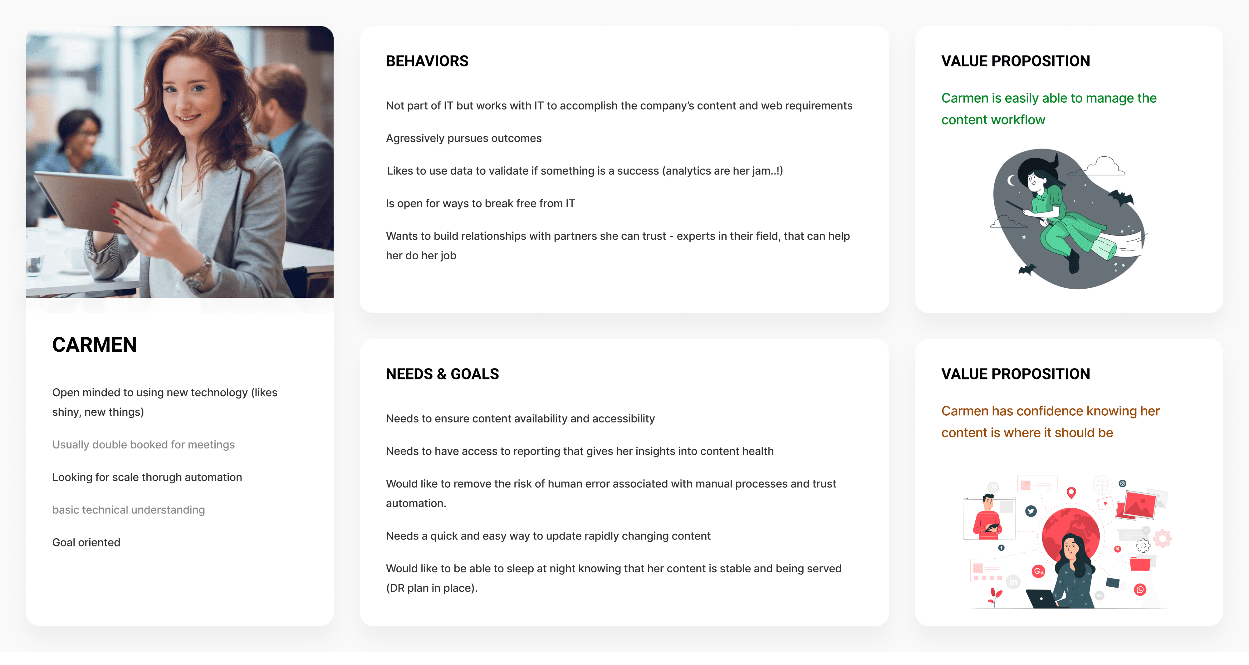
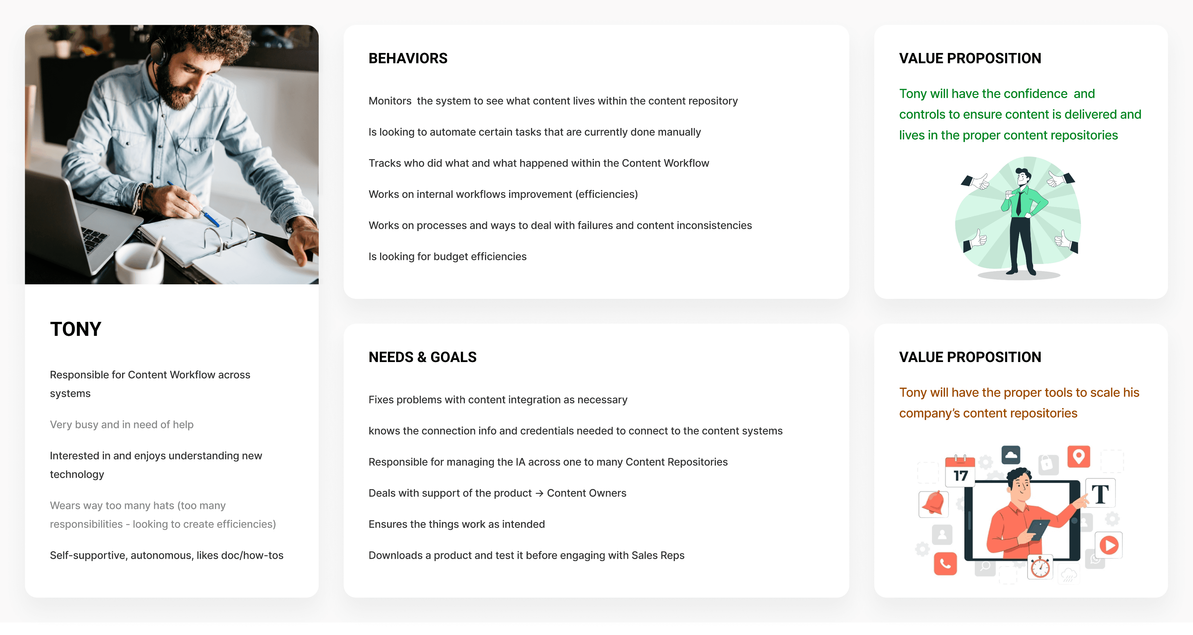
The outcome of the workshop was a mutual understanding of the target audience, their behavior, and the value proposition.
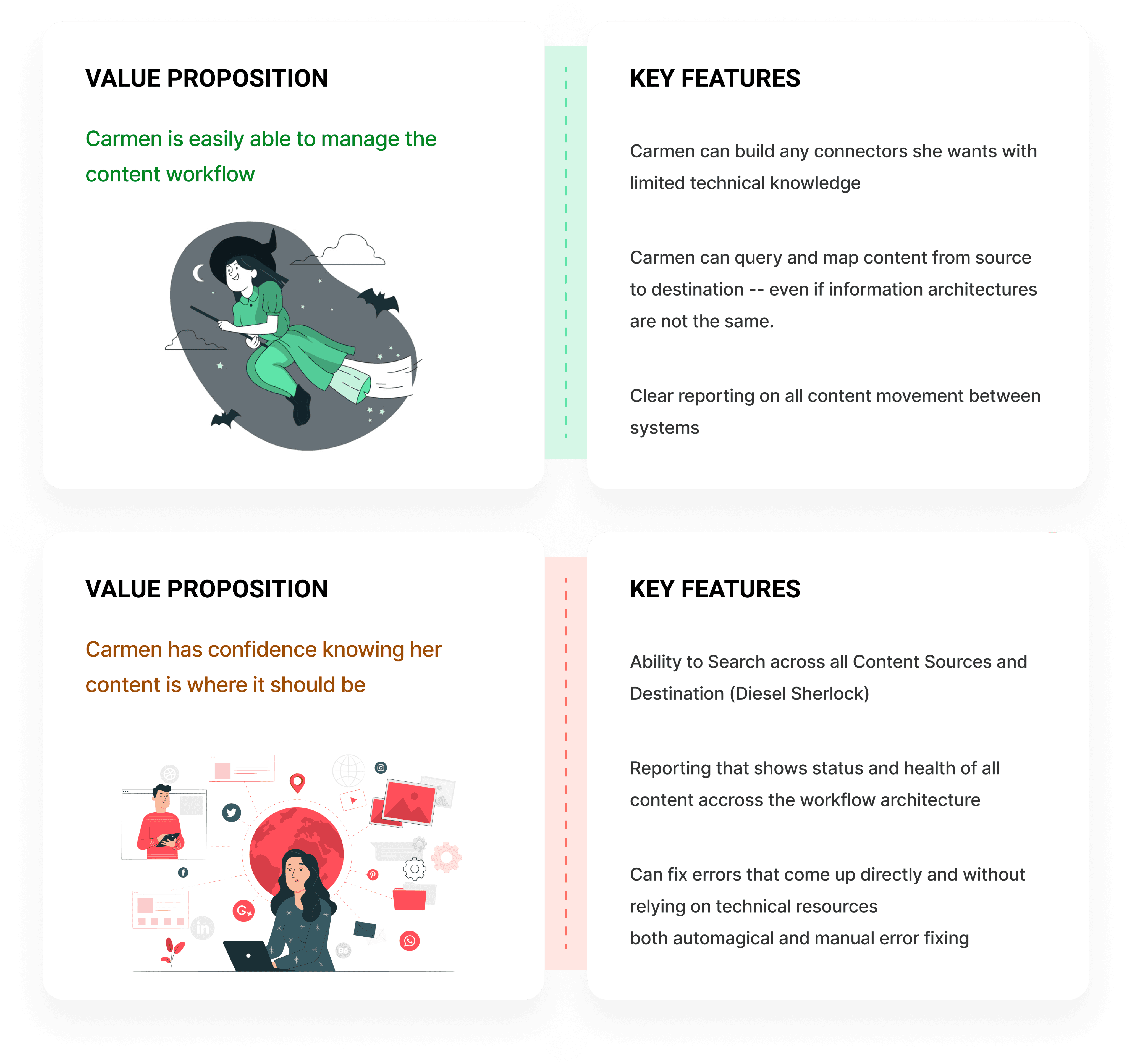
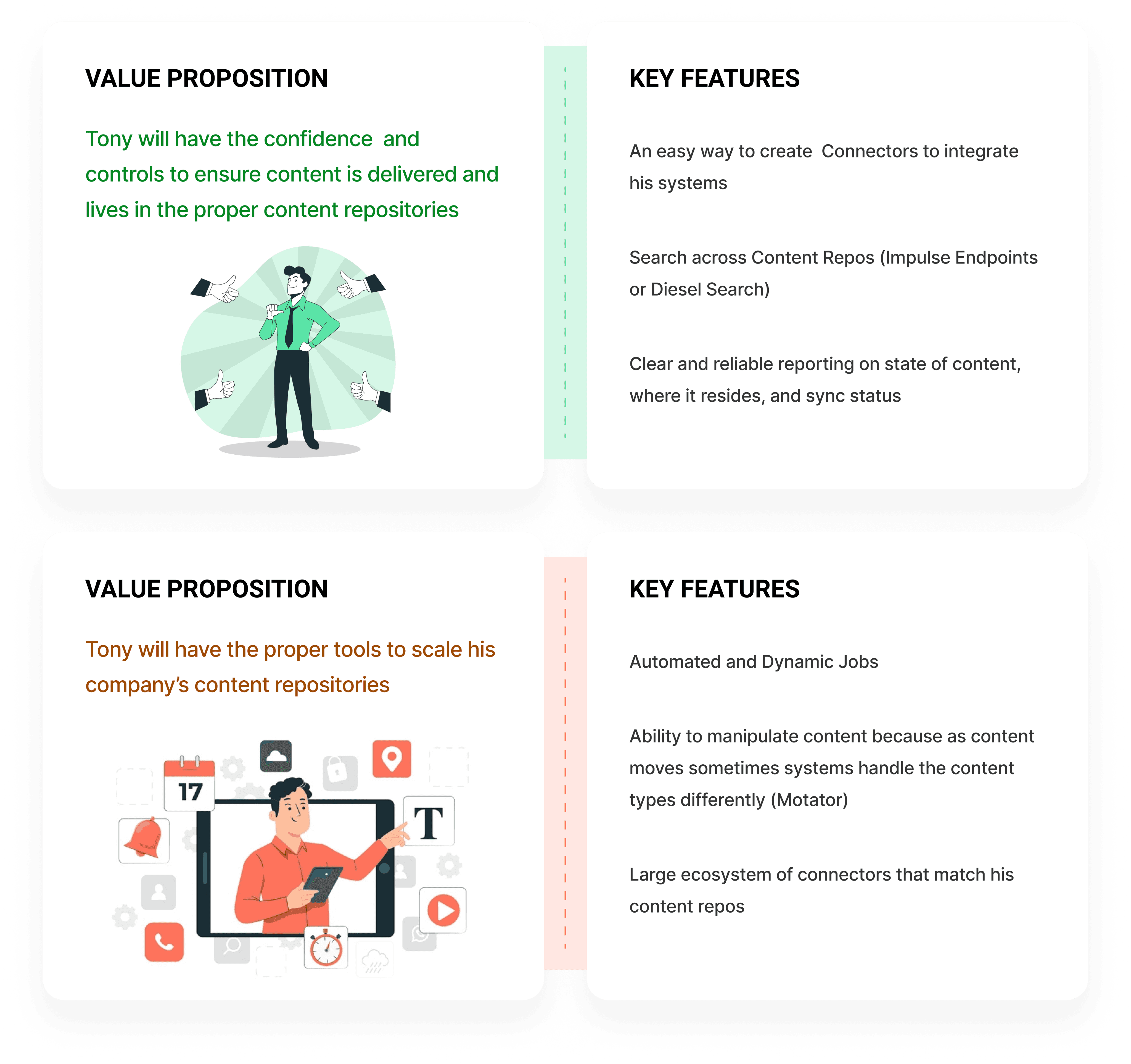
Each persona had 2 value propositions: The green one was the main value and the red one was the secondary value.
After understanding our target audience, I needed to empathize with the users and see their journey while they were dealing with syncing content among different CMSs. The product itself wasn’t suitable for us to let people use it and watch their interactions. Therefore, we had to sit with them while they were doing their jobs and meanwhile, ask questions regarding their behavior and the challenges they were facing.
As a result, we found out that the users are facing 2 main problems:
Forgetting the sync flow: There are diverse content repositories and the users have their own Excel files to manage and track these. This flow had a significant load on their short memory and they expressed that there usually are multiple errors in each sync. When the sync process is automated, it’s not usually changed for a long time. So it’s also probable for the users to forget the flow.
Situation awareness: Let’s say the sync is being conducted. They needed to know what was done successfully and what was not. Sometimes they needed this report while the sync was in progress so that they could handle it sooner or fix the existing problem
Ideation
The ideation consisted of 3 steps:
Definition of existing features
Brainstorming ideas and prioritizing them using impact-effort matrix and MoSCoW
Grouping the final items based on their relations and mapping them into the product’s architecture
After brainstorming and shortlisting ideas through prioritization, in a cross-functional call with Engineers and Product Managers, we mapped the ideas as key features with the value propositions of personas.
To fit the features into the product architecture, I created an affinity diagram that grouped them together.
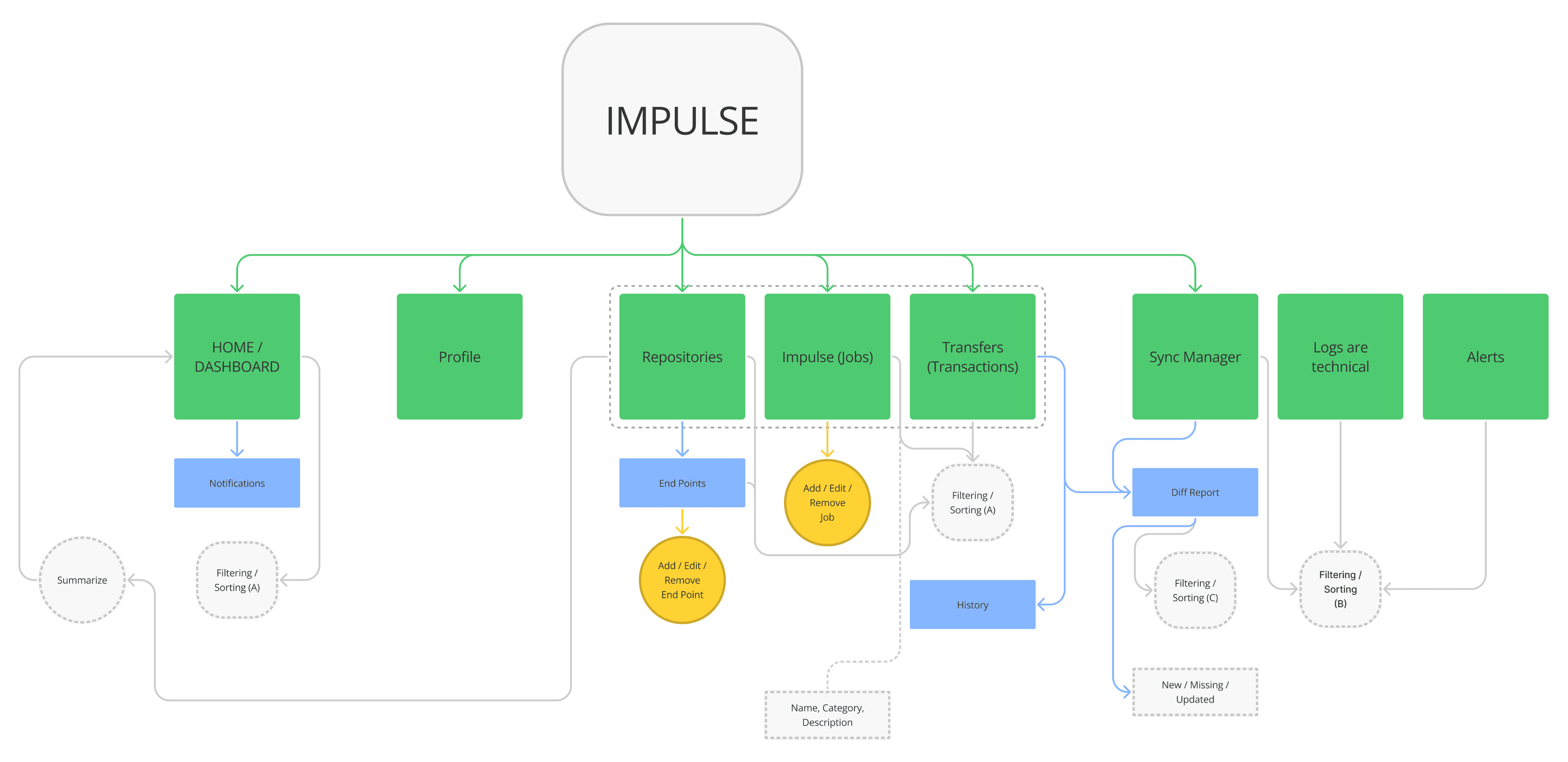
Next, I created sub-features for each item on the affinity diagram and then mapped them to the new product architecture, accordingly.
The green shapes are pages, the blues are sub-pages, the yellow ones are main actions regarding the user stories and the gray shapes are other needed data and actions.
Solution
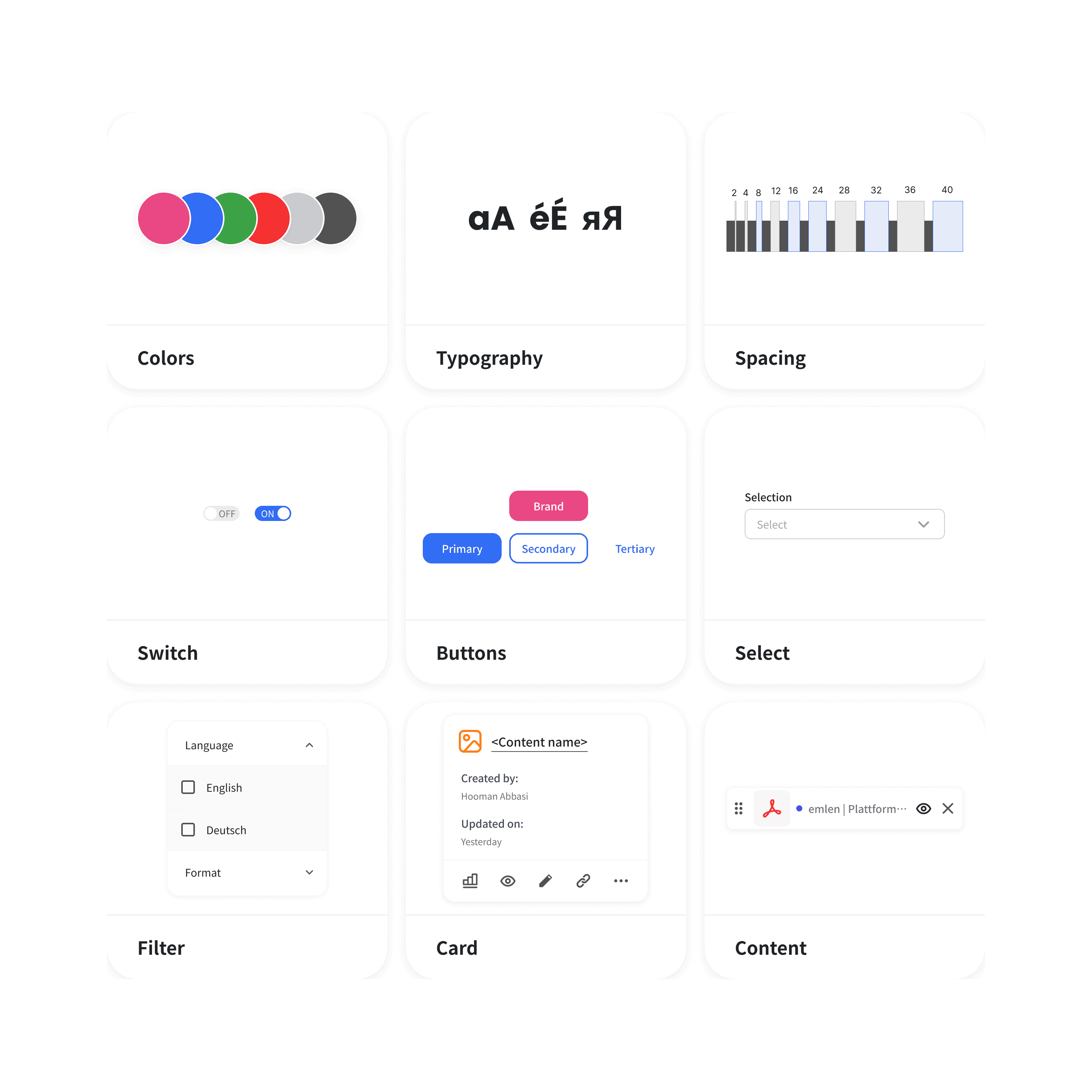
The solution part for this project can feed content multiple case studies since it covered building a design system, and a whole new product with new features.
That said, in this case study, I've explained the solutions that are related to the problems in the findings of the user research.
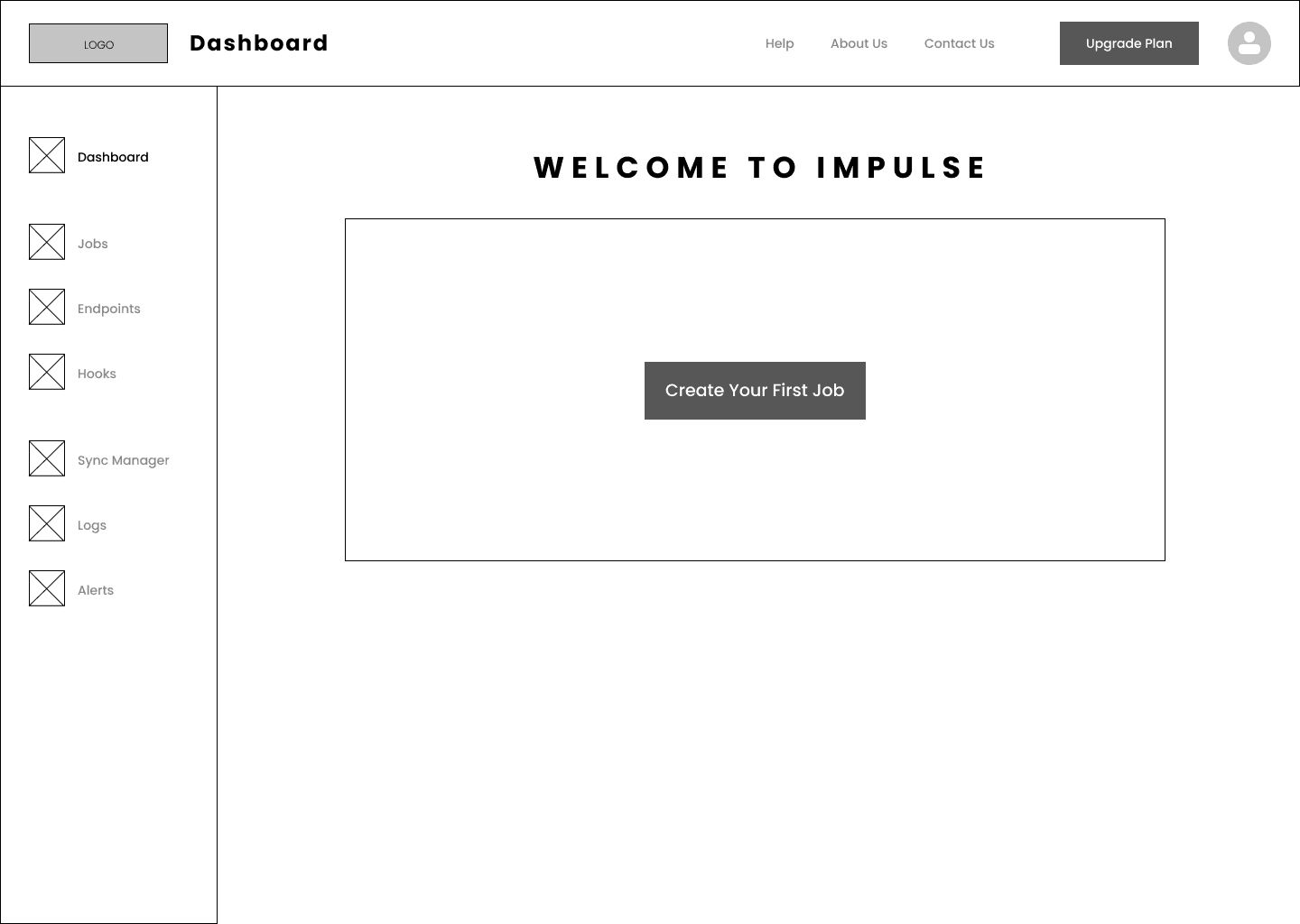
I went through 4 iterations of low-fi design and usability testing, before reaching the final solution.
The problem of forgetting the flow
The 1st major user challenge was forgetting the flow of creating jobs since it was done once in a while. In the legacy product, this flow also included technical configuration in the command line to establish connections between endpoints through connectors.
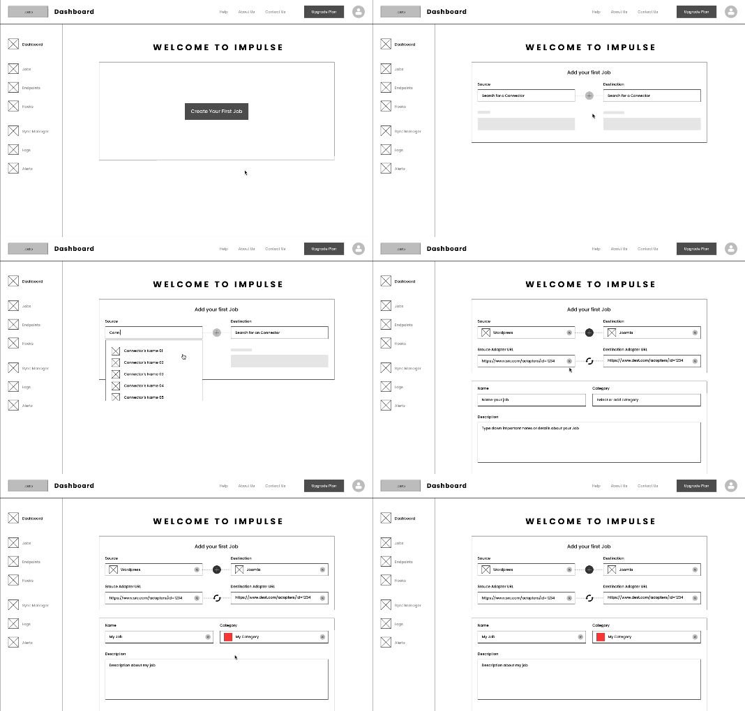
Solution: walk-through
The users forget the flow, so the solution should have been to make the flow as easy as possible to lower the load on their memory. Therefore, I came up with the following ideas:
Making the order of steps clear and understandable for first-time users
Making the flow easily accessible
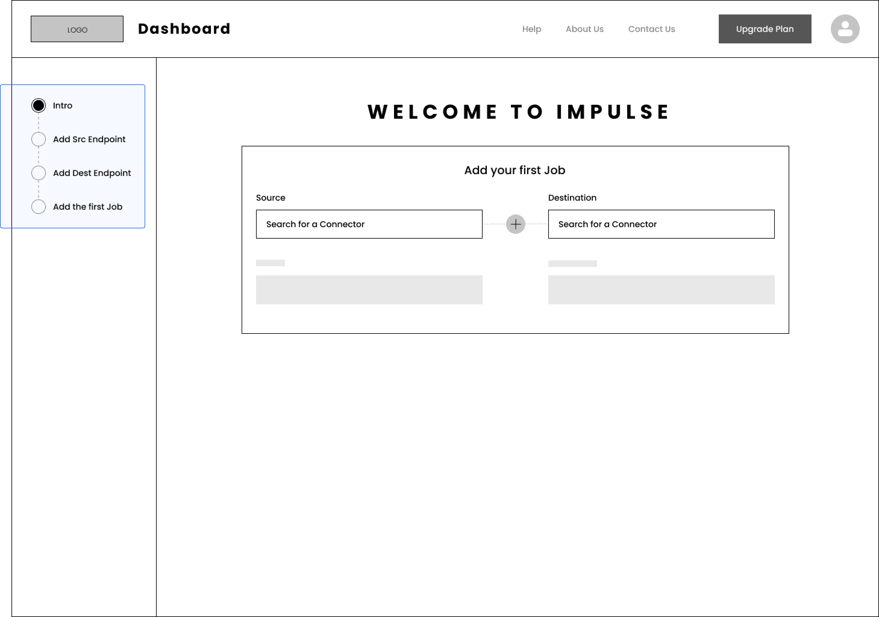
Through multiple calls with Engineers and the Product Manager, we came up with a flow that had different steps for creating the first job, with no need for command-lines.
I tested the low-fidelity prototype with 4 real users. The problem with the walkthrough was that:
The users were getting distracted with the side menu items, instead of focusing on the walkthrough
The users didn't know the next steps. Therefore they couldn't estimate how long it would take to create a job
Based on this feedback, I came up with the second iteration, replacing the side navigation items with the steps of creating the job. I tested this flow with 3 other real users. The previous problems were fixed. That said, there was another issue:
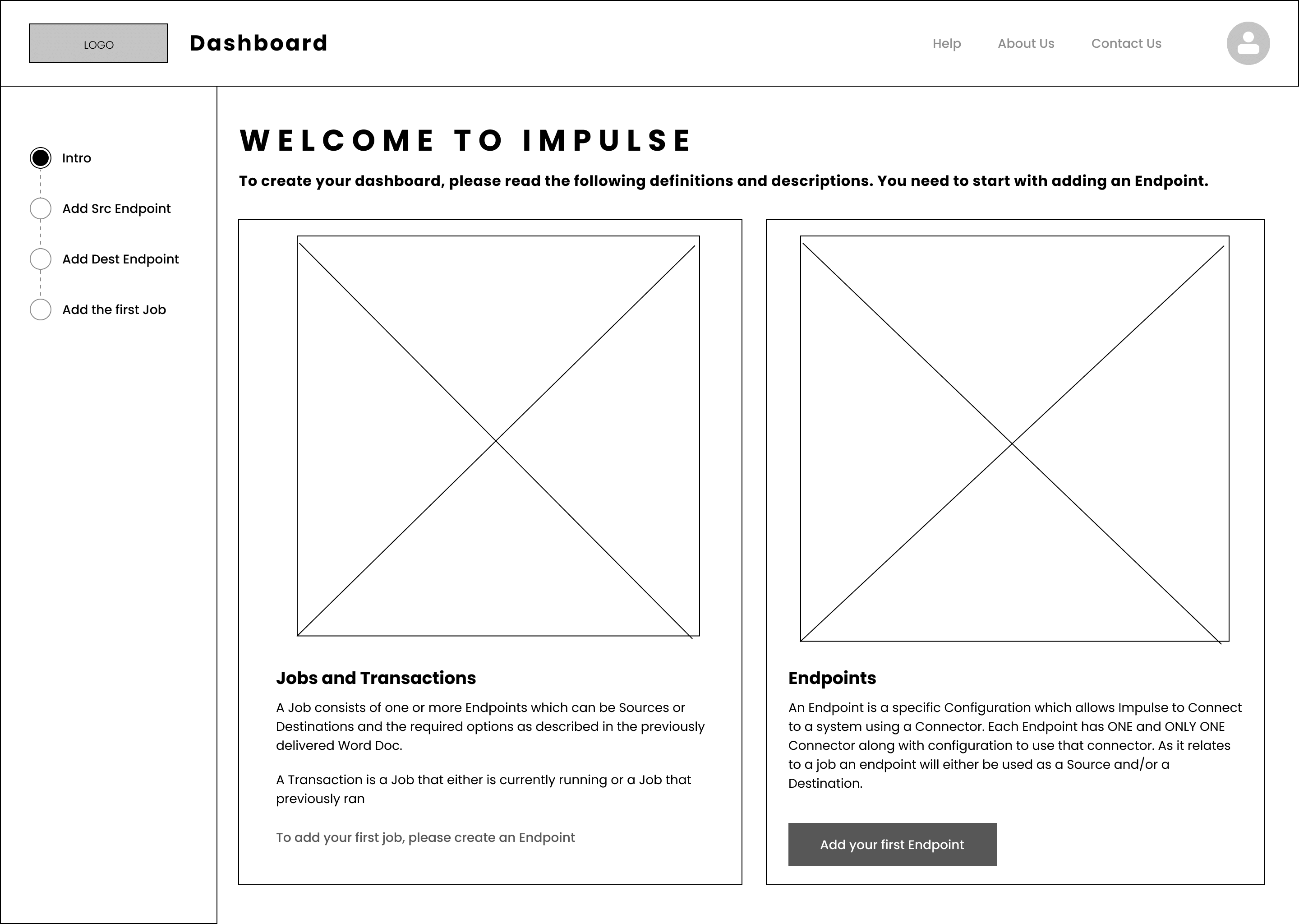
The users had no clue what are Jobs and Endpoints.
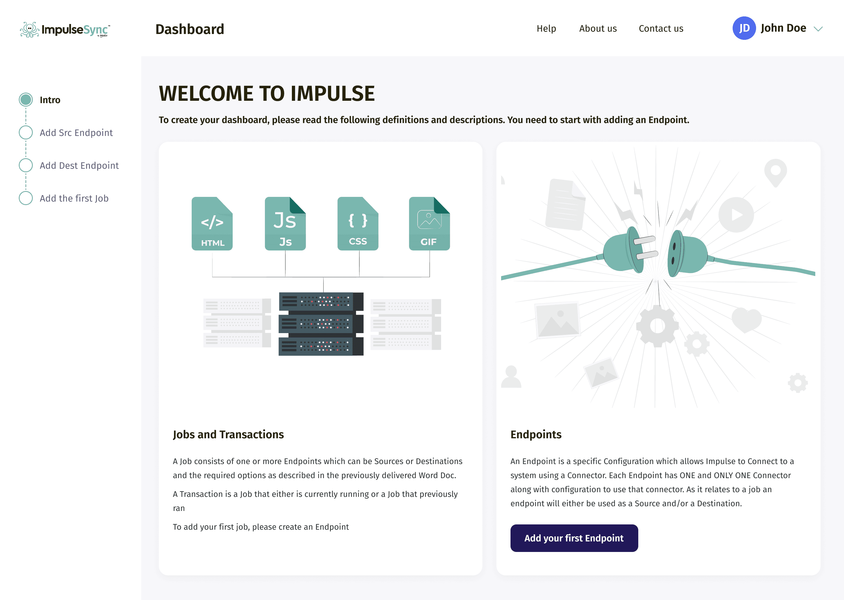
Based on the feedback, I designed an intro page with some definitions for Jobs, Transactions, and Endpoints.
I also added the CTA "Add your first Endpoint", to give the users a starting point. I tested the design with 4 users, and all of them could navigate through the flow.
The problem of situation awareness
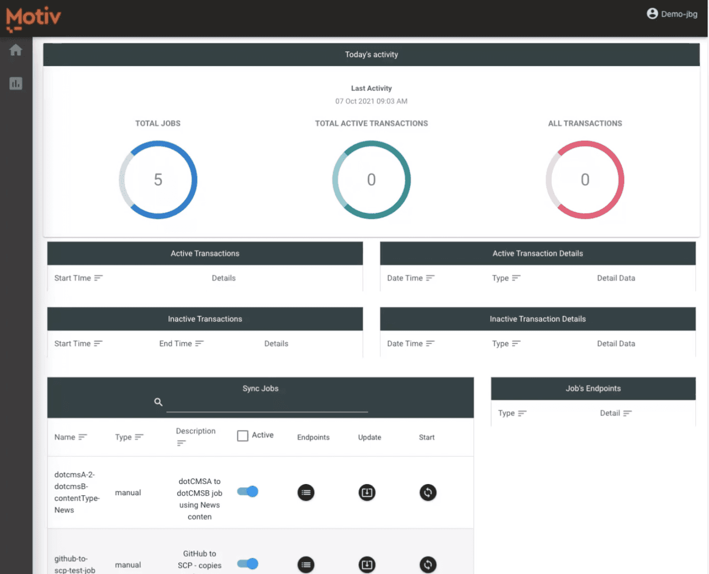
The second major problem was for the users to know the status of their Jobs and Endpoints, which wasn't included in the dashboard of the legacy product. These statuses were:
Active
Running
Scheduled
Synced
Disabled
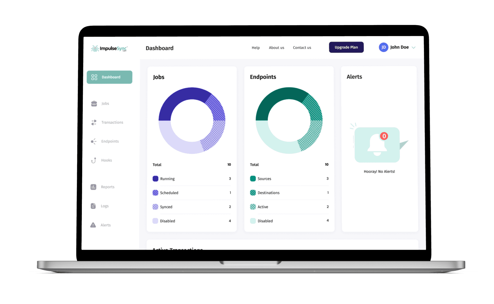
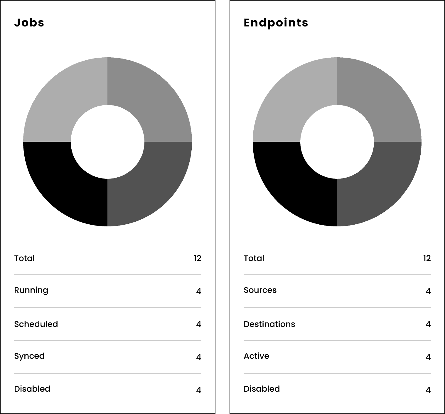
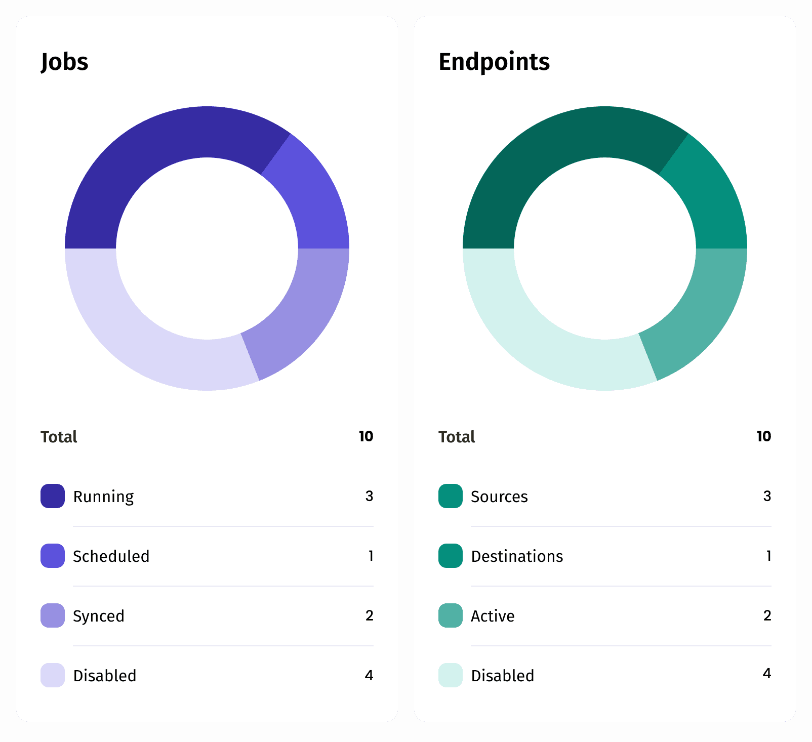
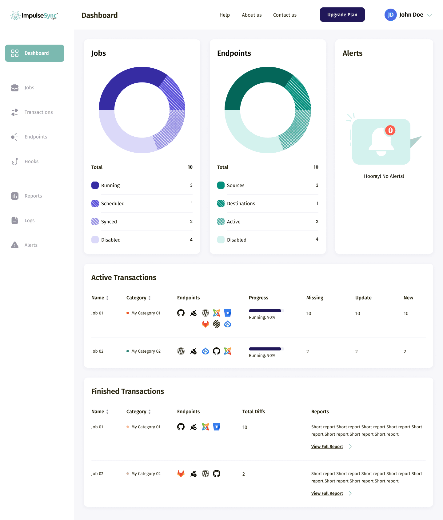
The idea was to simplify the decision-making. Therefore, I used a pie chart for Jobs and Endpoints, which showed the percentage of each status, plus the exact numbers below the chart.
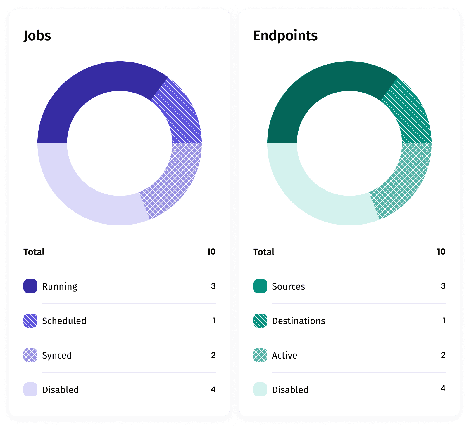
In the final UI of the chart, I used a monochromatic color set for better differentiation between Jobs and Endpoints. I also added small color patches before the status titles.
After testing with real users, I added patterns to the charts and I also added patterns since, due to the monochromatic nature of the colors, for some of them it was hard to link the titles with the colors.
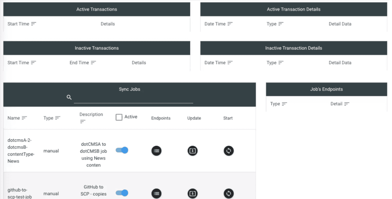
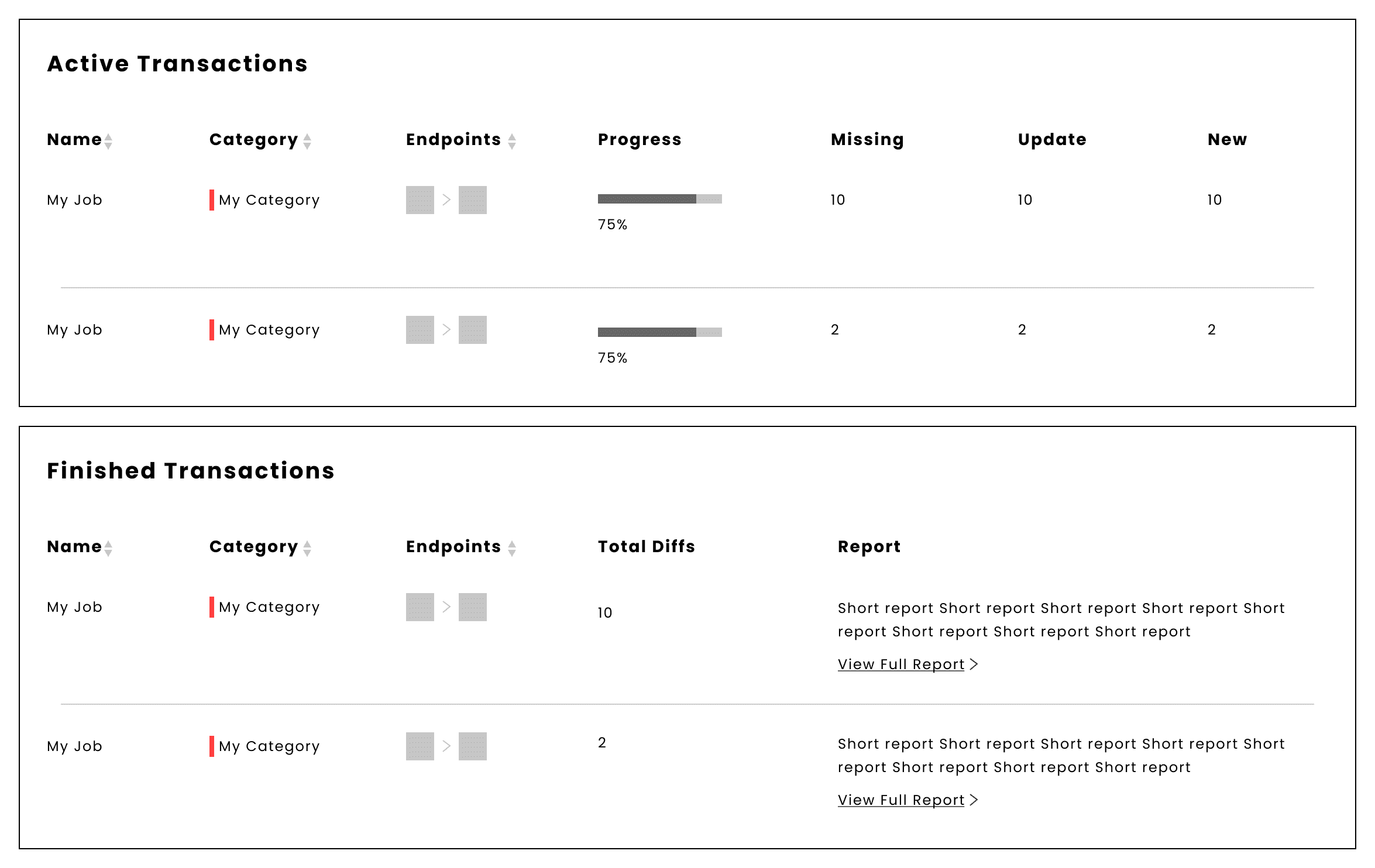
The other section of the dashboard was the transactions. The users found it extremely hard to map different tables in the legacy product. To make easier, I merged every table and then divided them into "Active" and "Finished" Transactions. The enhancements to the Situation Awareness Problem through information visualization are
In the legacy product, the users didn't have the feature of seeing the status of changes in Transactions such as Missing, Update, and New content. I added these segments in the Active transactions table.
In the new design, the users could also see the completion progress of the Transaction, which wasn't available in the new product.
The other part was accessing the final report of the transactions. To do so, they had to navigate to the Reports section, search for the Transaction, and find the report. In the new design, I added the report summary and a CTA to the full report to remove unnecessary steps.
The final UI of the dashboard, compare to the legacy product
Results
Decreased the load for the Customer Success agents for onboarding and creating jobs by 90%, by enabling a self-service walkthrough.
Increased the speed of taking actions regarding ongoing sync tasks by 60% by bringing in situation awareness by enhancing information visualization in the dashboard
Increasing product engagement by 40% through redesigning the product's architecture and navigation
