Leveraging growth through enhancing the payment and checkout experience
Summary
Overview
Spearheaded the comprehensive enhancement of the payment experience for Buy Now Pay Later (BNPL) Digikala, a leading e-commerce platform with over 40 million active users, aimed at enhancing the checkout experience and growing the user base by integrating cashback and installment payment options into their marketplace. The initiative supported the payment mobile app's home page redesign, resolving new customers' churn issue, hence increasing the customer base by 1,000,000.
Company
Digikala, DigiPay
Project
B2C, Marketplace
My role
Design Lead
Product
Mobile App, Web App
Challenges
The main challenge was high user churn despite significant investments in promotions. Users activated the promotional cashback but did not return after their initial purchase and sign in.
Solution
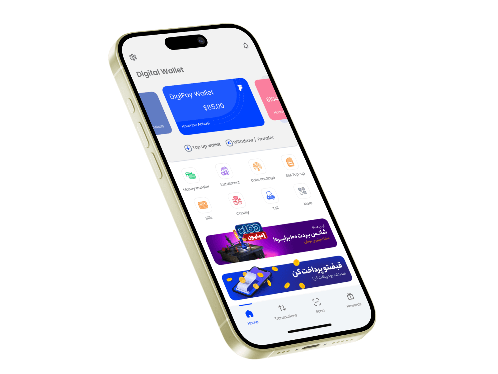
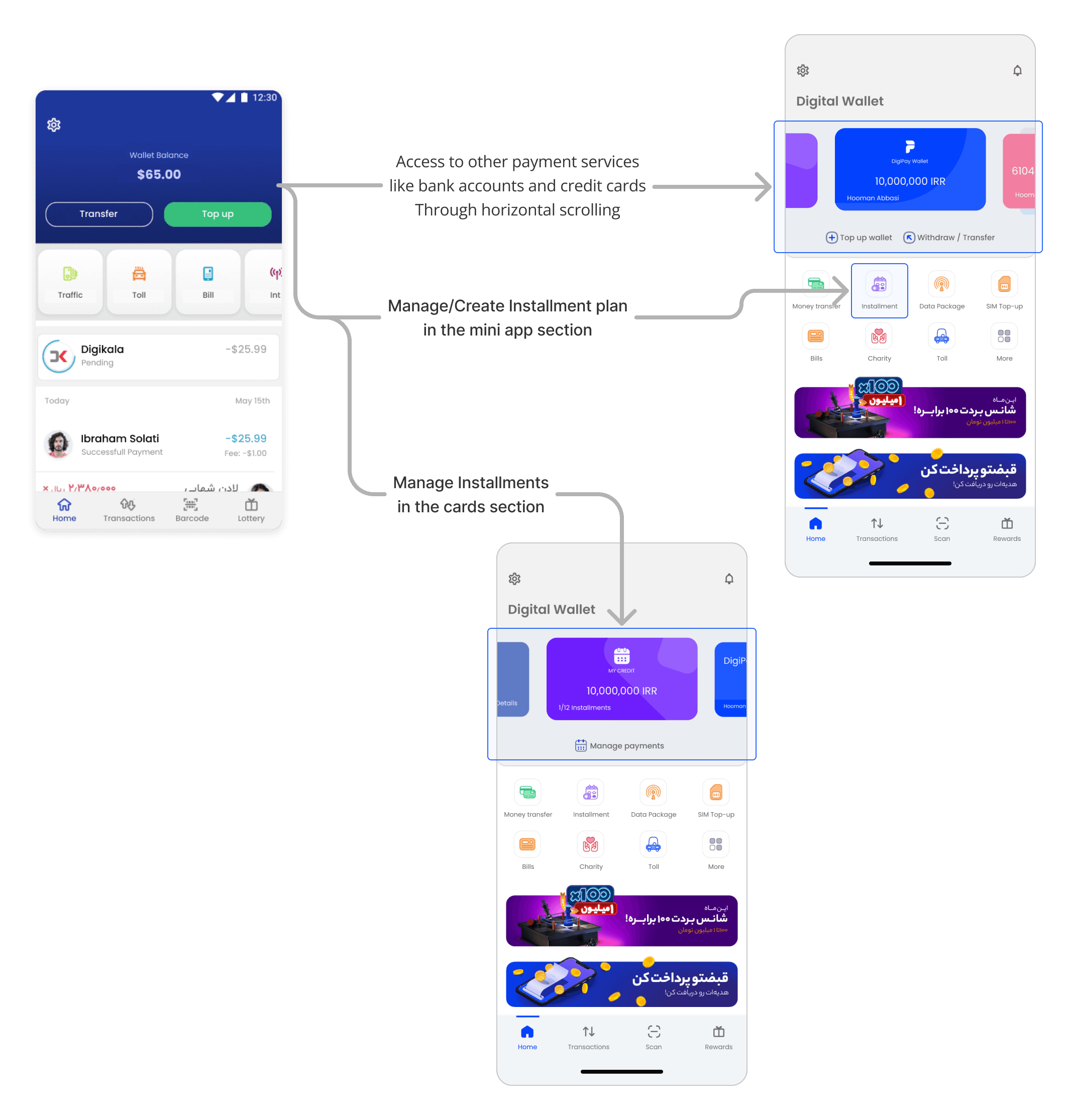
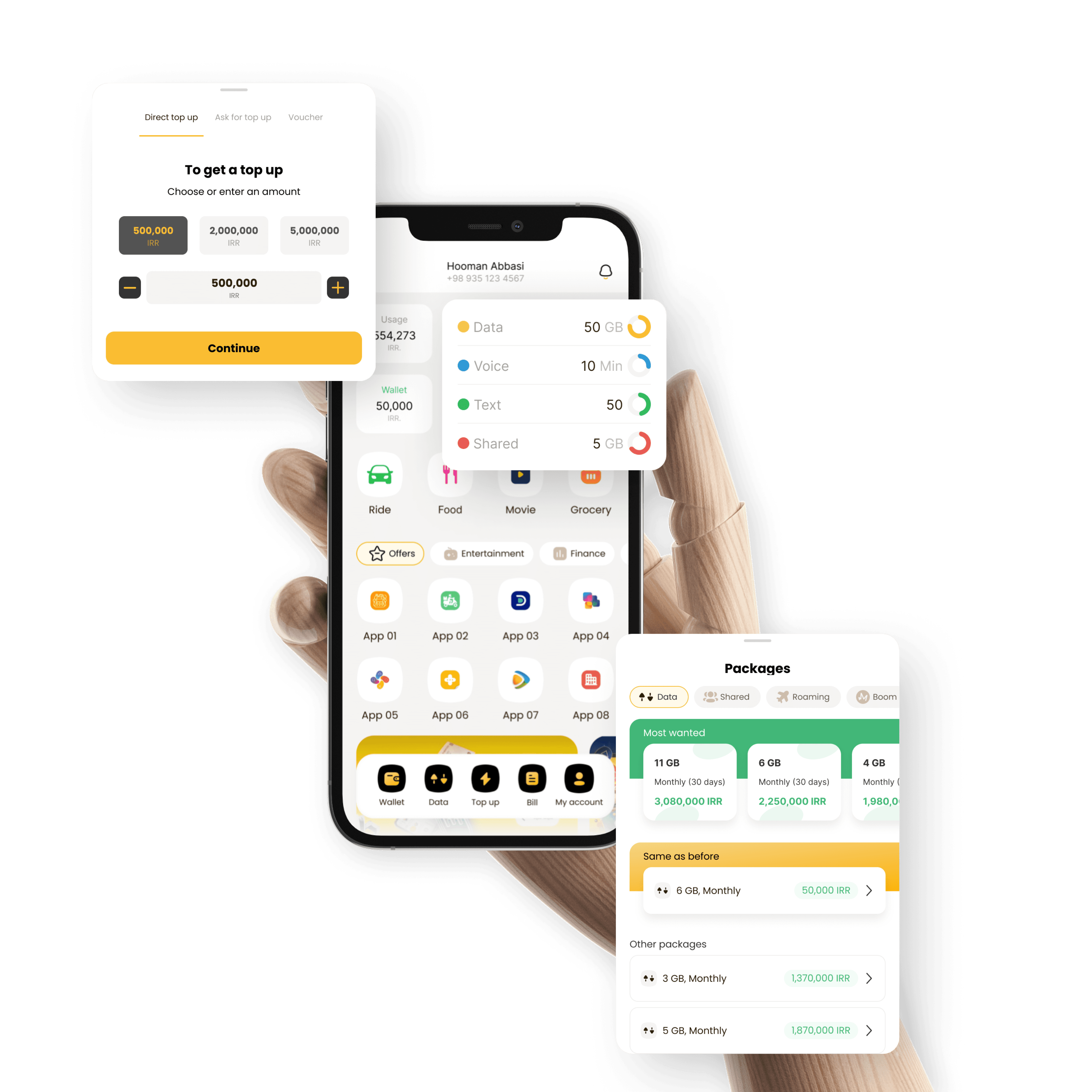
Redesigned the payment apps's home page in the credit card and bank accounts section for frictionless access to the plans and purchases.
Integrated installment payment options directly in the marketplace's checkout process.
Methods
Conducted interviews and usability tests, combined with user behavior analysis to gather insights and refine the payment process iteratively.
Utilized Figma for UI design.
Used Jira for project management, ensuring seamless integration of new features.
Collaborated closely with cross-functional teams in engineering, product, and customer success.
Result
The weekly retention rate was increased by 30%.
The CSAT in the checkout experience using digital wallet and installment plans was increased by 20%
The outcomes of this project supported the company's growth objective to increase payment mobile app's customer base by 1,000,000.
The Situation
The Problem
Research
We interviewed with 20 real users. We invited them to the HQ in one of the meeting rooms and recorded the sessions. Back then, there was no AI assistant to help us. Therefore, we needed to listen to each recording multiple times to extract key phrases. Our team collaboration was like this:
The design owner (me or other team members), who had conducted the interviews, went through the recordings and extracted Key Phrases.
Every other designer afterward, including myself, created affinity diagrams to first come up with Codes, then Themes
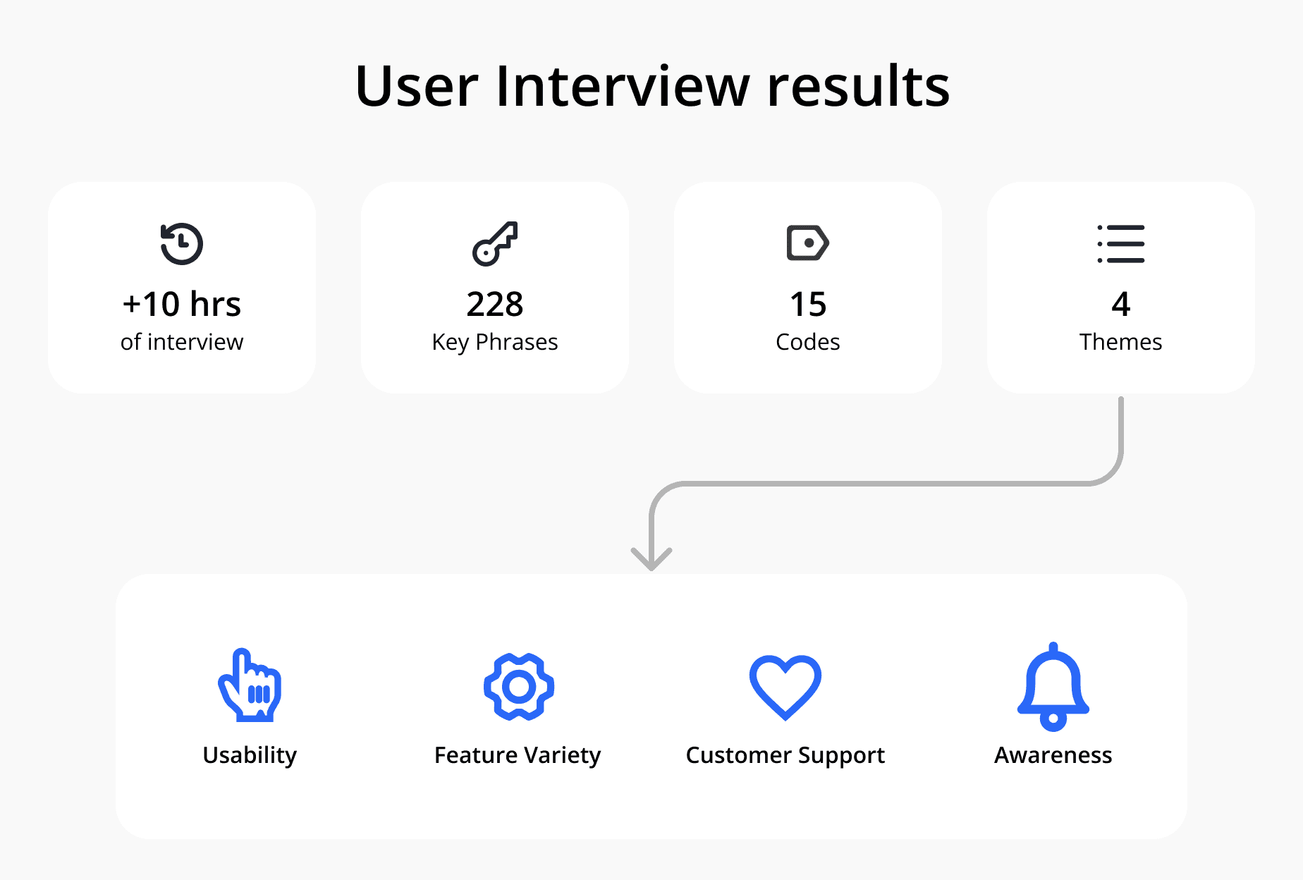
Overall, there were 228 key phrases. We categorized them into 15 codes, and finally, we extracted 4 themes.
As illustrated above, the themes were
Usability: the users had to switch between the Marketplace and DigiPay app to make the purchase. Therefore, the use of the digital wallet was complicated.
Feature variety: the users could only use their wallet on their Digikala shopping card and couldn't shop directly from merchants in the DigiPay app, so they didn't find enough motivation to use the app
Customer support: the lack of sufficient guidance for the users when they were encountering problems while using their wallet
Awareness: the majority of the users didn't know that DigiPay is a part of the Digikala group
One key learning for use regarding the Credit product was that the users weren't struggling in managing their monthly payments. This insight also aligned with the user behavior in our analytics tool.
The possibility of conducting a usability test in the planning had become a reality since the highest-ranked theme in the user interviews was Usability.
The 3 designers in my team and I, collaborated and conducted usability tests with 15 real users on the top 3 flows that the users were struggling with the most in the user interviews:
Engagement with the digital wallet in the app itself
Purchase from merchants on the Marketplace with DigiPay wallet
Creating an installment plan to make purchases in the Marketplace
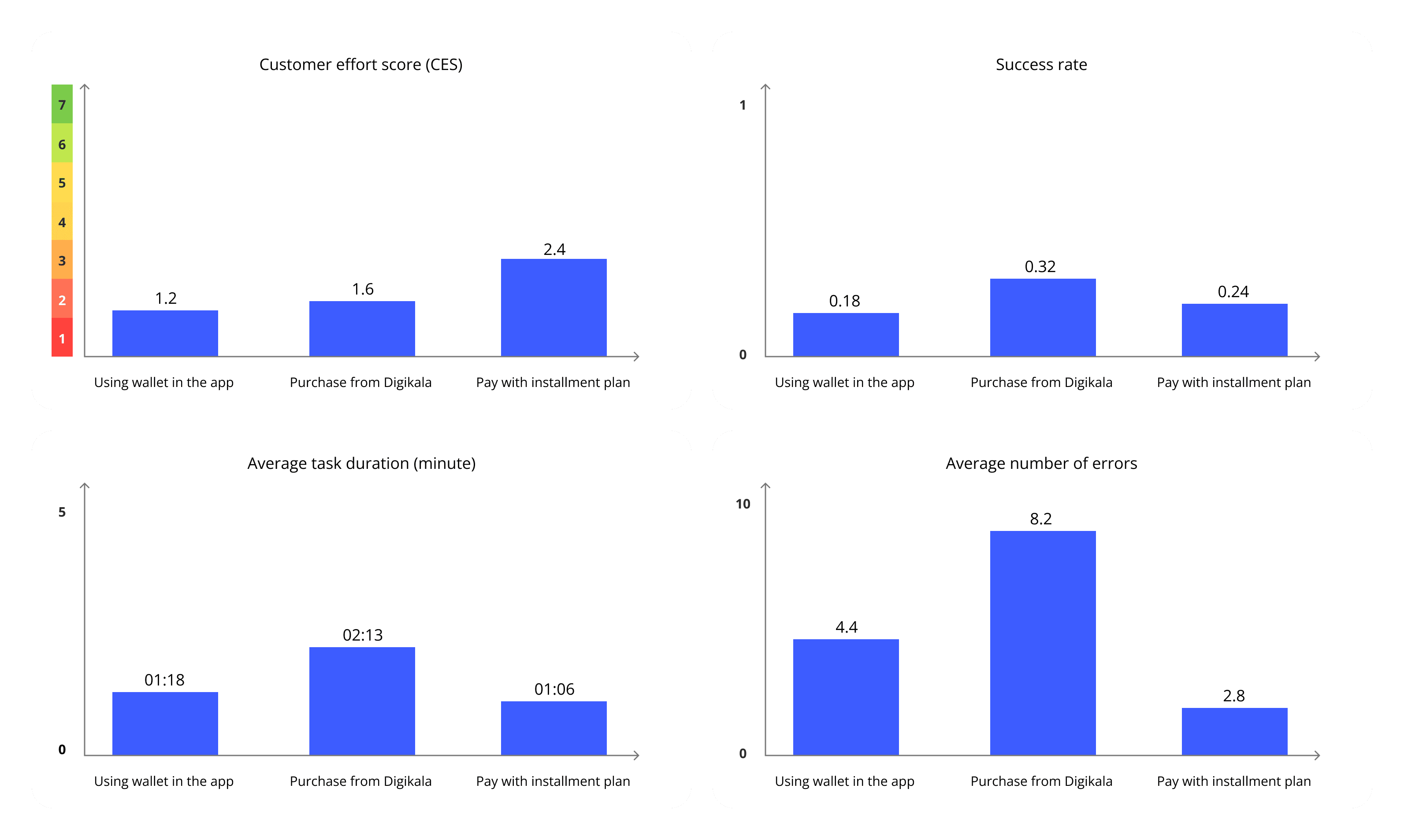
As shown in the charts, the combination of low success rate, the number of errors, and low CES indicates the same results that came up in the interview: The usability of the flows wasn't up to the mark.
Wallet:
Users didn’t know that their registered mobile numbers in Digipay and the marketplace must be the same so that they could use their credit
Users expected to have the option to go to the Marketplace, directly from the DigiPay app
Credit
Users spent several minutes filling out credentials forms before evaluating their credit score. In the end, they might not be eligible for the installment offer
Applying for a credit card was only possible through the DigiPay app. Therefore, when the users wanted to check out in the marketplace, they were shown a message that they should install and continue the journey in the DigiPay app. This experience brought friction to the process
Challenge: COVID 19
While we were in the middle of the process, unfortunately Covid pandemic started and the offices were shut down. The challenges I was facing as the design manager were:
The teams became remote and many didn't have the experience of remote working
Many became infected by Covid and couldn't contribute to the plan
Burnout due to not having a clear boundary between personal and professional life
We were using the Sketch app for designs back then, which was offline and non-collaborative
There wasn't an established remote policy in the company. Therefore, cross-functional collaboration became challenging for us
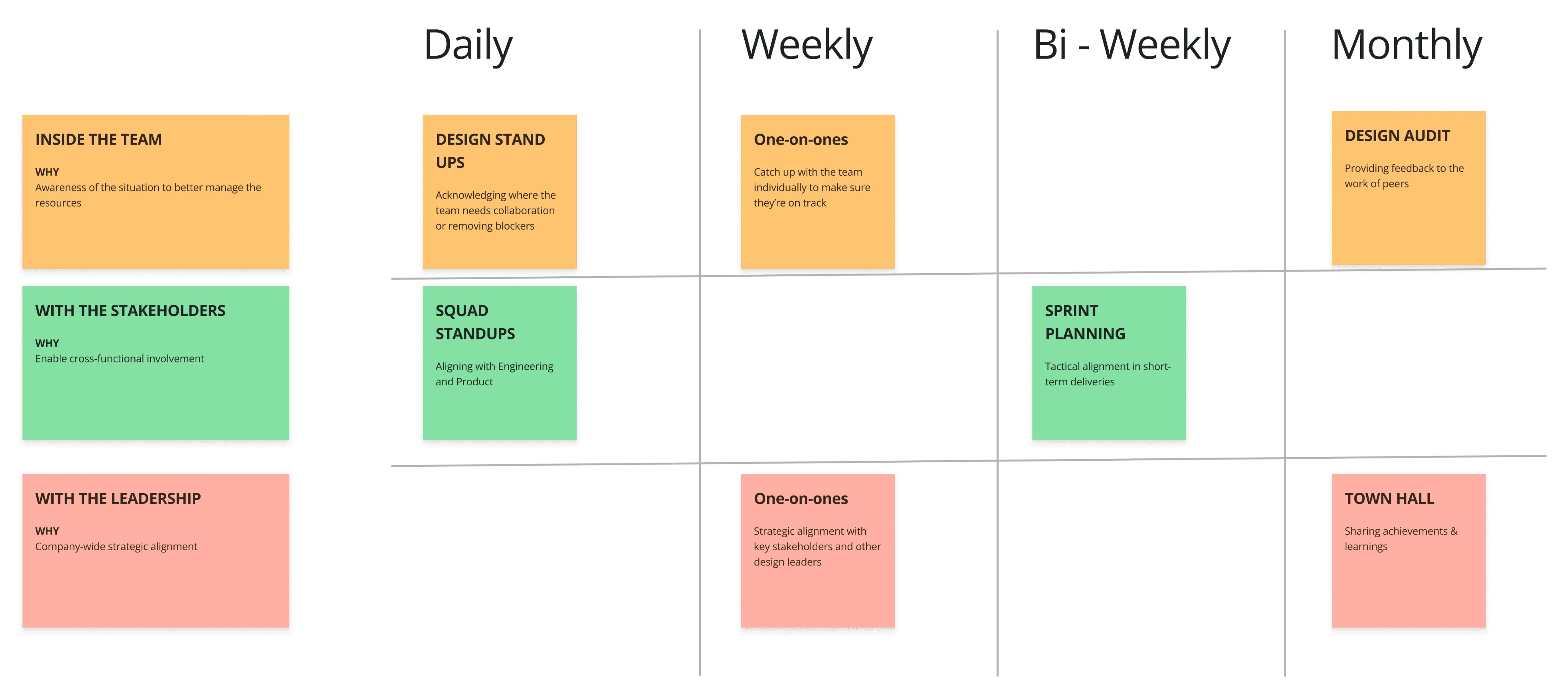
It took almost 2 months for the company to come up with an end-to-end remote working policy. I took the initiative in my team before that, and through mutual alignment with my team:
Setting a fixed availability hour for meetings: from 11:00 to 15:00
Creating a Whatsapp group for instant messaging
High, Medium, and Low labels for the criticality of messages
Using Skype for video calls
Turning on webcams on video calls
This initiative increased the team's productivity by over 40%. I shared the results with the leadership team, and my team's approach was recognized, and all of the 5 behaviors got embedded in the company's remote policy.
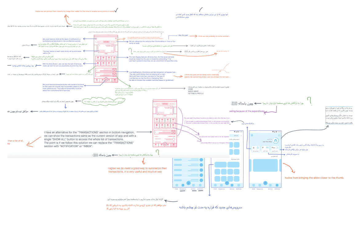
A friend of mine (also a designer) who was working in another company told me that they're using Freehand for sketching ideas and collaboration in designing. After testing the product, I immediately shared the idea with my team and also other design leaders with whom we were collaborating. Everybody liked the tool very much and we purchased the team plan of Freehand.
Solution
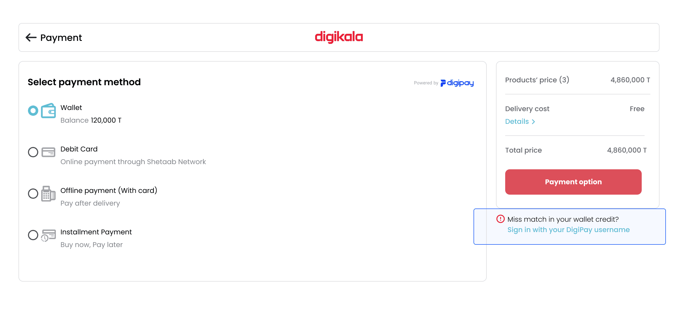
Adding a note for the users to sign in with a relevant username (mobile number) if their wallet credit on the DigiPay app is different from the amount shown in the marketplace's checkout
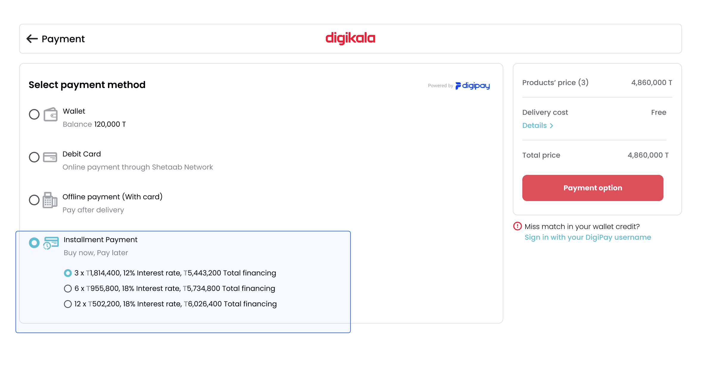
Installment plans were added to the checkout of the marketplace.
In the credit application process, we simply changed the order. Instead of filling in credentials, and then checking for credit, we enabled a credit score check with individuals' national ID. Only if they were credible, they could continue the journey.
Unfortunately, Adding an option to directly go from DigiPay to the Marketplace wasn't feasible back then due to technical limits. Today the option is available from the bottom app bar as "Stores".
Enhancements on the Mobile app
There was a parallel project of rebranding and redesigning the home page of DigiPay's mobile app. We used the research insights from the interviews and the usability tests were used in redesigning the wallet and credit section of the app, which resulted in over 15% engagement for the app.
There were separate usability tests, conducted by other squads for the home page redesign, which don't fit into the context of this case study.
Results
After the implementation of the changes,
The weekly retention rate was increased by 30%.
The CSAT in the checkout experience using digital wallet and installment plans was increased by 20%
The outcomes of this project supported the company's growth objective to increase DigiPay's mobile app's user base by 1,000,000.
