Re-engaging the new users, through building a walkthrough
Summary
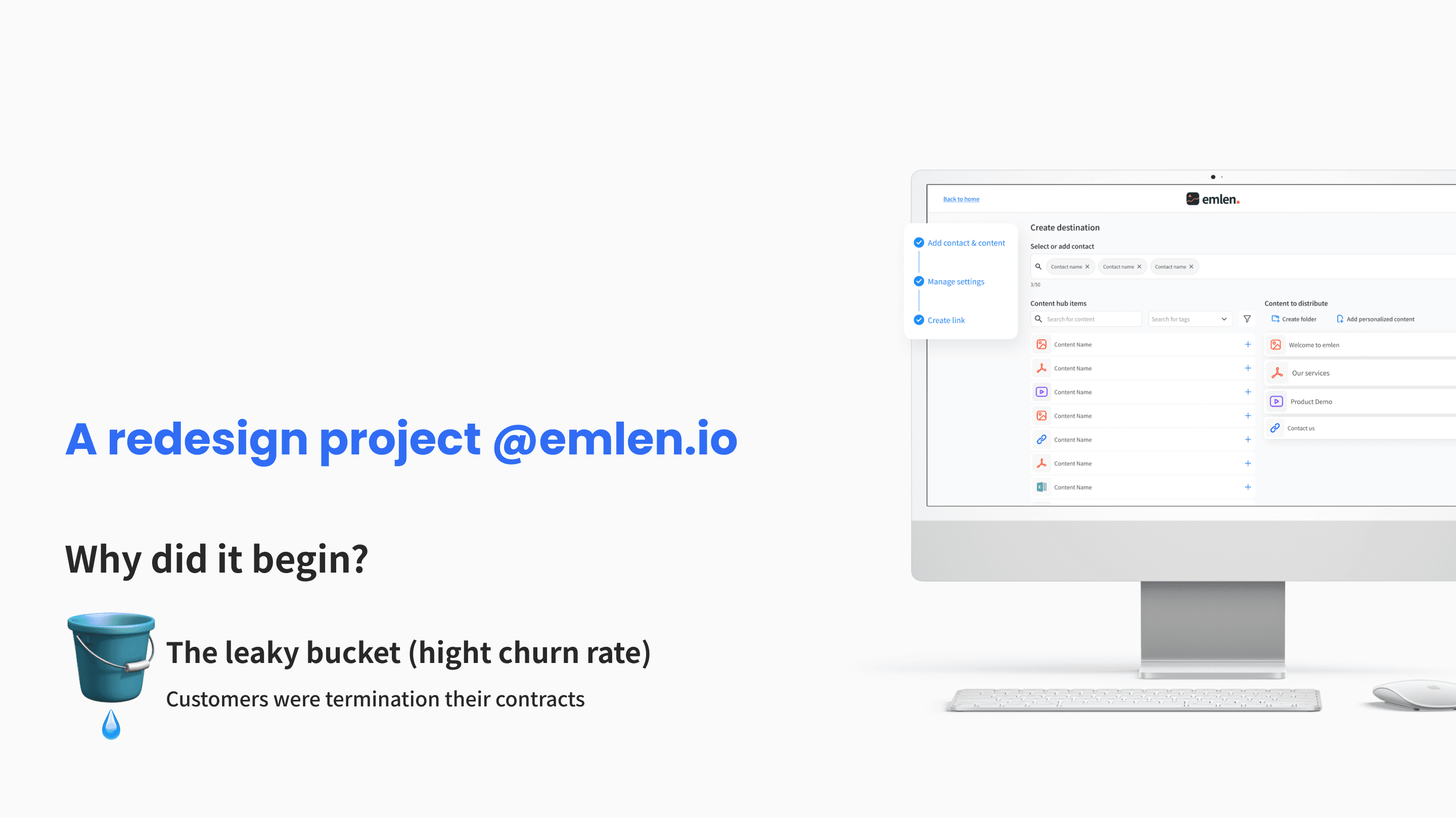
Prototype
The Situation
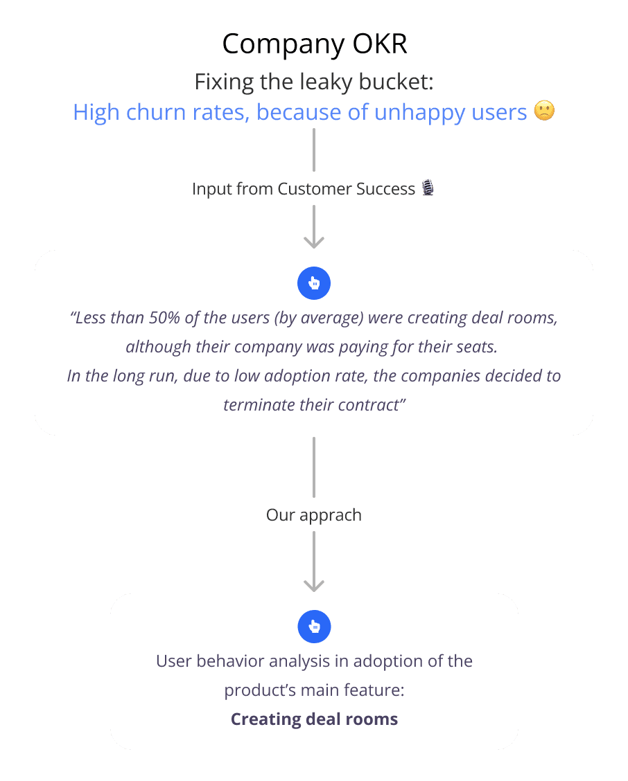
Emlen was on a growth mission, but at the same time was facing revenue churn. Based on an initial investigation from the Customer Success team, one of the main reasons was unhappy customers, which led to the below problem statement:
" Less than 50% of the average users were creating deal rooms. Due to the low adoption rate, the companies were terminating their contracts. "
Discovery: User behavior analysis
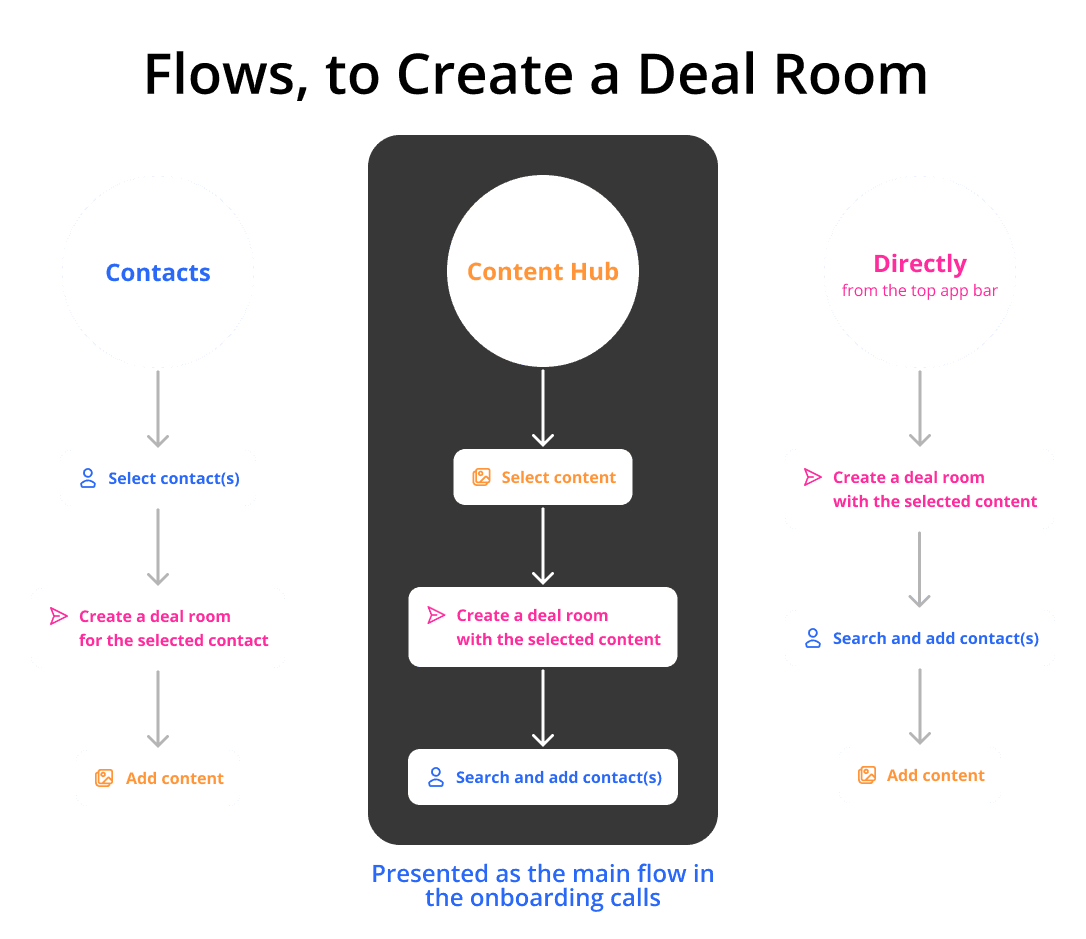
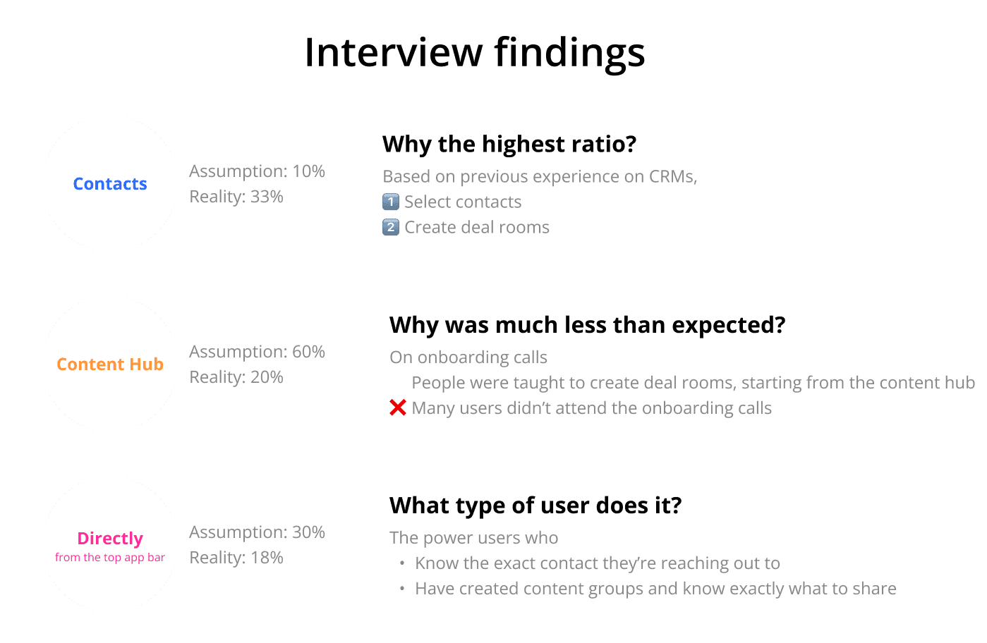
In the product, the users could create deal rooms in 3 flows, starting from Content hub, Top app bar (directly), and Contacts page.
" In the onboarding calls, the customers were taught to create deal rooms, starting from the Content Hub. "
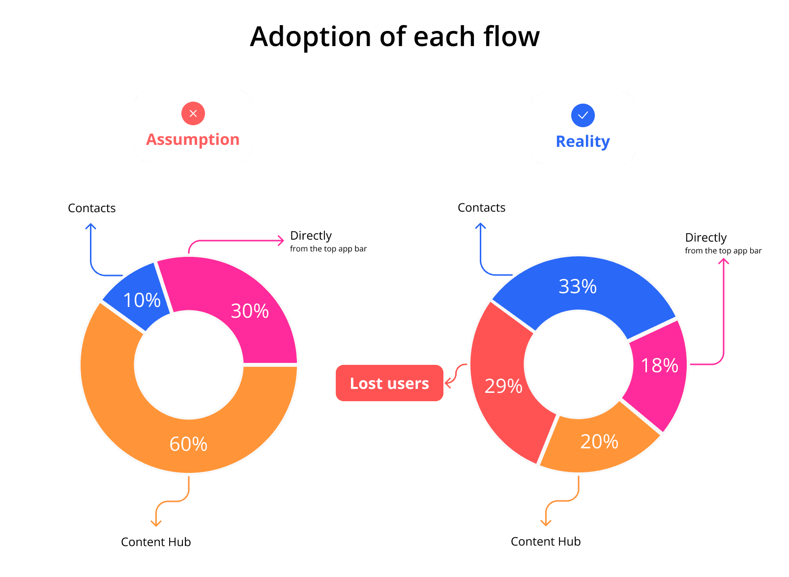
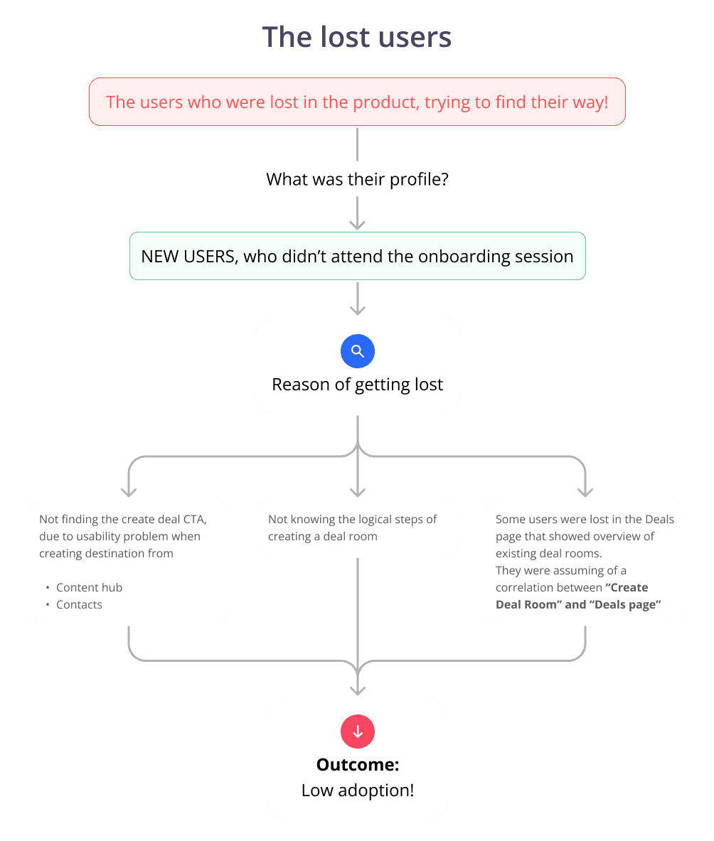
" The lost users were the ones who jumped from one flow to another, without ending up in creating deal rooms. "
Digging deeper in user interviews
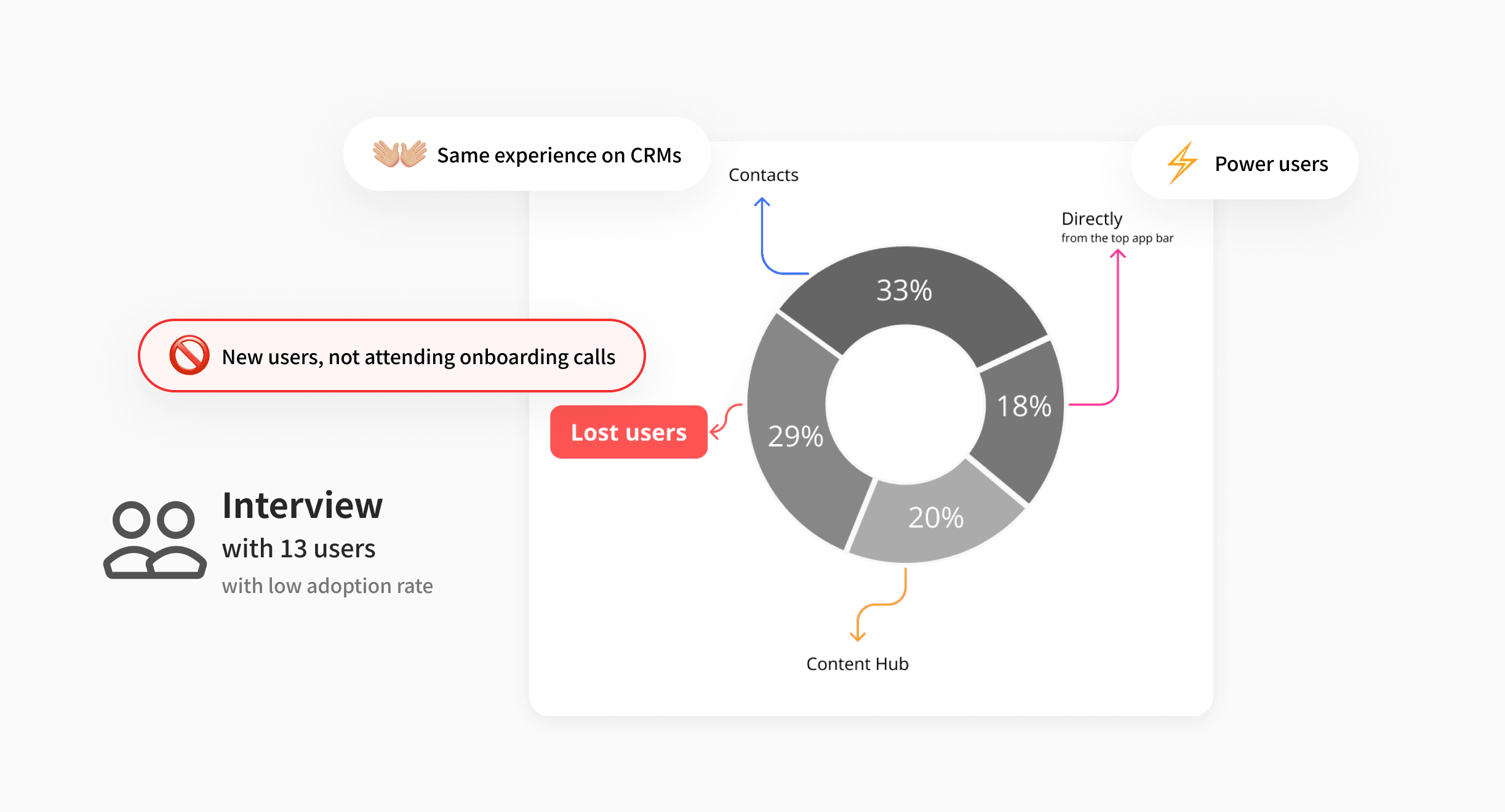
After interviewing 13 users, I figured out that:
" I assumed that the majority of the low adoption comes from the lost users! "
Solution
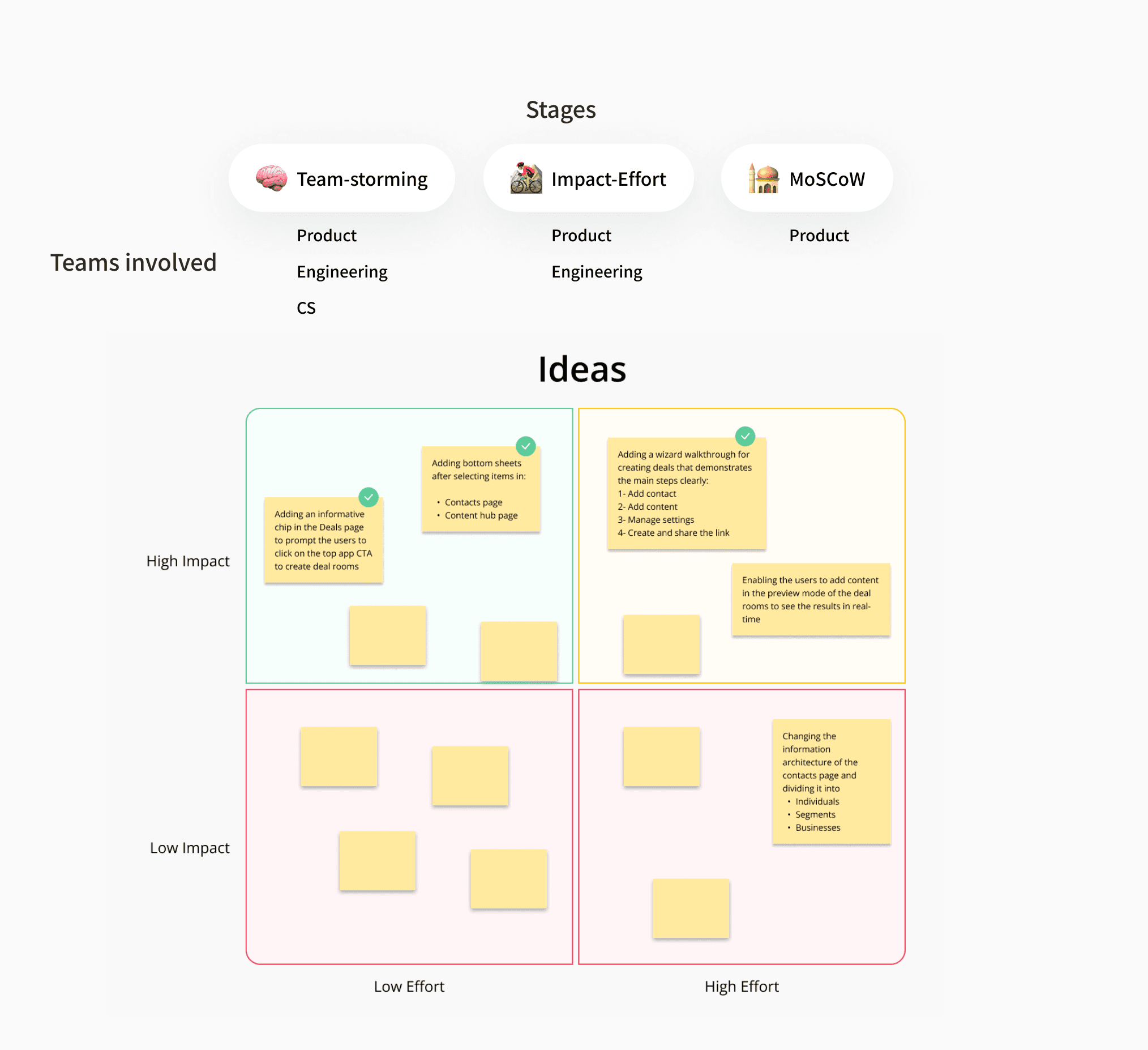
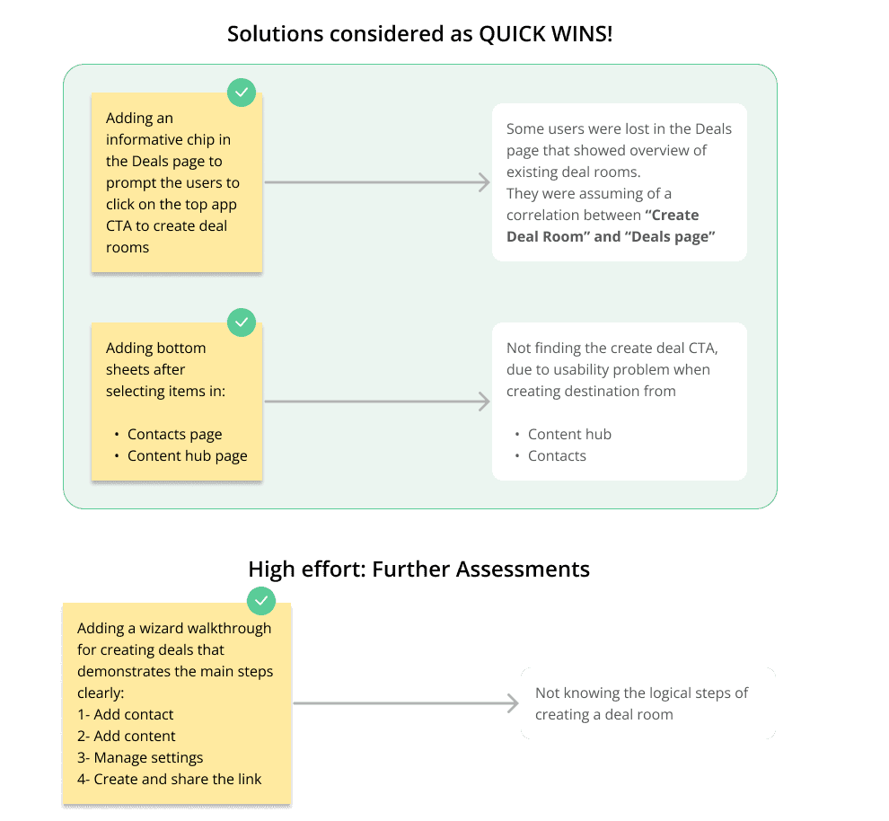
I led an ideation workshop with Product, Engineering, and Customer Success to come up with ideas for the problems we were facing for the lost users.
The quick fixes:
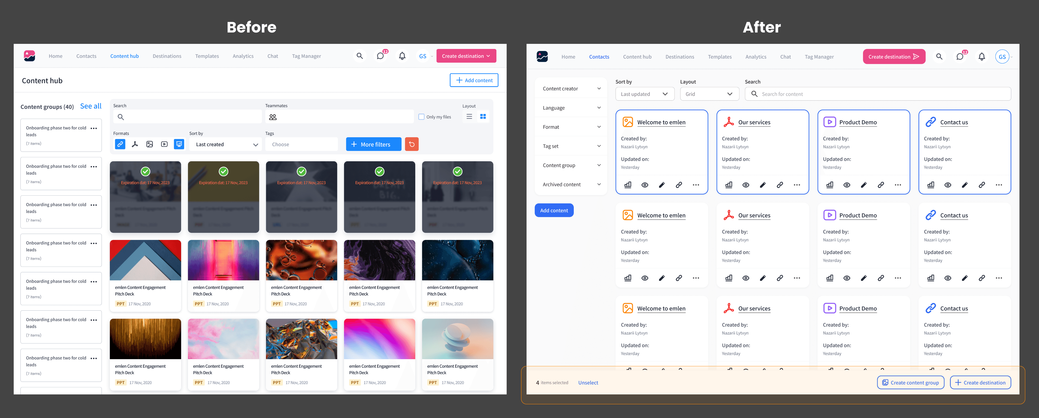
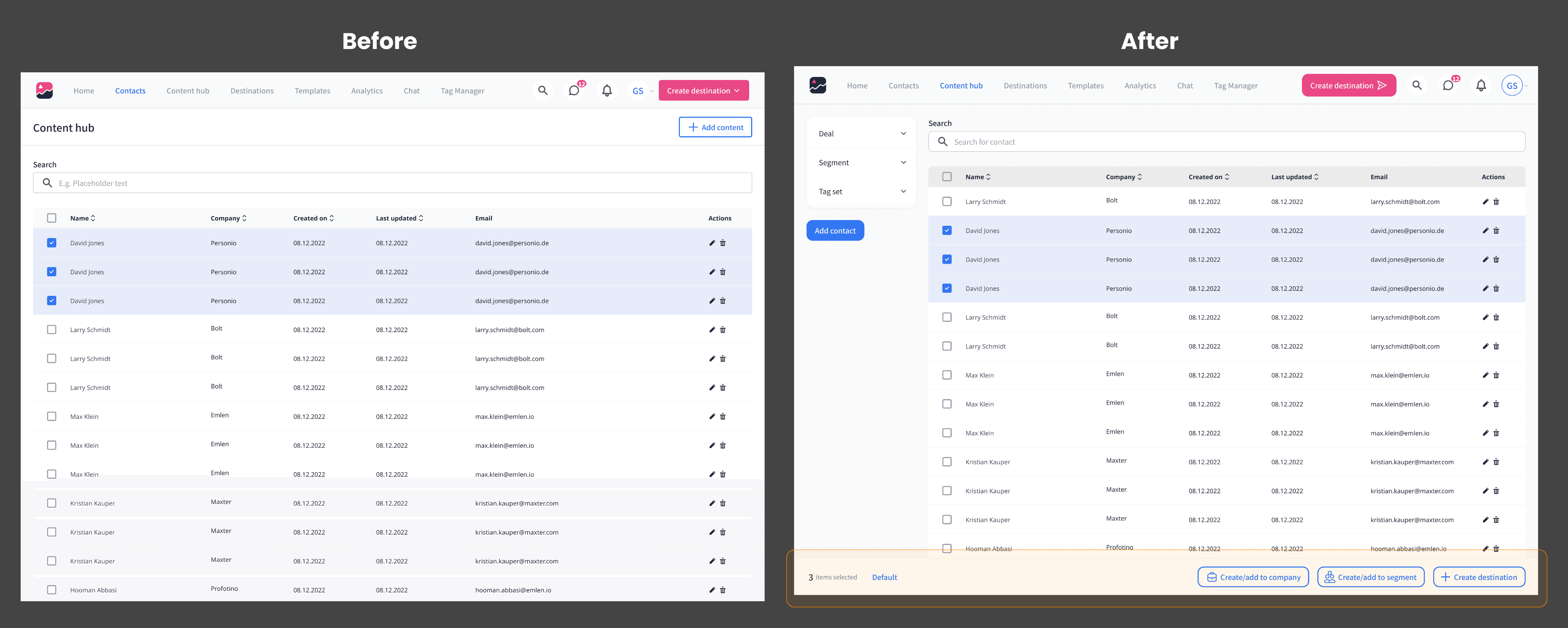
Adding bottom sheets with CTAs after selecting items in: 1) Contacts page; 2) Content hub
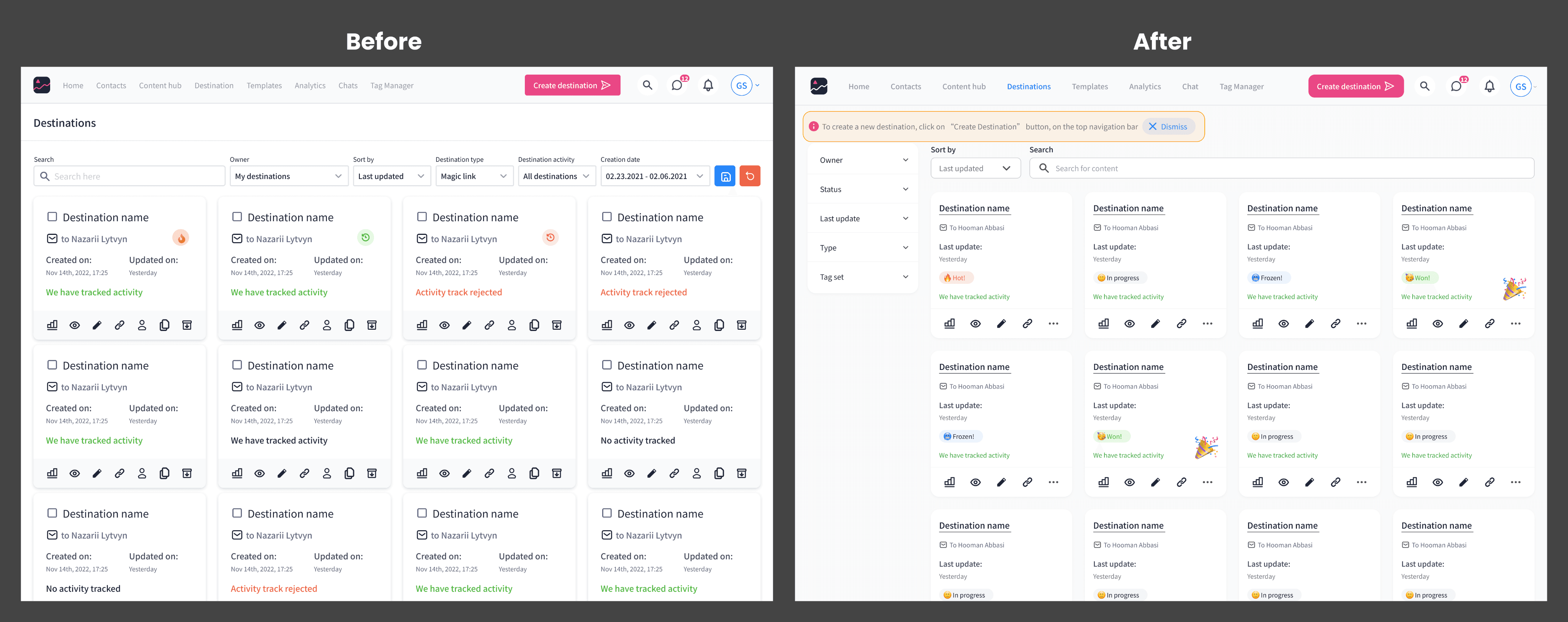
Adding an informative chip in the Deals page to prompt the users to click the CTA on the Top app bar, to create deal rooms
" The long term solution was to add a wizard walkthrough for creating deals. "
We planned to build the 2 low-effort ones as quick wins in 1 sprint, and plan the high-effort one.
Quick fix 01: Bottom bar for selections
I designed a bottom bar which only appears after selecting content items. One of the CTAs was "Create Destination".
Quick fix 02: Guide in the deals page
I added a simple information on top of the page, indicating that creating a deal room is possible by clicking on the Create Destination CTA on the top nav bar. The users could also dismiss the info.
" The quick solutions reduced the percentage of lost users by 10%, and increased user engagement. "
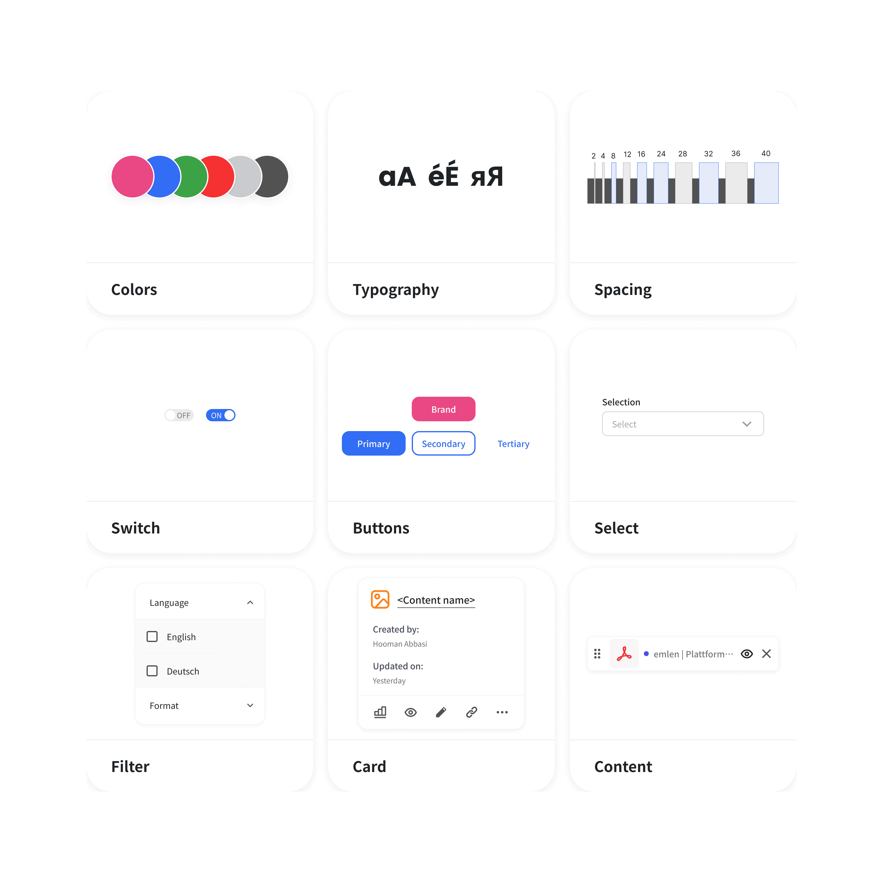
Challenge: Parallel design system project
In the 3 images that I've shared above, it's obvious that the layout of the pages are completely changed and that's because of a parallel design system project. That said, the effort of the implementation of the quick fixes was still the same since the design system was being implemented in another repository.
To learn more about the design system case study, click here.
The long-term solution: Walkthrough in creating a deal room
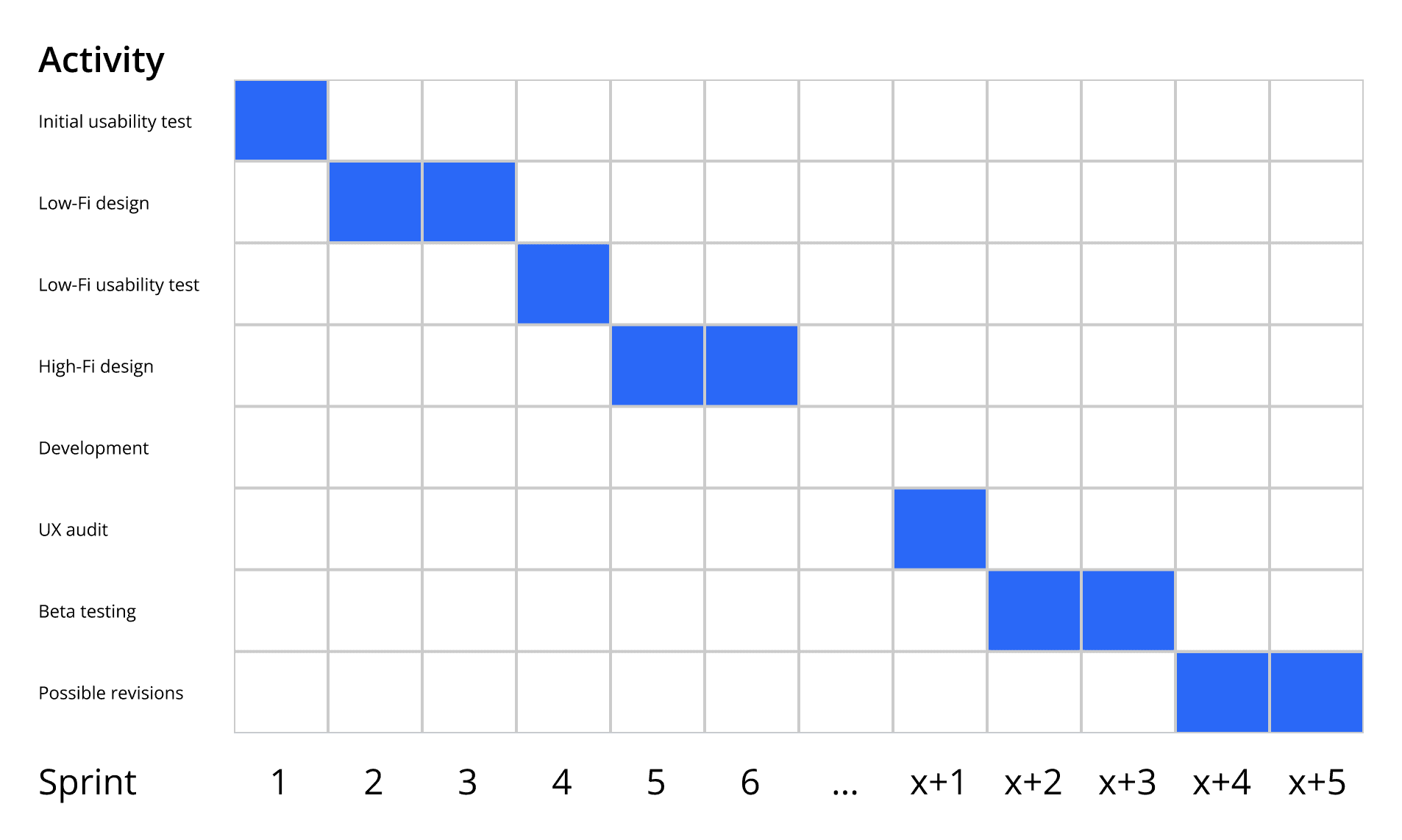
As mentioned in the ideation section, building a walkthrough for the feature required high effort. The reason was the old code-base for the feature. If we wanted to redesign it, it had to be coded from scratch. Therefore, I had to plan the redesign beforehand.
Restructuring the flow
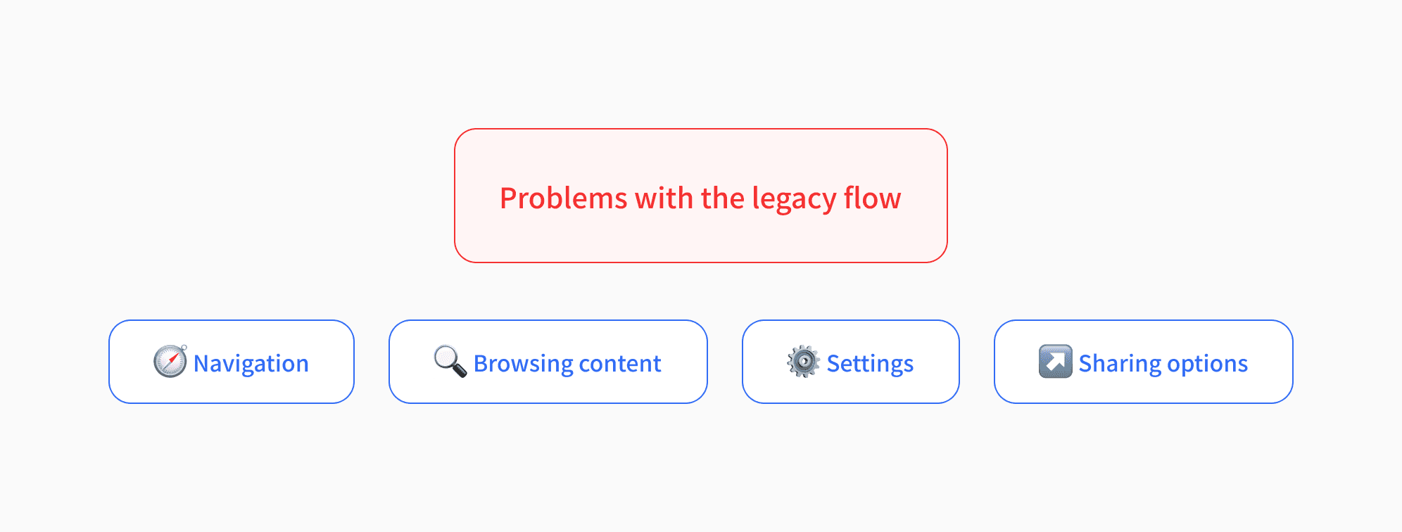
Problems with the legacy design:
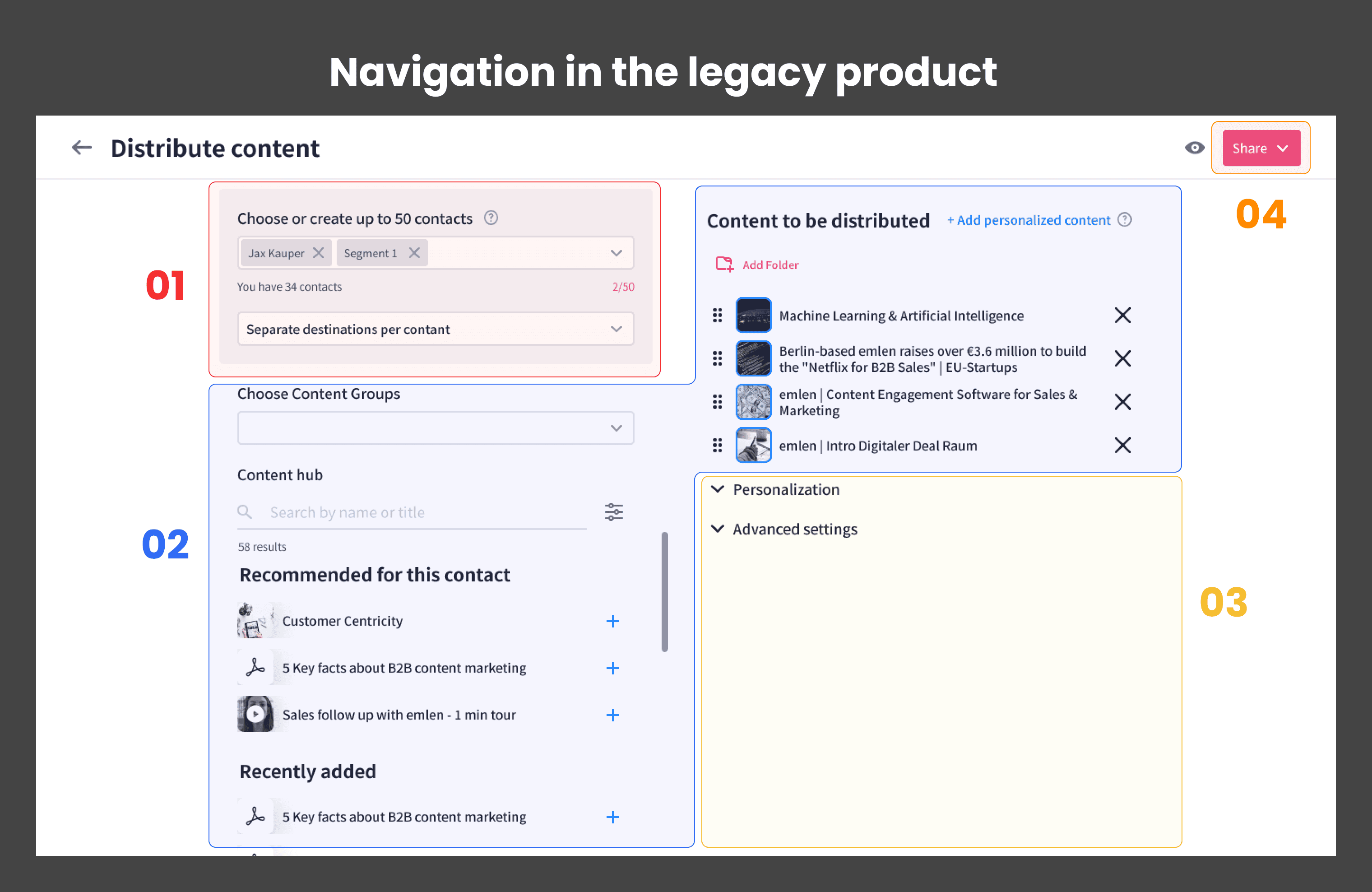
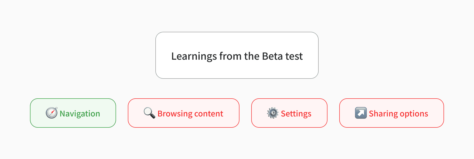
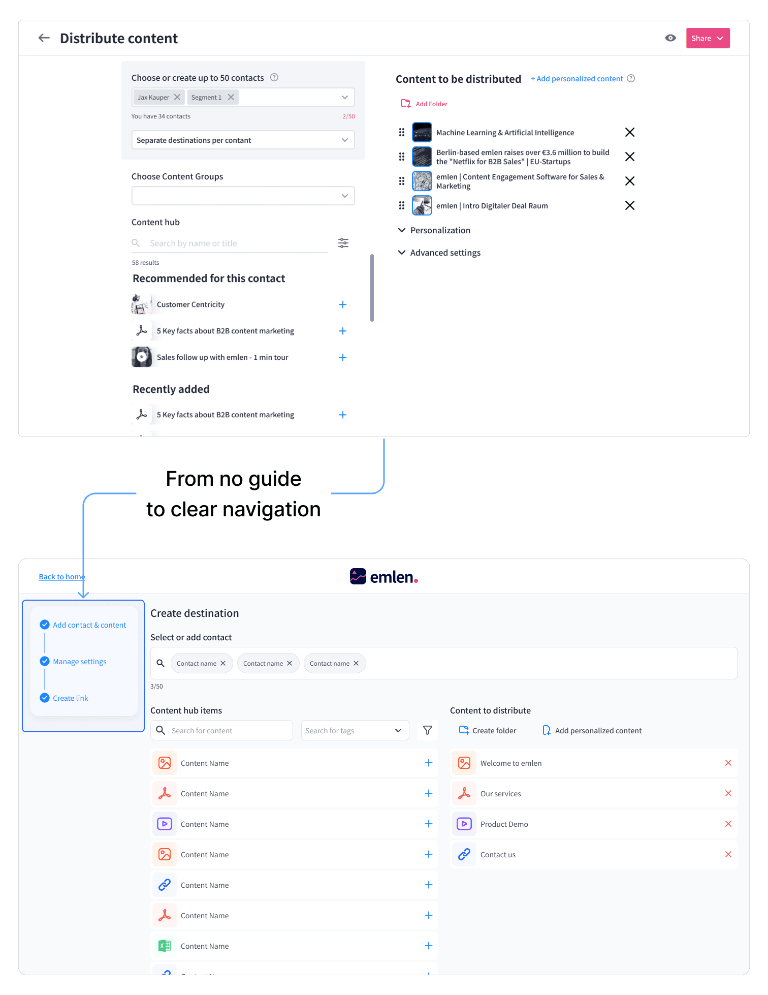
Navigation: The users had to create rooms 4 times by average to learn the ins and outs of the feature without making mistakes
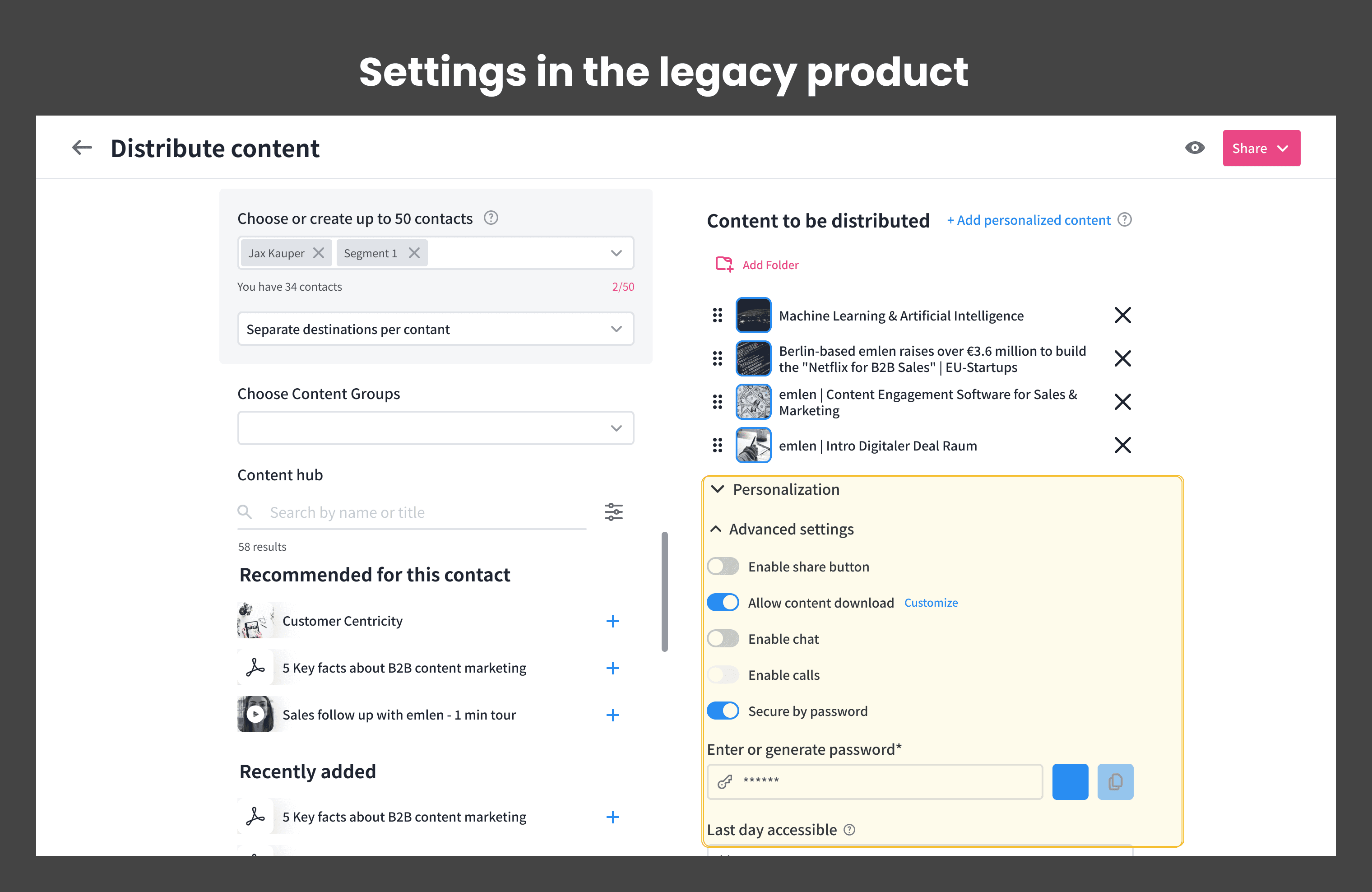
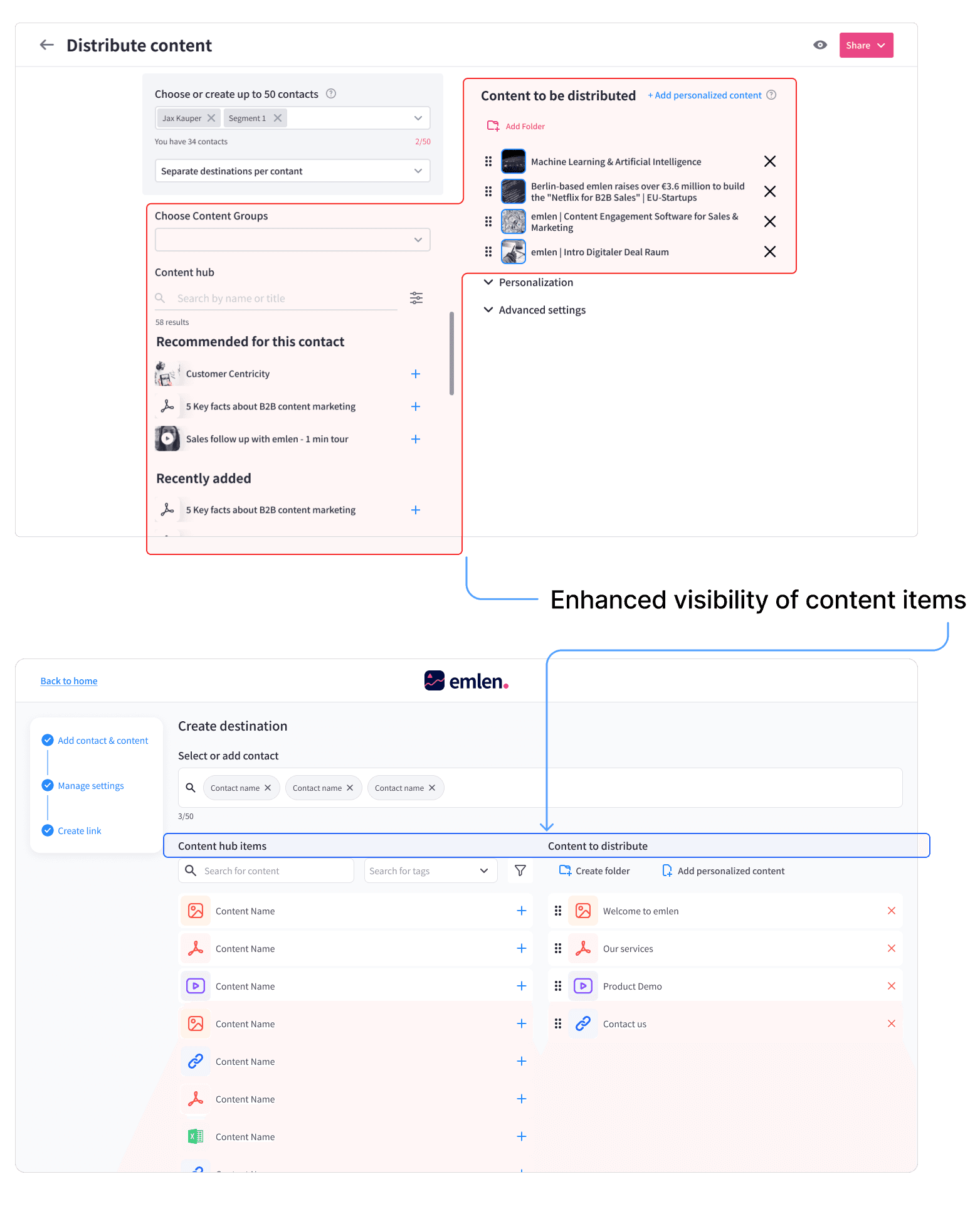
Browsing content items: There wasn't enough space to browse content items, especially in small displays.
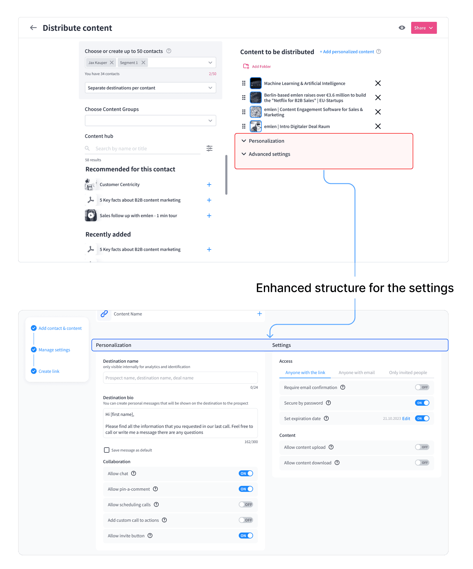
Settings: Users often skipped settings since they either didn't notice it, or found it complicated to understand.
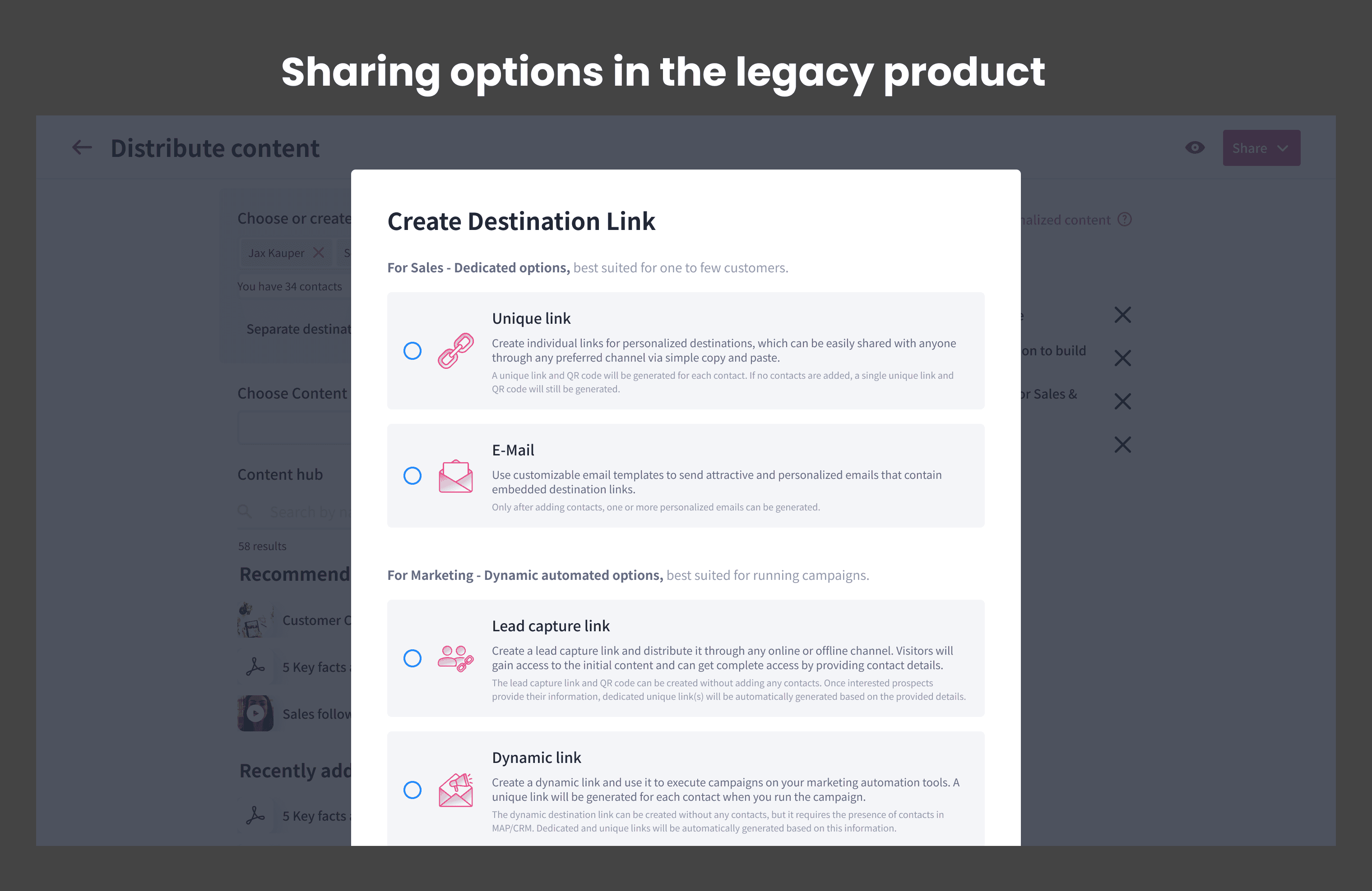
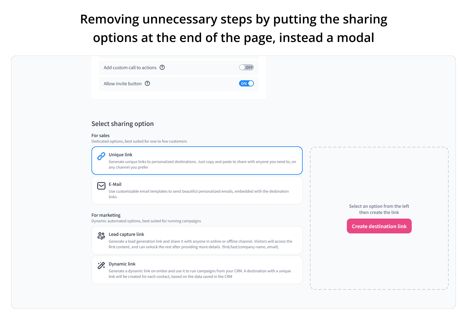
Sharing options: To see the sharing options, users had to click on the "share" button on top nav bar. Some of those options were disabled based on contact selection or other settings. Therefore, the uses had to move back and forth multiple times to set the right option
First iteration
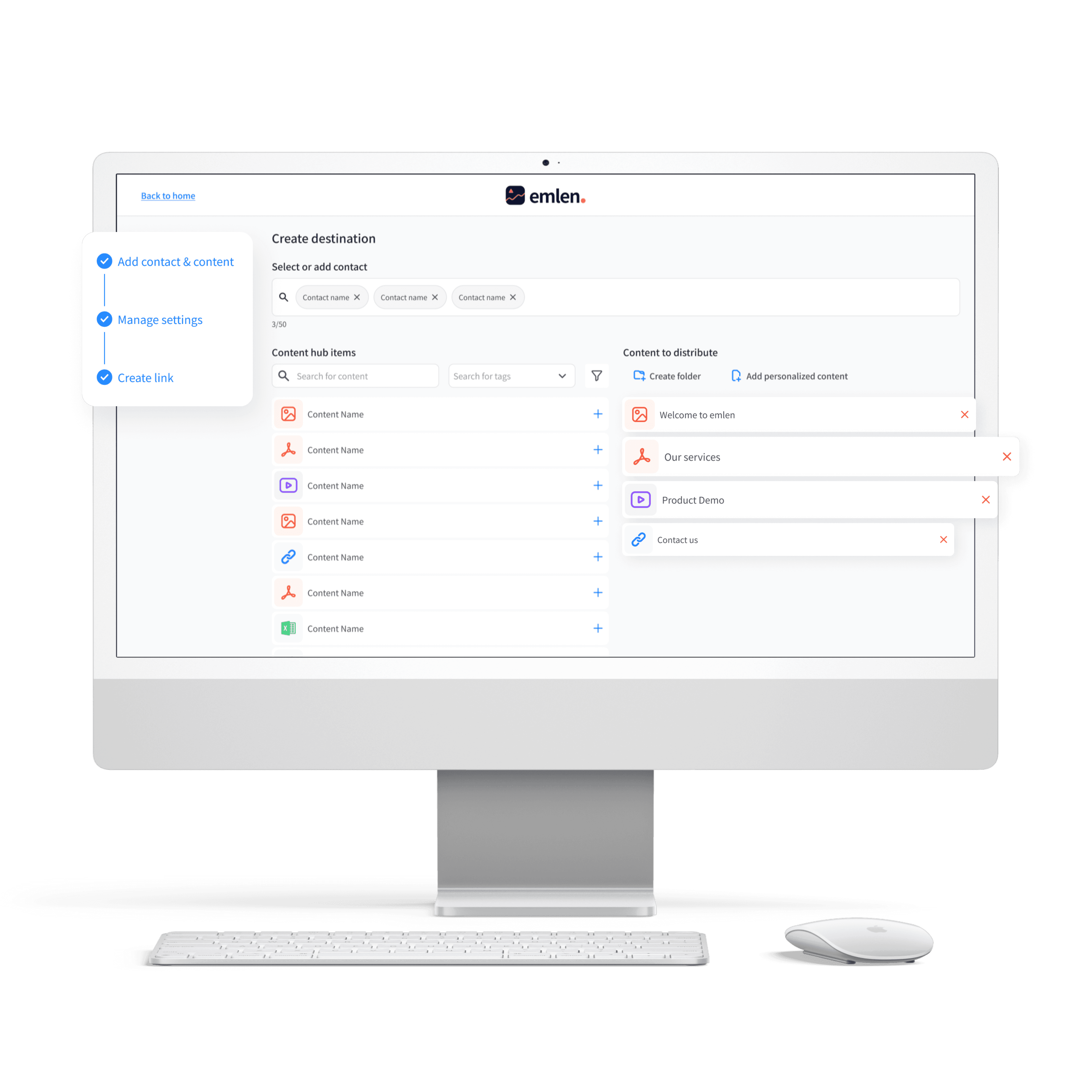
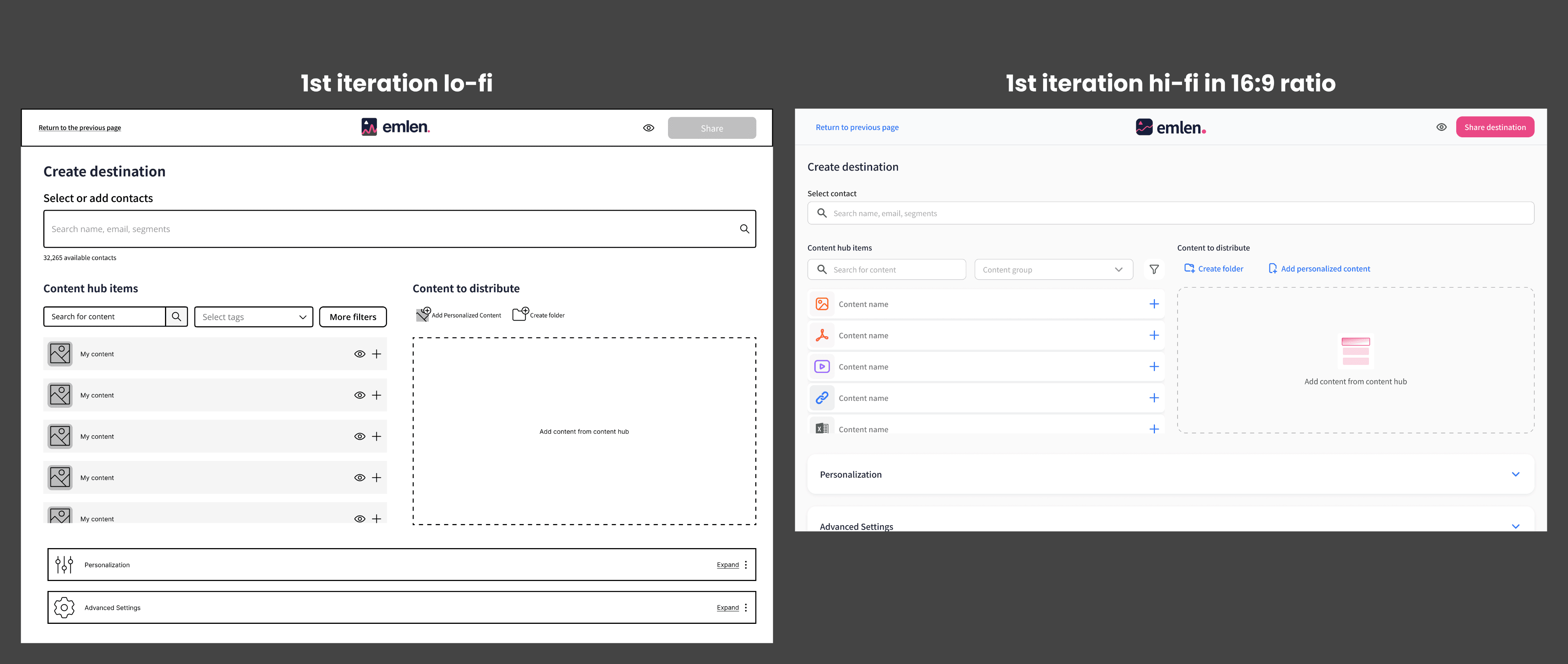
The first design (image below) solved the Navigation and Browsing problem. Initially, I thought it was also solving the Settings problem. But after conducting usability tests, I figured out that the problem remains. The sharing option was also still a problem.
First design of the deal room
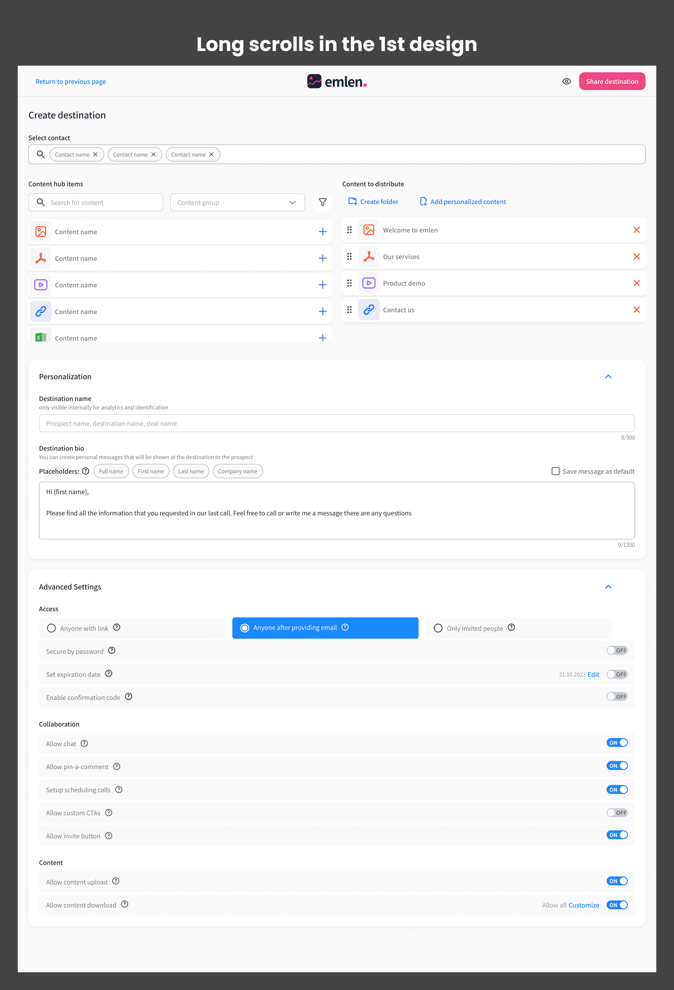
" In the first design the users with screen sizes below FULL HD resolution, didn't find the Settings and Personalization without scrolling down. "
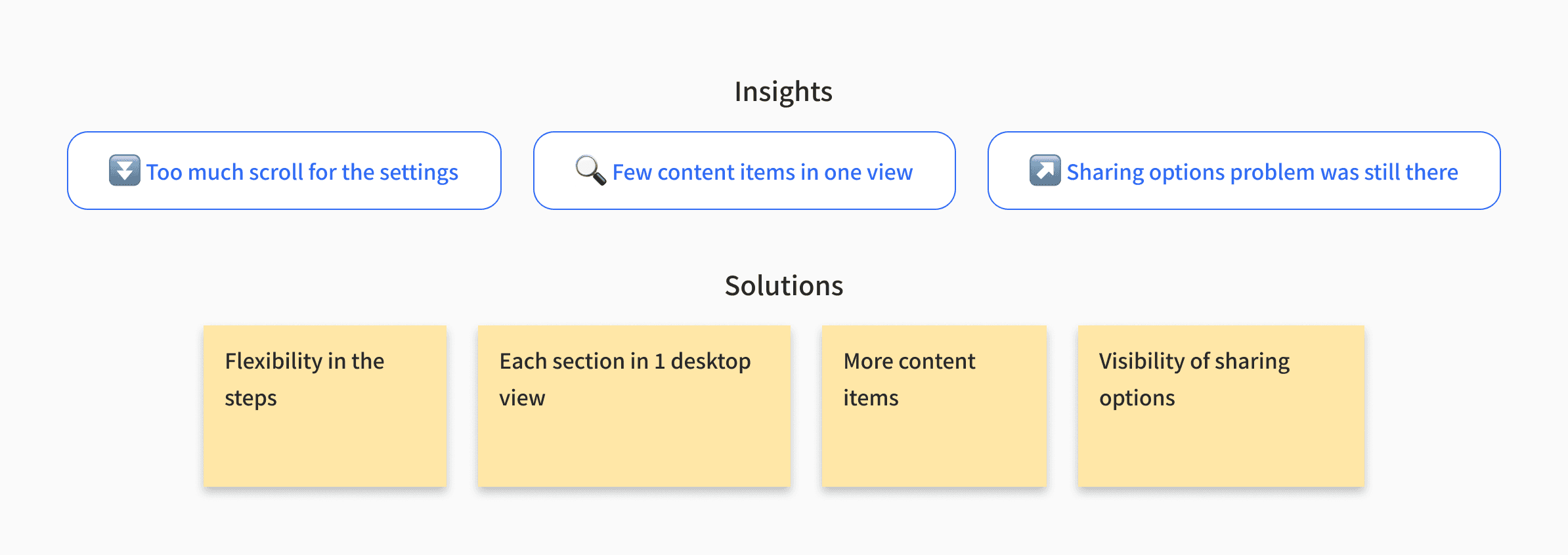
The results of the Beta test was clear. I had only solved the navigation problem and the other 3 problems were still there.
Design iteration
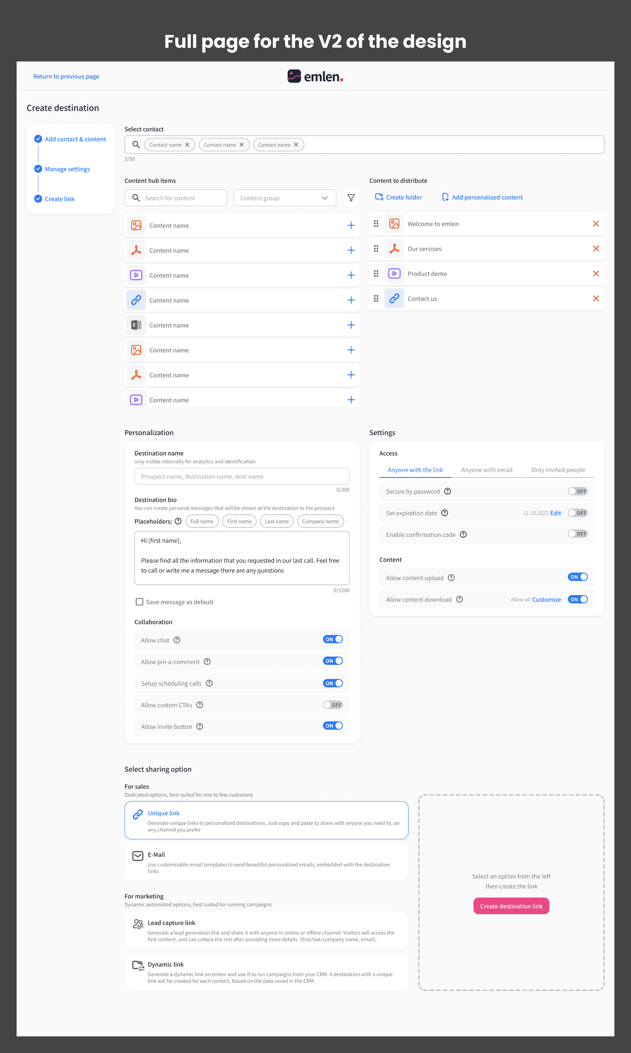
After the beta tests, I made the following changes to the design:
Removed the "Share" CTA from the top nav bar and placed it at the bottom of the page.
Added a left panel, showing the steps and their status.
Added flexibility in navigation from one step to another through auto-scroll, manual scroll, and clicking on the steps in the left panel
Results
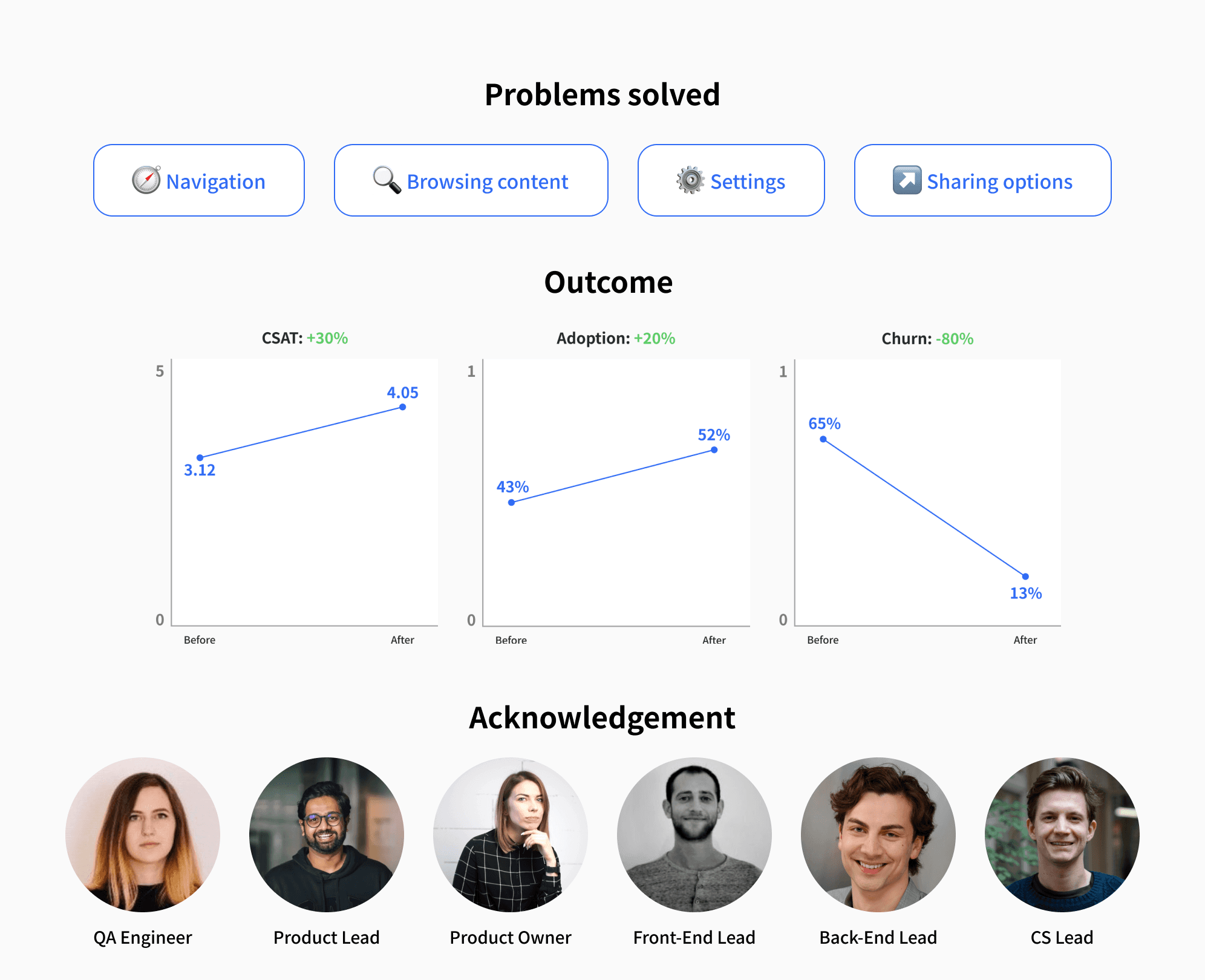
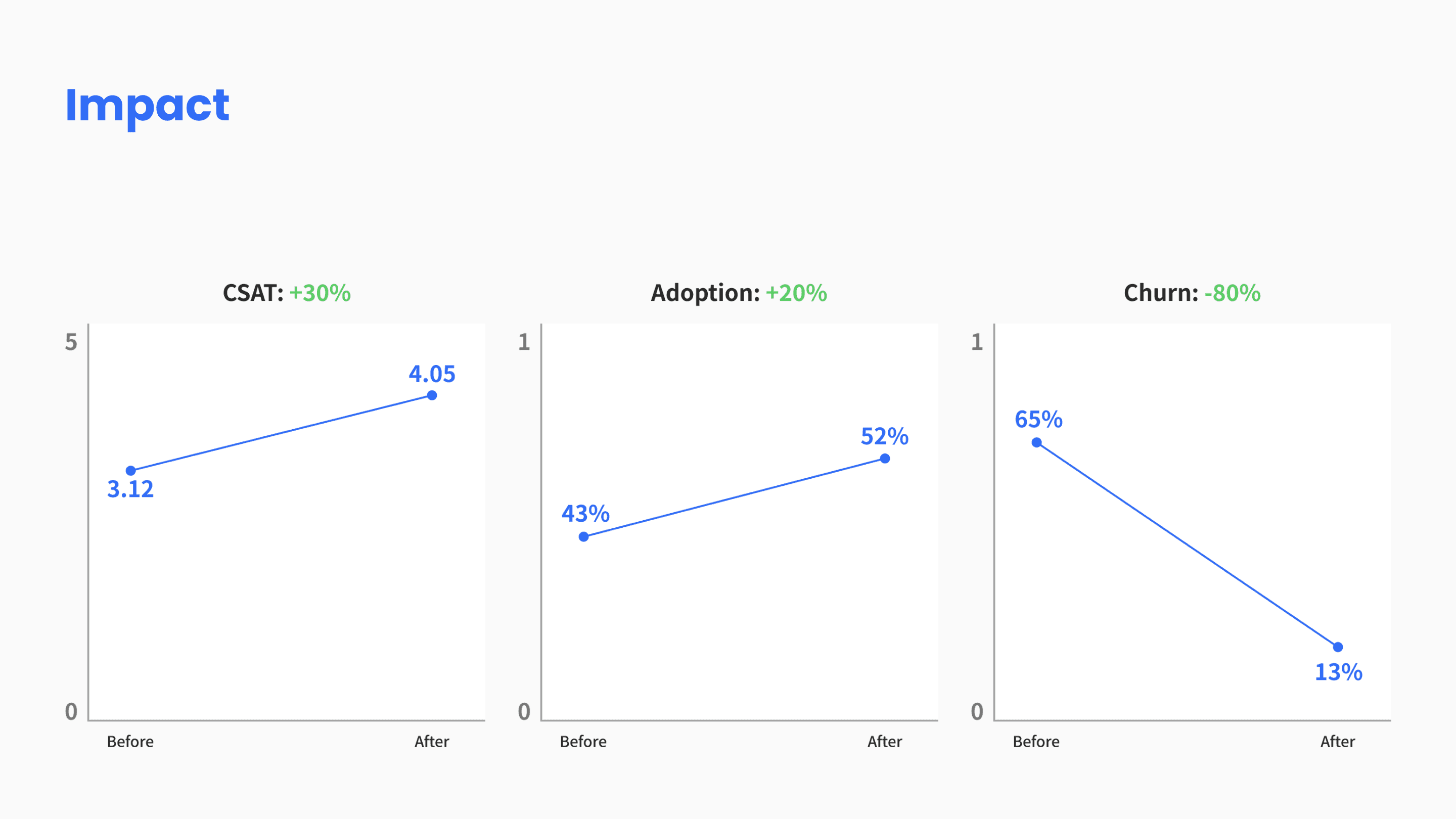
Customer satisfaction increased by 30%.
The average product adoption per customer was increased by 20%.
With an impact on the company's objective to reduce churn, through increasing customer satisfaction and new users' adoption, the churn rate was decreased by 80%.
