From a simple SIM-Care app to a marketplace for mobile apps
Summary
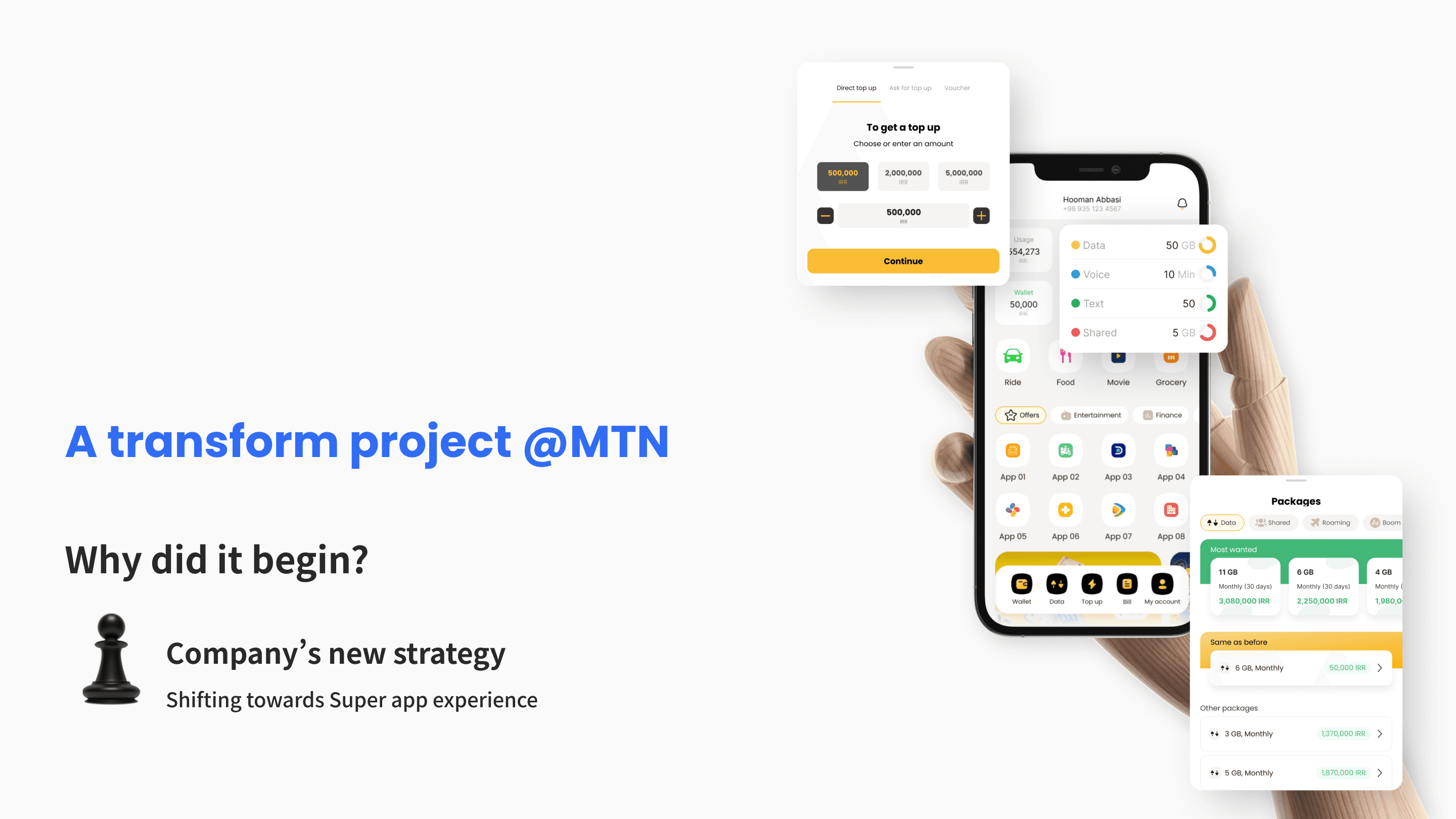
Prototype
The Situation
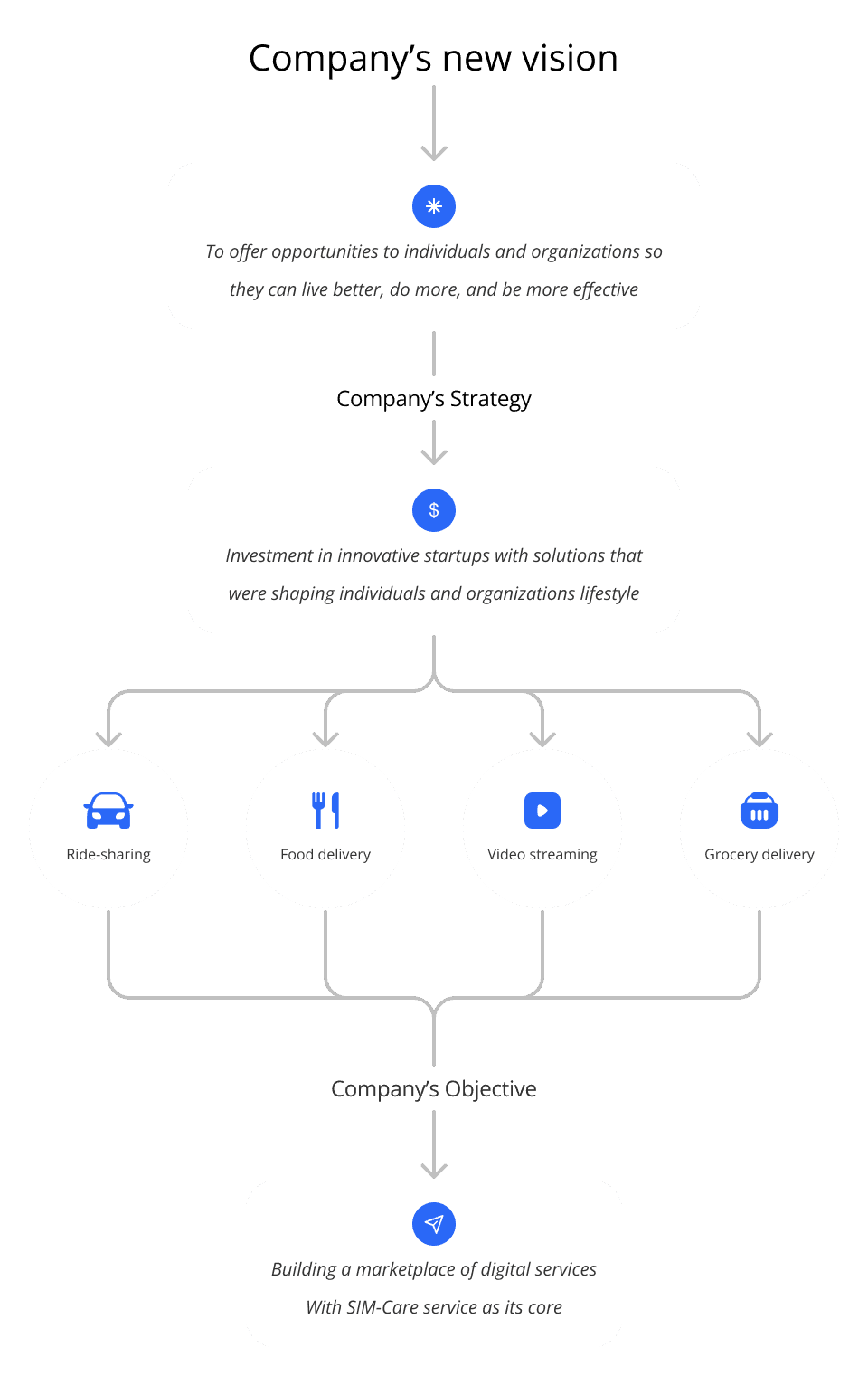
The company had recently invested in 4 mainstream products in ride-sharing, food delivery, video streaming, and online supermarket industries.
" The company strategy was to transform the SIM-Management app with over 30 million users to a Super app. "
Discovery: How the users see the transform?
Did the users know what a Super app was?
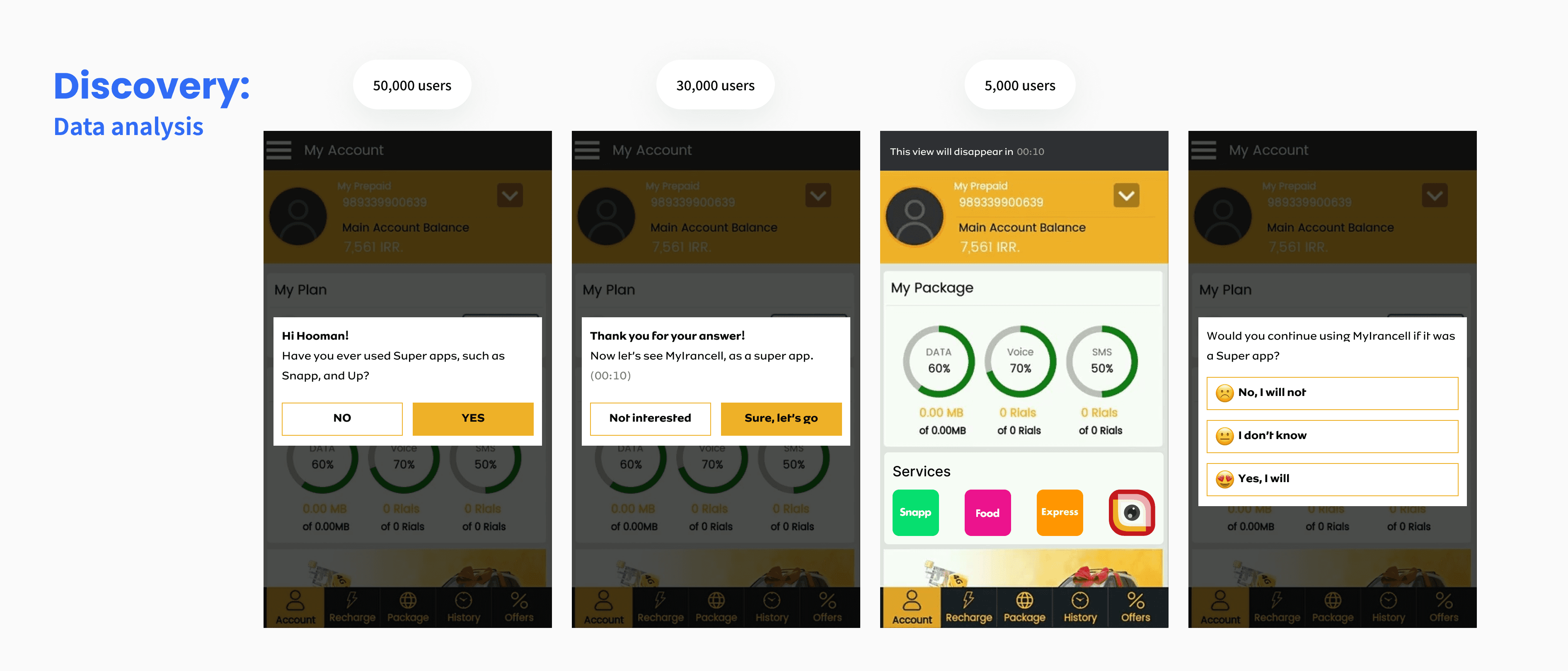
The answer was either YES or NO. So I conducted an in-app survey with +50,000 users.
More than 80% of the users were already familiar with the concept. Probably because there were already well-known super apps in the market.
Did the users want a Super app and would they use it?
To get an answer to that question, I needed the users to have a taste of the experience of a Super app. Therefore, I created a mock with the help of the engineers on the legacy app. Then I conducted an A/B testing with to +30,000 users.
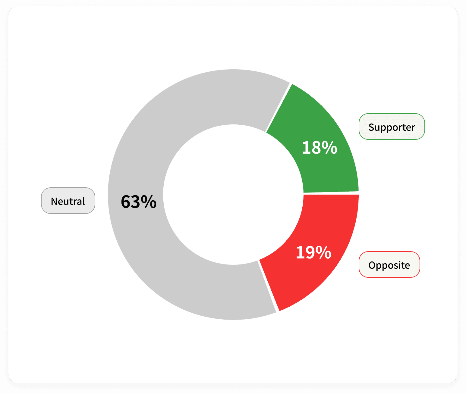
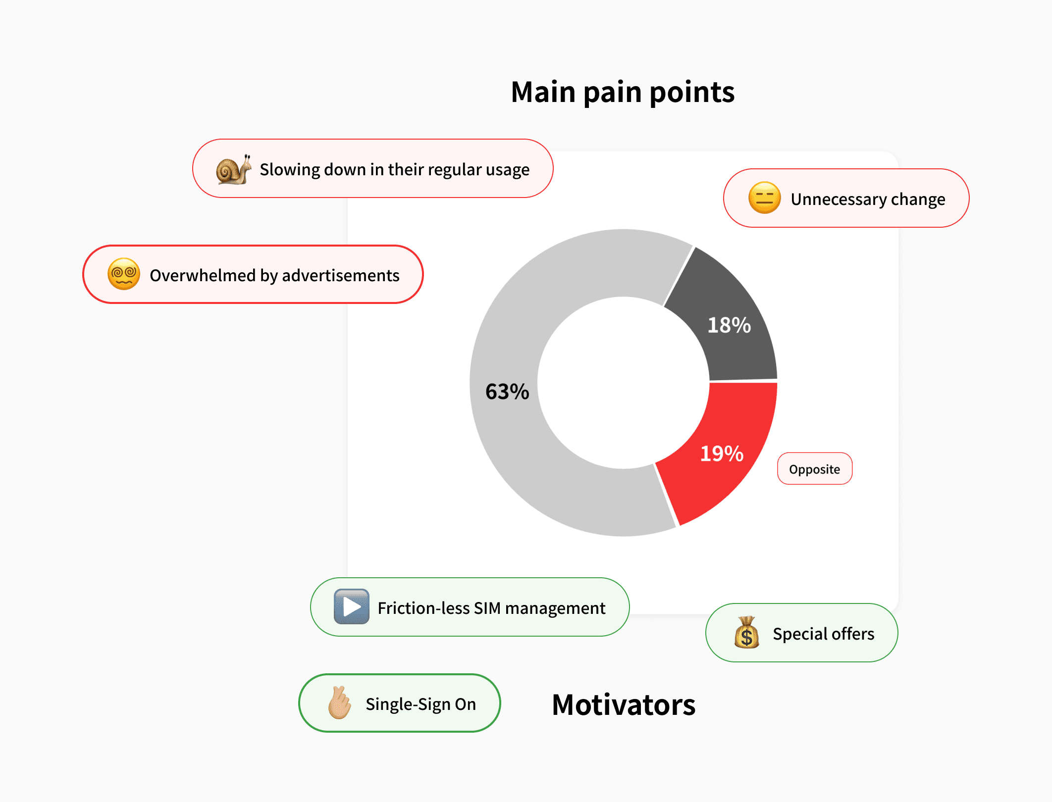
63% of the participants were neutral about the Super app experience, 19% were against it, and 18% liked the idea.
A/B Testing of a Super App experience in the legacy app
How would a Super app experience affect the current users?
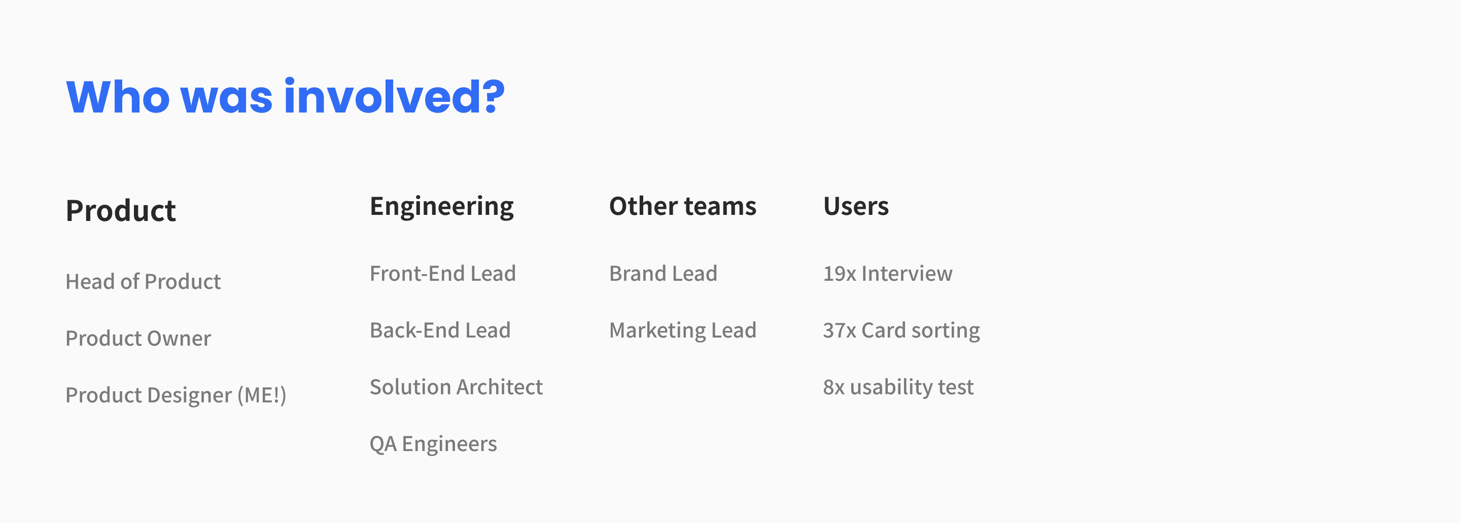
I needed more insights about the users' pains. There was no information available in that regard. So I interviewed 19 users.
The majority of them found this change unnecessary
They were worried about being overwhelmed by advertisements
They believed that this change was going to slow down their SIM management process
I asked the negative people what would change their minds. The majority of the ideas were:
They would still be able to check their SIM balance and manage their account without friction
They would receive discounts and special offers from the merchants in the Super app
There would be a Single Sign-On (SSO) between the Super app and merchant services
" Users wanted friction-less SIM management, special offers, and Single Sign-On "
Challenges
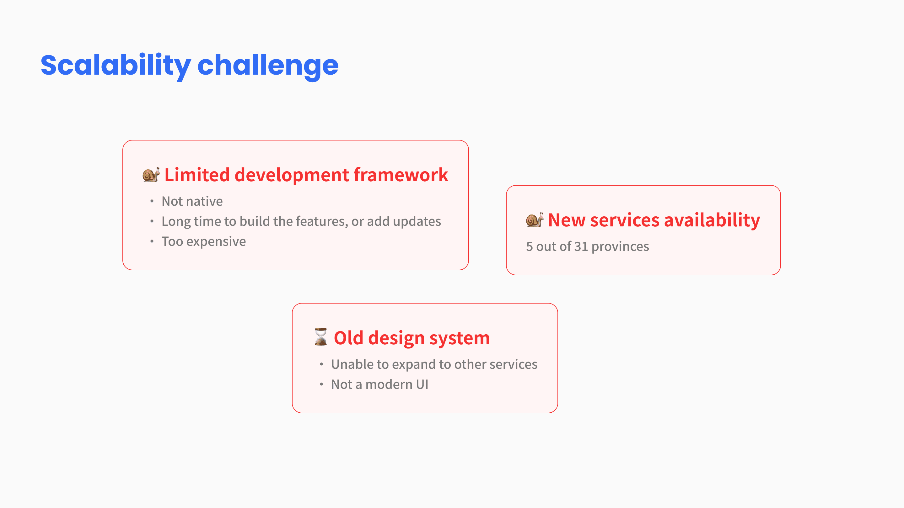
The legacy development framework was a web app, built on a custom framework. It wasn't native. It wasn't scalable on the front end, and the license and operational costs weren't reasonable due to the mentioned flaws. Therefore, we decided to:
Freeze the feature development on the legacy app
Rebuilding the app's front end from scratch on a scalable framework
The new services were only available in 5 out of 31 provinces. However, changing the app experience would affect millions of users everywhere. Therefore, we needed a dynamic view that would change based on location.
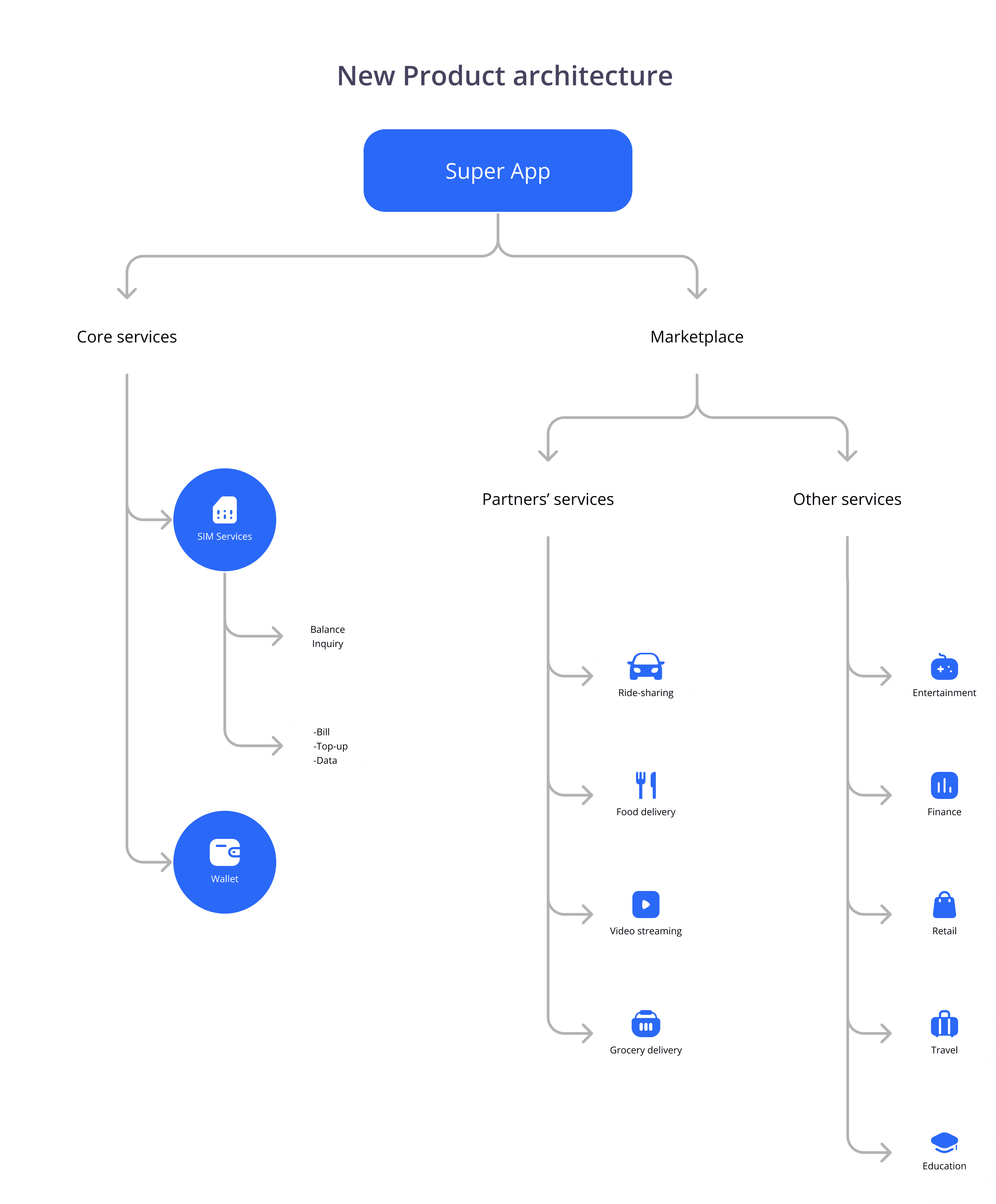
The products that were in the Super app, were:
Core services: such as SIM services and the Digital Wallet
Marketplace: which consisted of partner's services and other service providers in the categories shown in the image below
Aligning business requirements with user needs
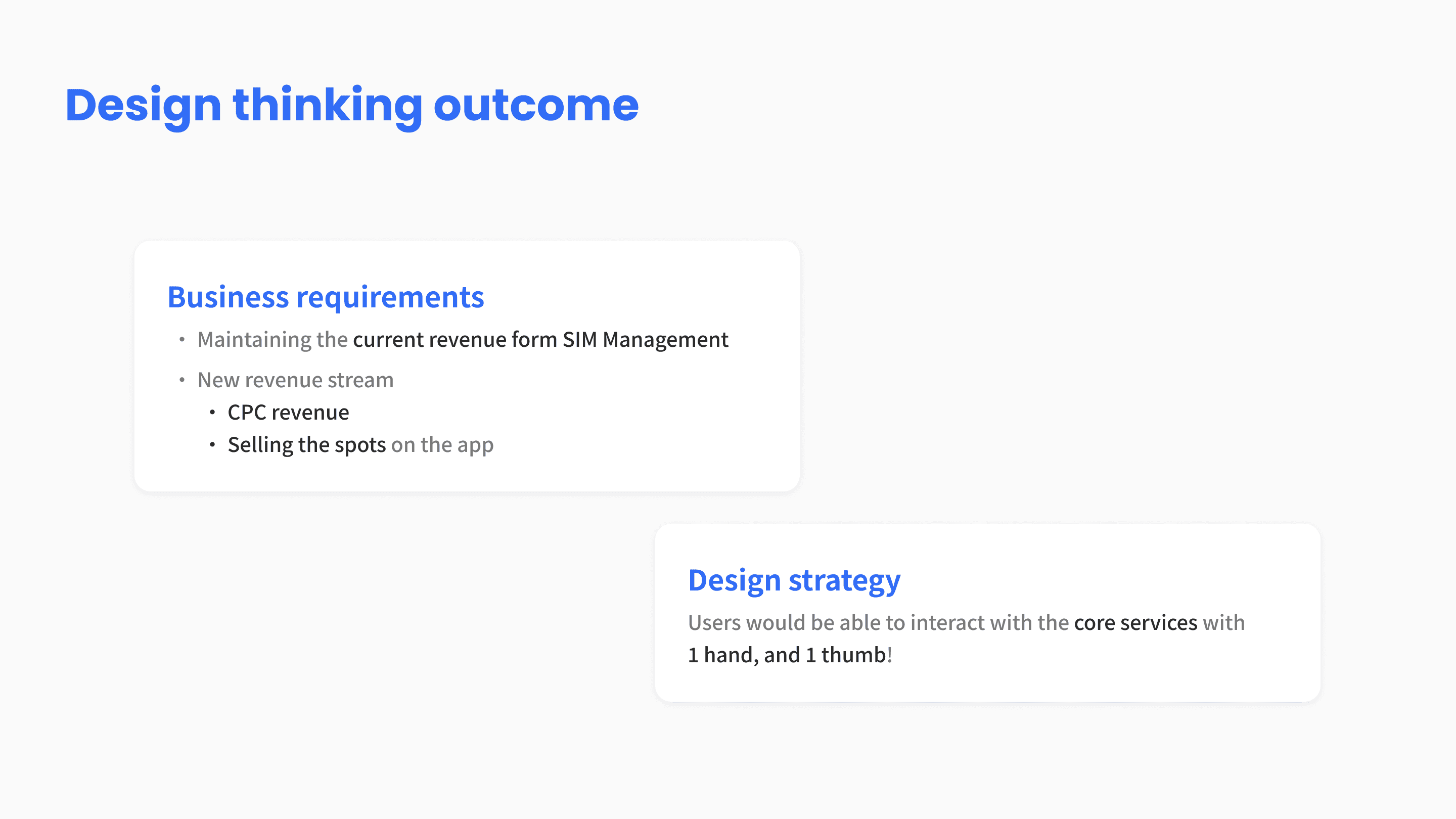
Business requirements:
This current revenue of the SIM-Management services needed to be maintained and increased
Generating CPC (Cost Per Click) revenue
Sell the spots on the app
Product structure mapped to the business requirements
After an ideation call with designers, the product manager, and the lead engineers I categorize the app's home page into 3 segments:
Segment A: Balance inquiry of the SIM card services
Segment B: Core CTAs (Bill, Top-up, Data), and Navigation to the Wallet and SIM-Services
Segment C: Partner's services, and slots for other services
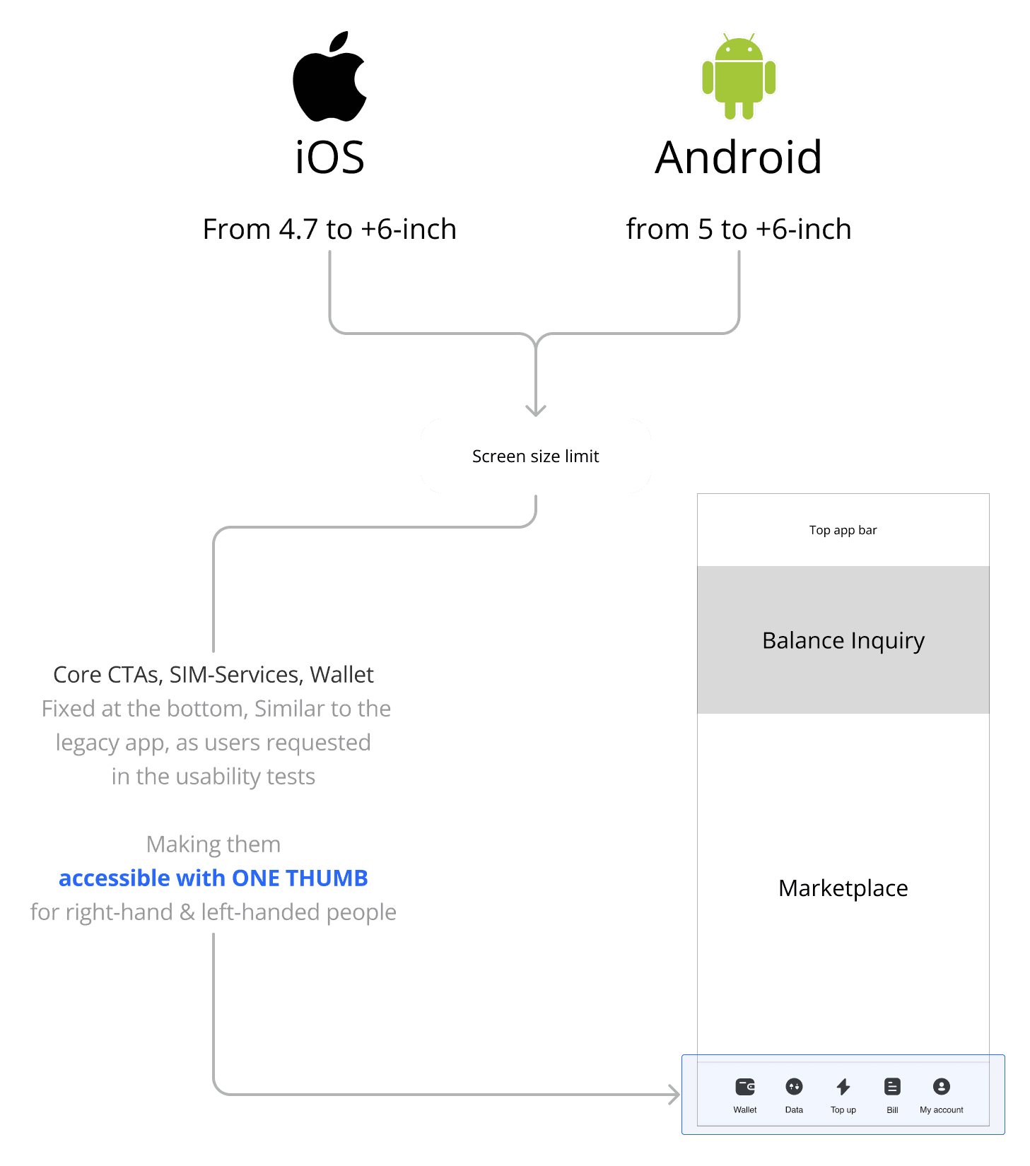
" We agreed on a 1-thumb strategy: users would be able to interact with the core services with 1 hand, and 1 thumb! "
The next step for us was to find the right order of these segments with 6 possibilities:
A, B, C
A, C, B
B, A, C
B, C, A
C, A, B
C, B, A
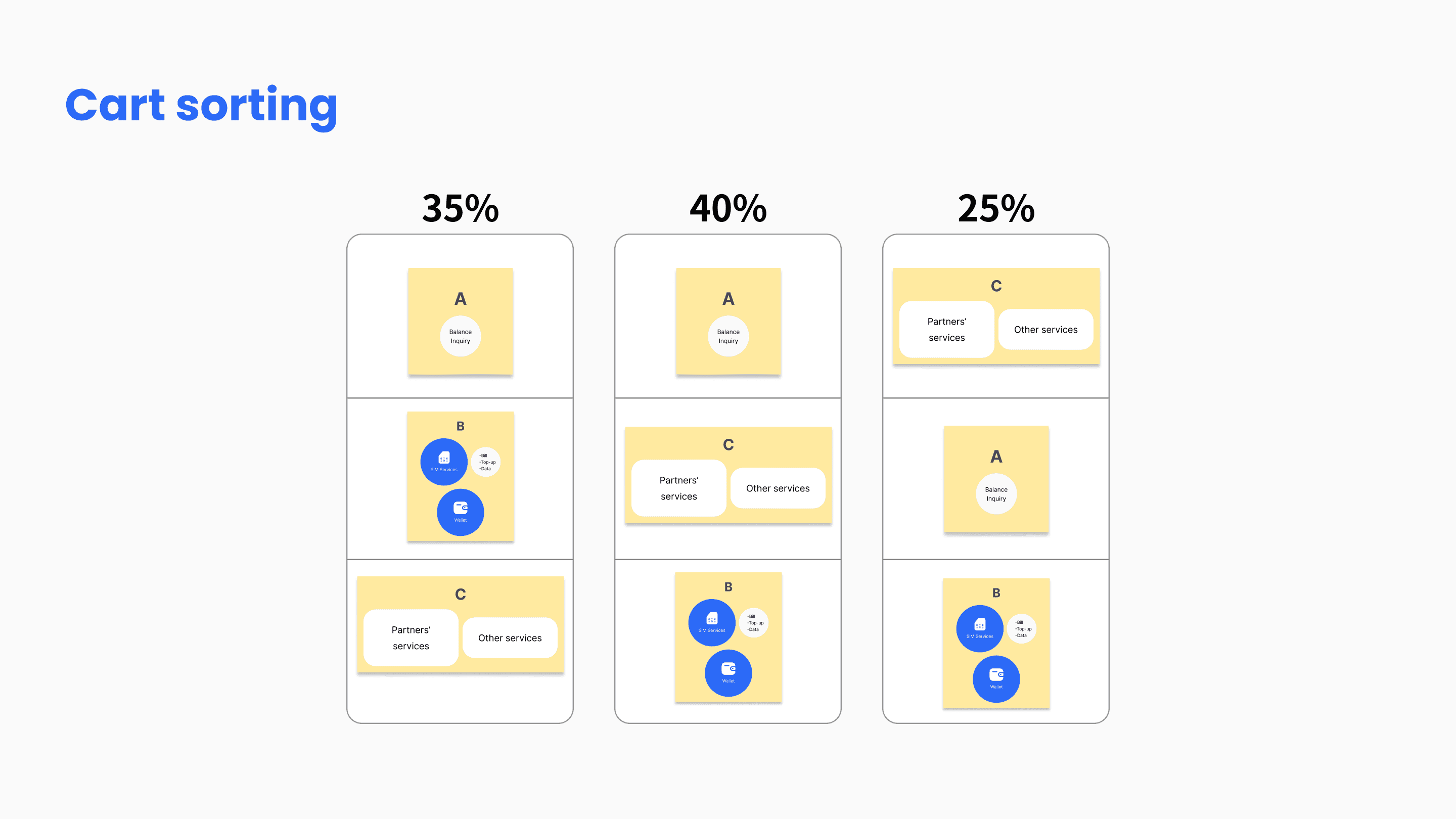
Card sorting with 20 users to find the right order
The question was straightforward: "How would you arrange these 3 segments in your mobile screen so that you would interact with them with only one hand and one thumb?"
Research insights
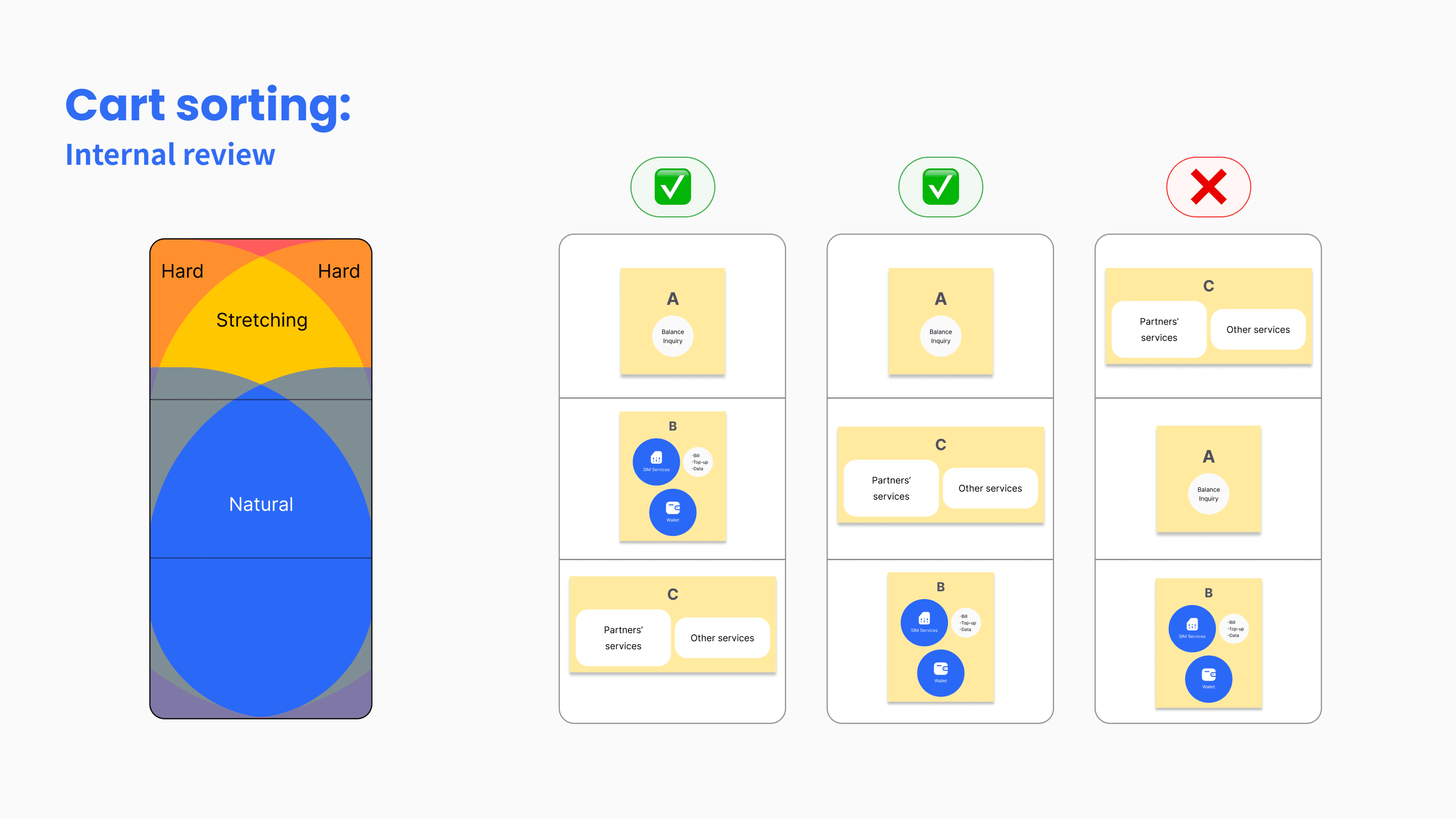
15 people chose A, B, C and A, C, B. The most important segments for them were A and B (Core services). These segments were interested in the most.
Since they were told that A is read-only, the majority of them had chosen A to be on top of the page, where they couldn't
5 chose C, A, B. The insight was:
They considered C, less important than A and B. Therefore, they had it on top of the page, were it wasn't accessible with one hand.
" Based on the card-sorting results, segment A (Balance inquiry) was fixed at the top. "
My assumption was A, B, C. I thought of a connection between A and B, based on Gestault's proximity principle.
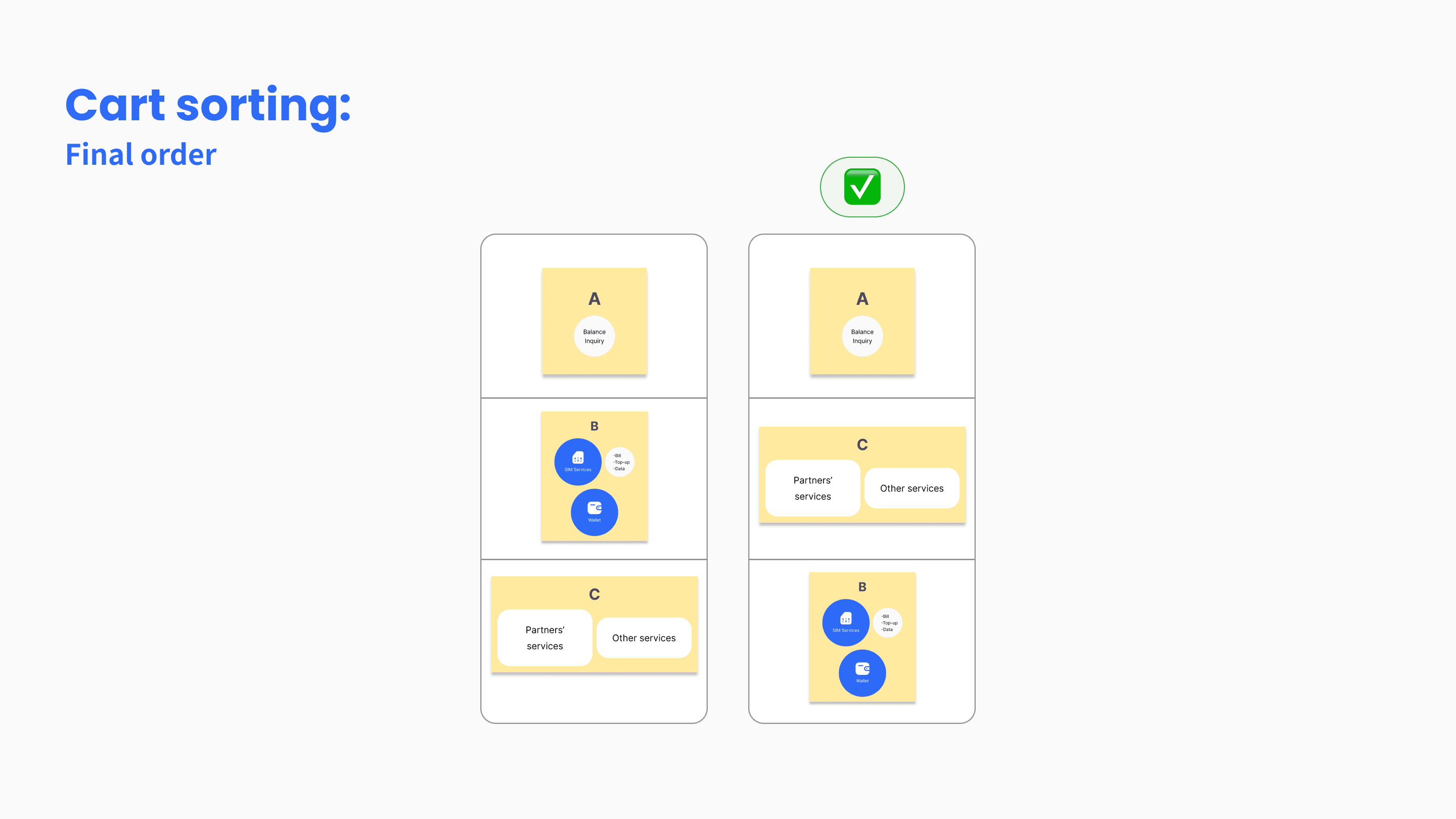
To back the decision up with data, I continued further card sorting with 17 other real users. To my surprise, 12 of them chose A, C, B over A, B, C. Their reason was convincing enough for me:
In the legacy app, the CTAs were at the bottom of the page. I recorded multiple quotes, expressing "Just like the current app, at the bottom"
" The final order (A, C, B), based on user research, was against my initial assumption. "
Solution
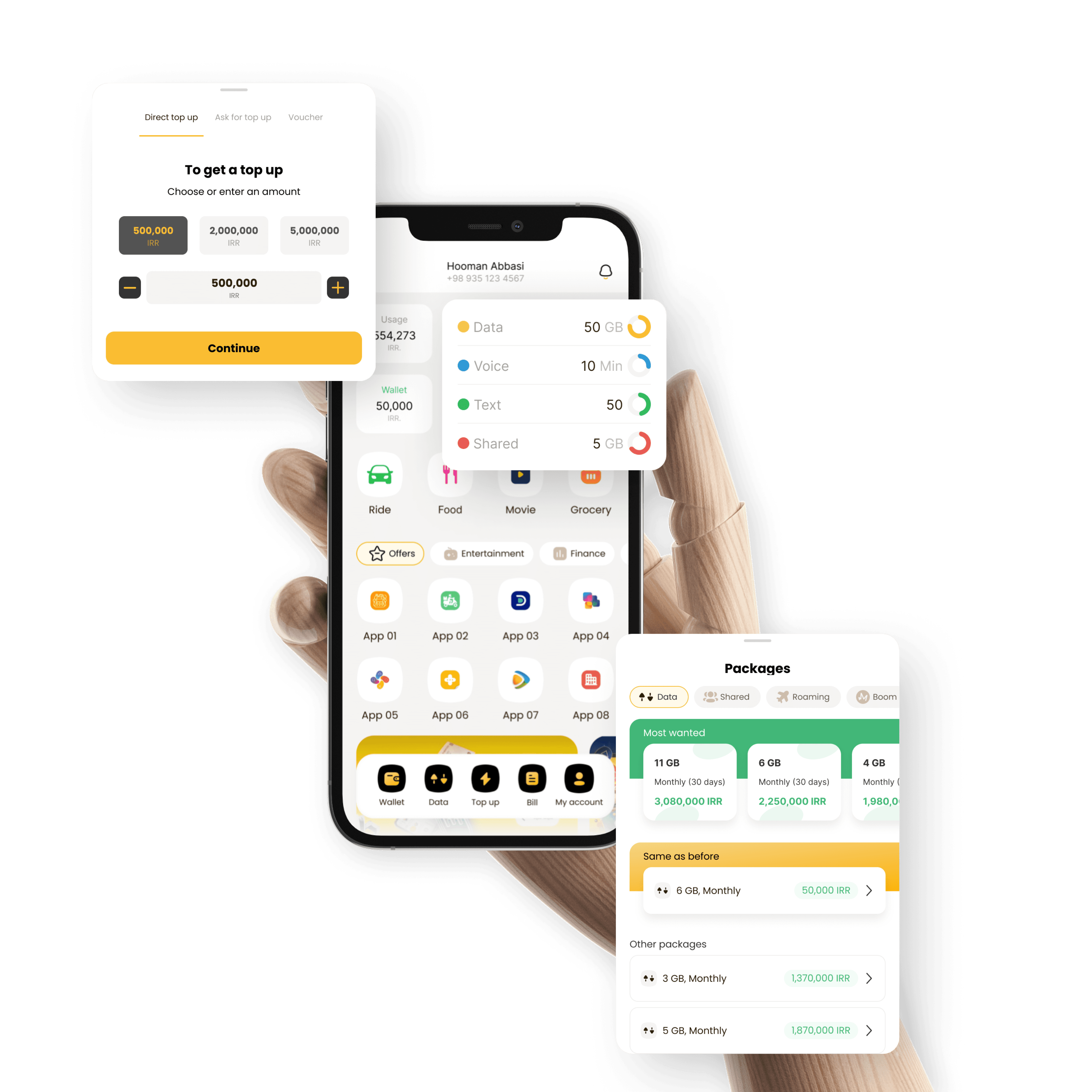
Designing: Core Services
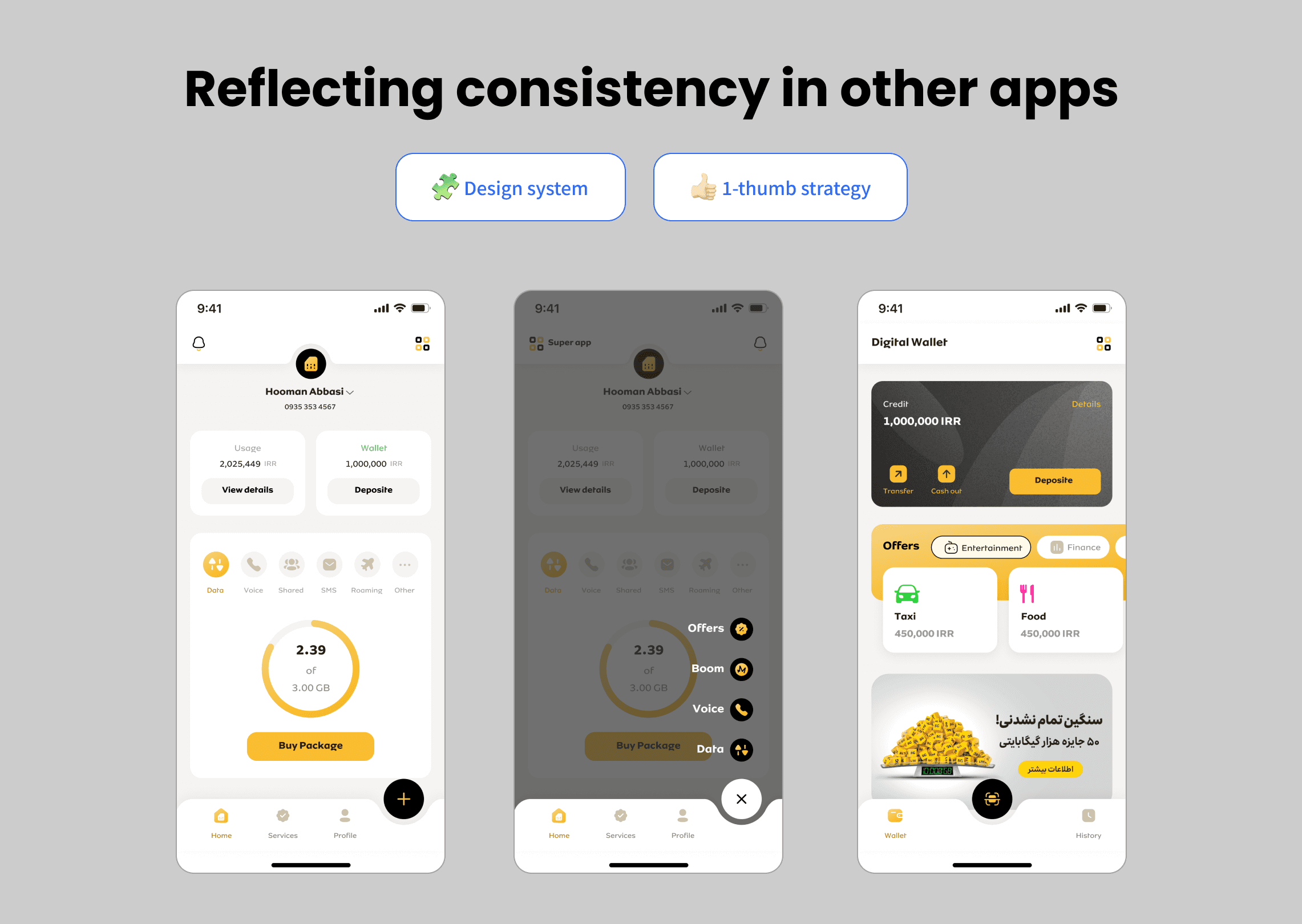
In the card sorting, the users had it mentioned that they'd prefer the Core CTAs of the SIM-Services to be similar to the legacy app. Therefore, I took a similar approach, since it was in alignment with our 1-thumb usage design strategy.
Test insight: Modal sheets instead of full pages
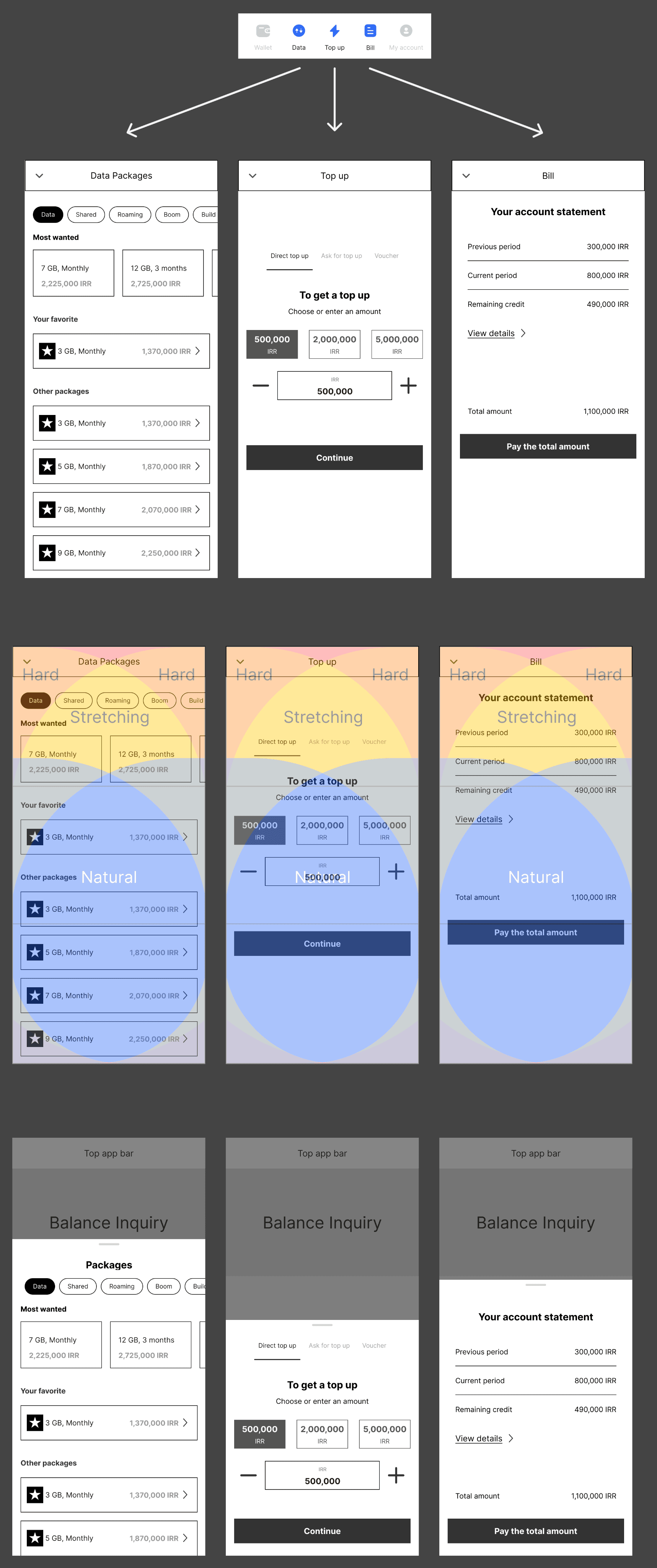
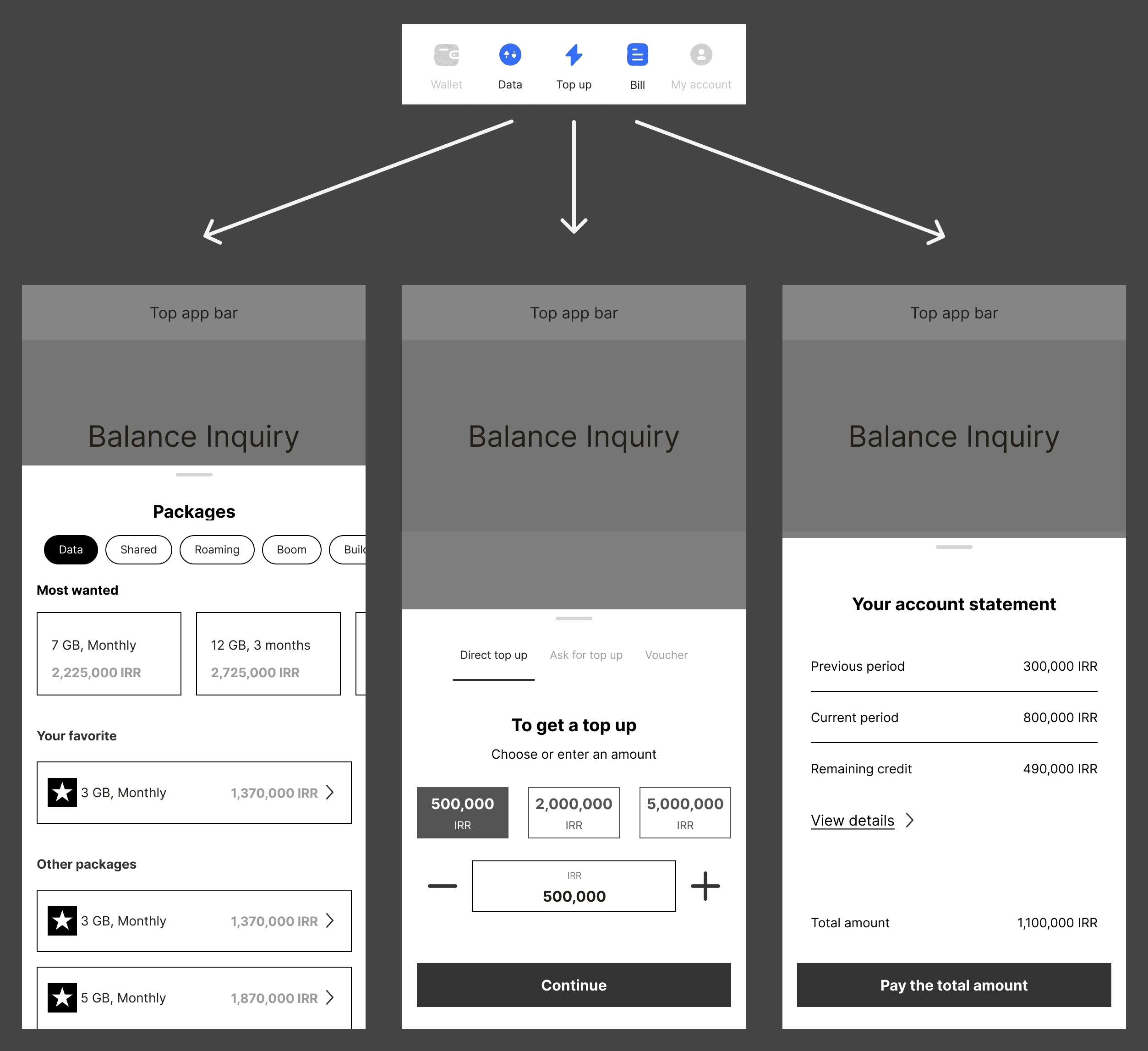
In the first design, for each item at the bottom bar, there was a separate page, which was a similar experience to the legacy app. However, after conducting the usability testing with 5 real users, I realized that it was against the 1-thumb strategy. As soon as the users wanted to navigate back, they used the other hand!
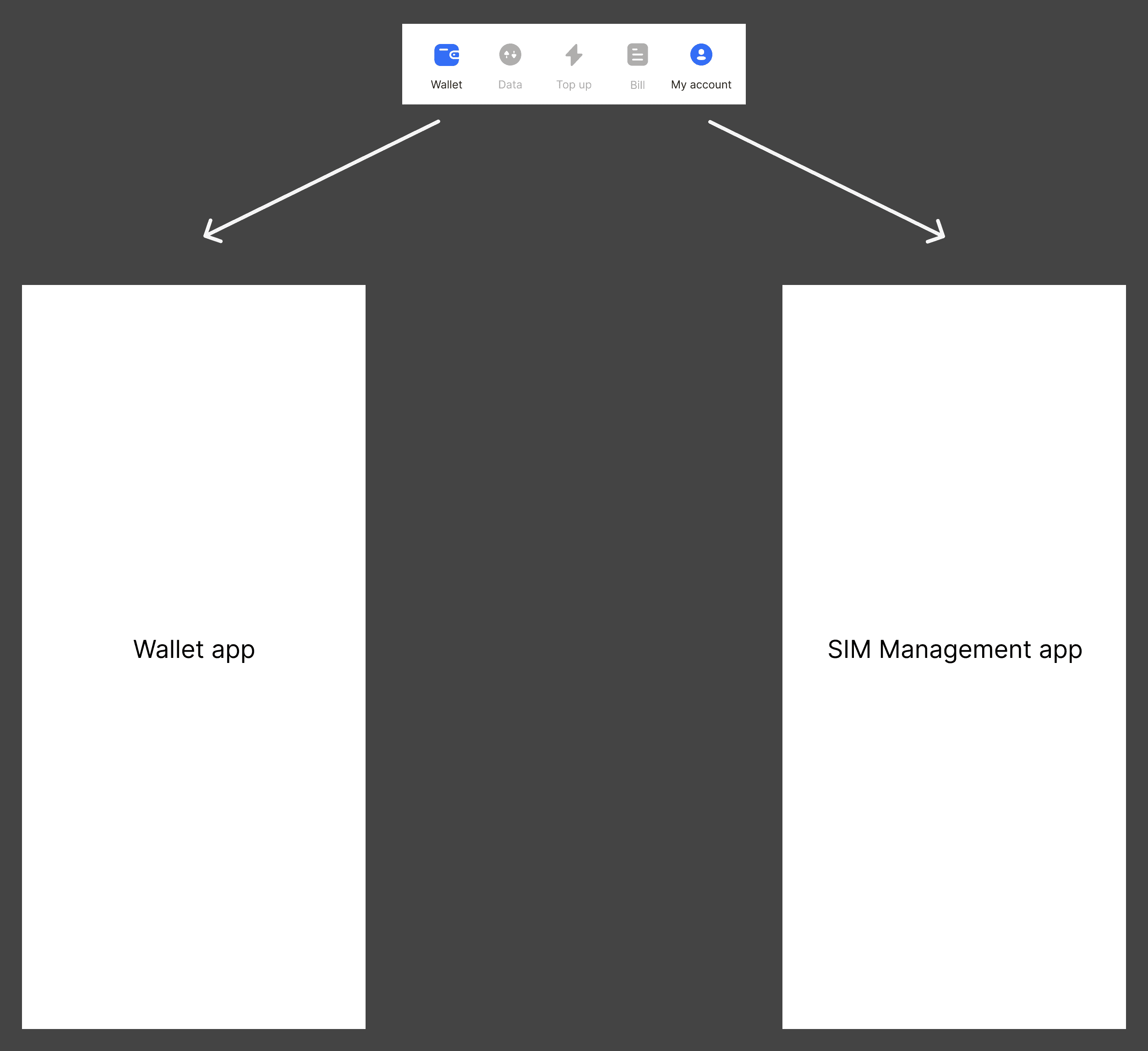
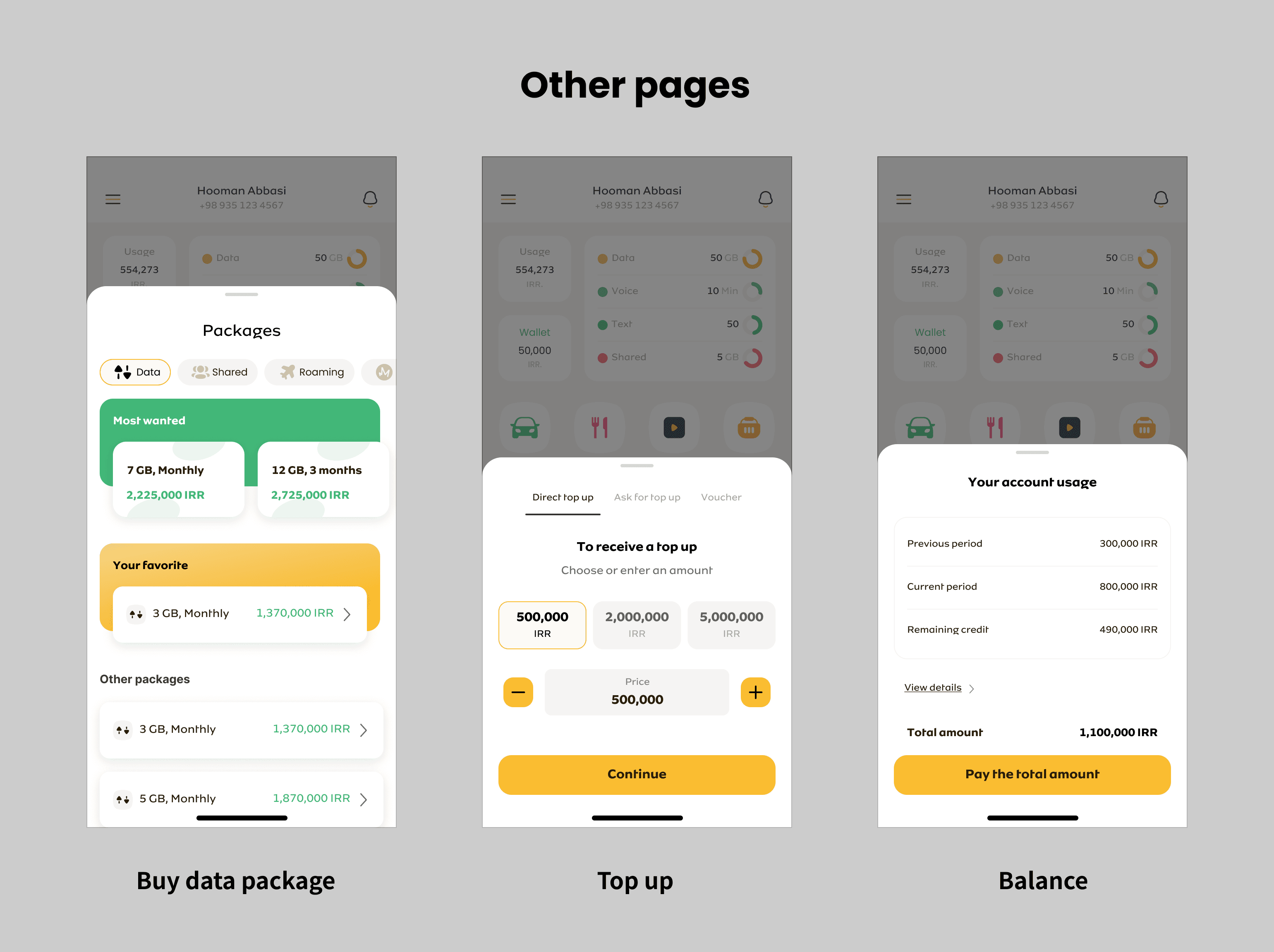
The user could navigate to SIM-Service ("My account" in the image) and Wallet through the bottom app bar, which were separate products. We needed to discuss consistency. So I led an ideation call with the other 2 designers and we ended up using modal sheets for Data, Top-up, and Bill, which were the Core CTAs.
" Having full pages for core services was against the 1-thumb strategy. "
Due to high technical effort, we weren't able to embed The Wallet and the SIM-Services into bottom sheet and they had to stay in full pages.
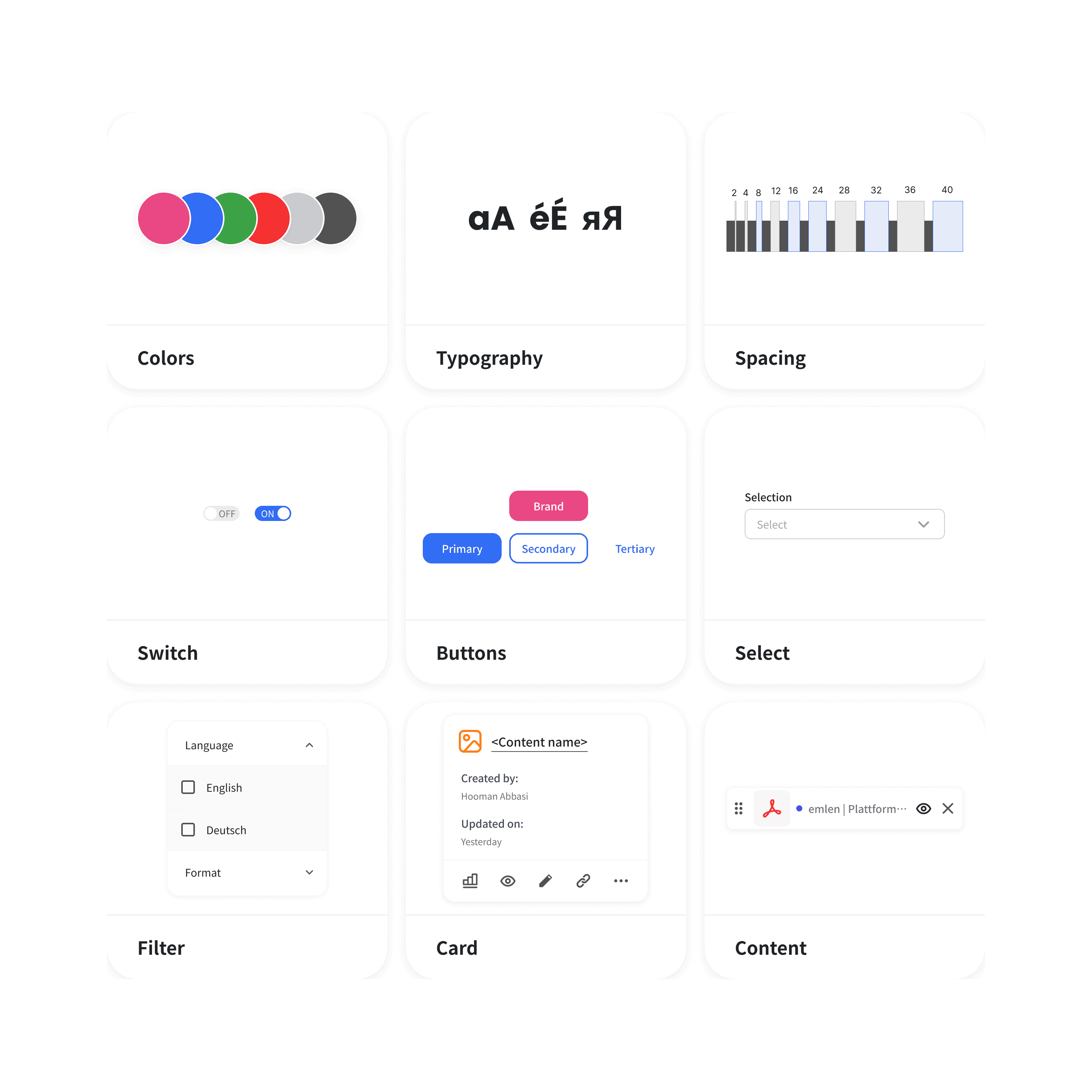
" Having 2 different behaviors on the bottom app bar items was against our design system's guidelines. "
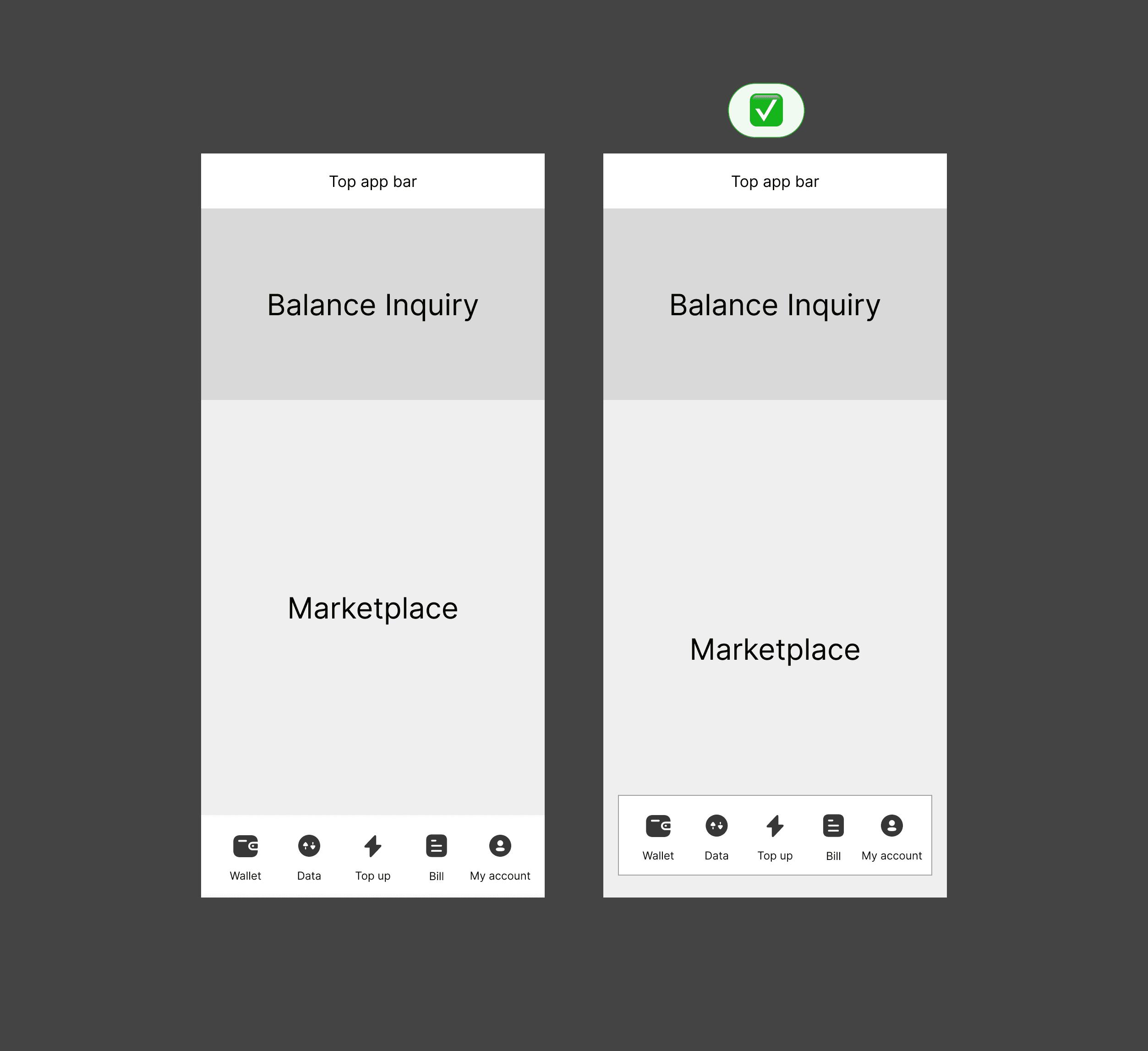
Therefore, I decided to come up with a new style for the bottom app bar.
I simply copied the layout of another mobile app in the market. I believed (and still believe) that if something is working out there, you shouldn't reinvent the wheel!
Designing: Marketplace
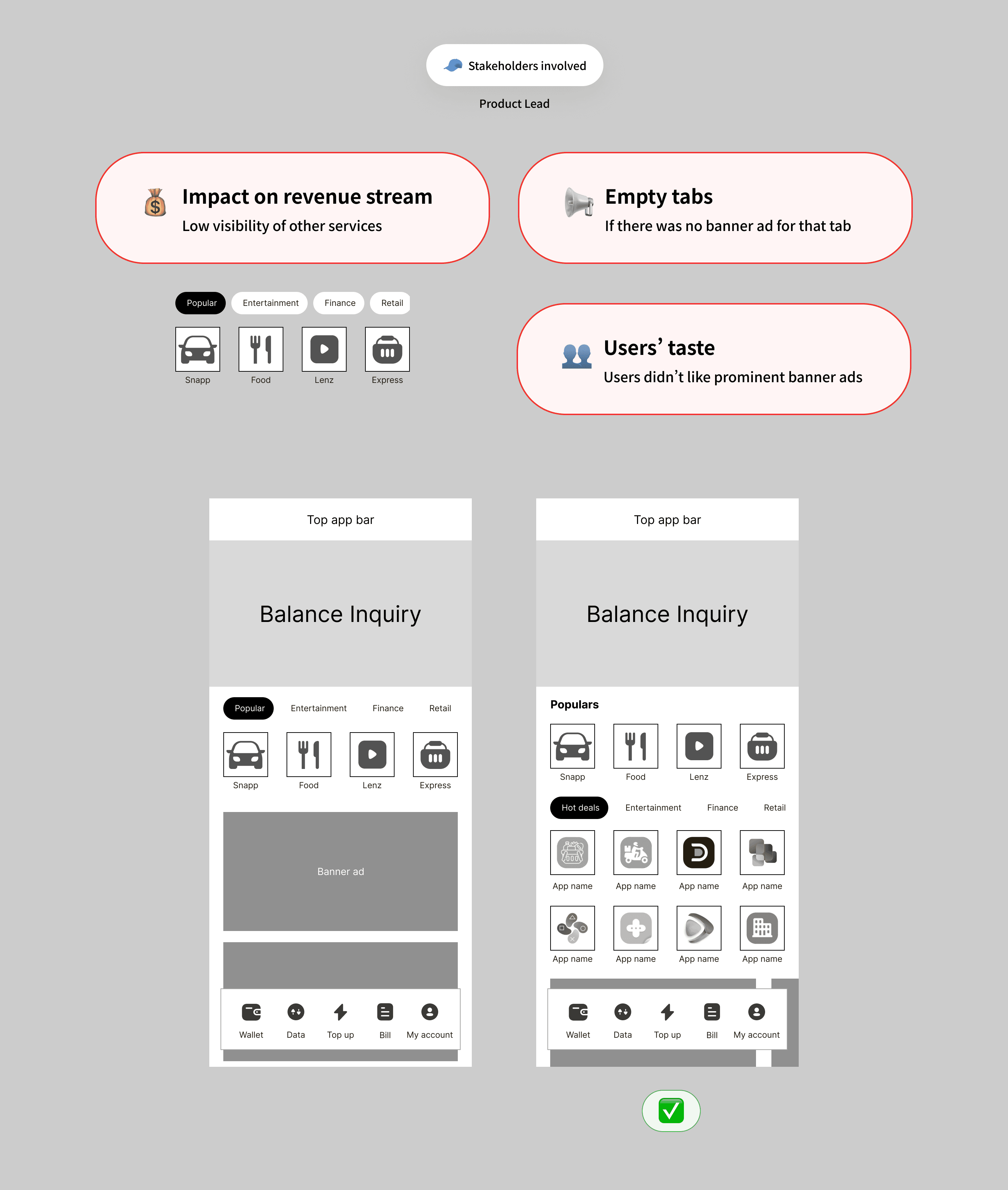
I came up with 2 designs for the Marketplace. In the initial wireframe, I used a tab structure, which had the Partner's services on the 1st tab by default. However, the Product manager was against this idea and I think that he was right! The problems were:
Low visibility of the other services: This would make the Supper app less attractive for other services to purchase slots.
Large advertisement banners: This approach had 2 negative effects. 1) not every tab might have had advertisements booked or purchased. Therefore, we would end up with large empty spaces; 2) Based on previous reviews, our users weren't fond of the banners. So we had to make them pop less.
" The Product Manager was against the first design of the Marketplace. "
Designing: Balance Inquiry
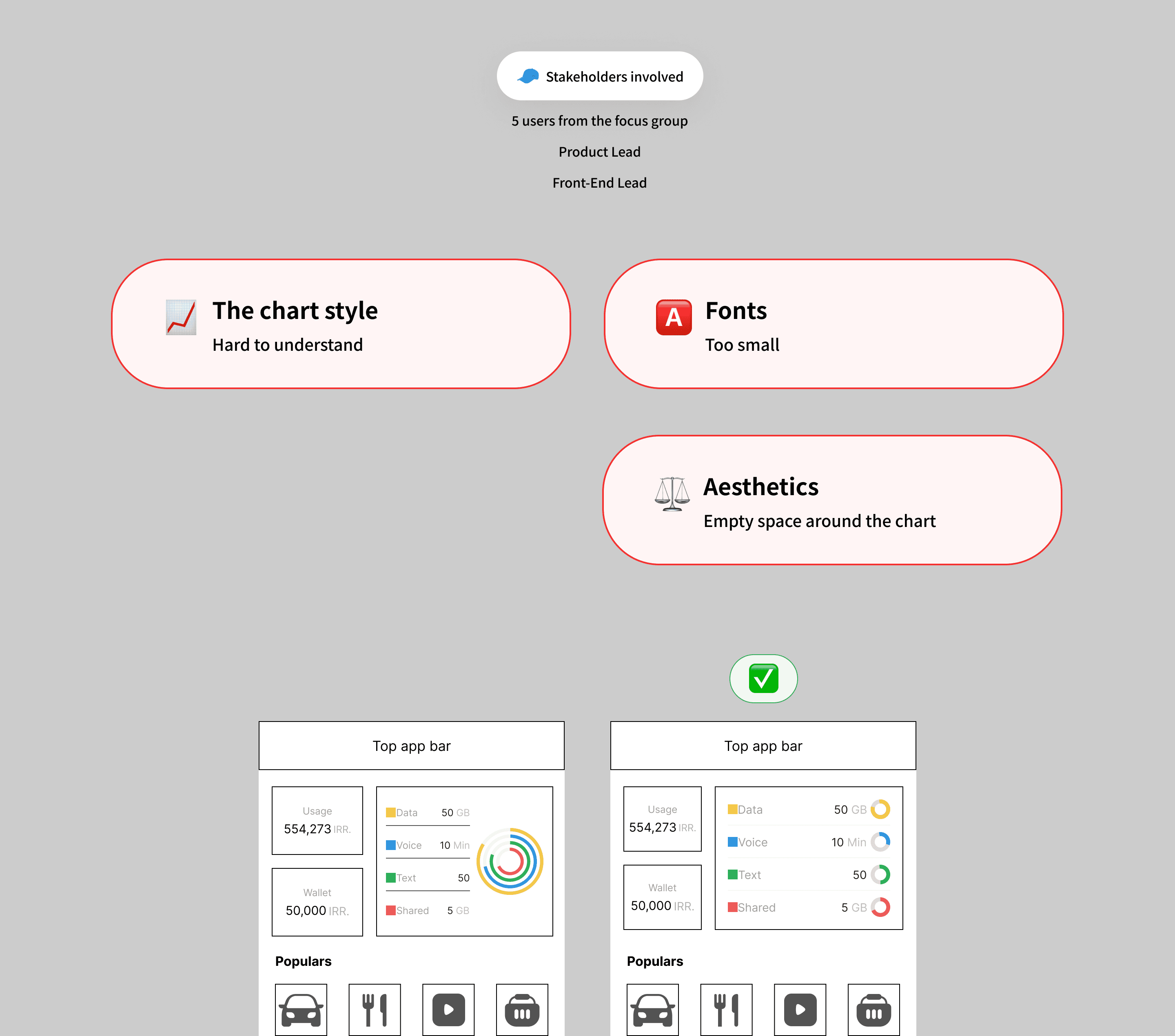
The space was very limited and much information needed to be visualized! So I came up with a nested graph with different colors for data, voice, text, and shared packages (the left screen in the image below).
" Redesigning the balance inquiry was with a significant amount of risk. Therefore, I conducted usability tests with 5 real users to validate the design. "
As a result, the nested graph was complicated for all of the users. They found it hard to understand. They said that it looked good, but they needed to focus a lot to get something out of it.
The other feedback was regarding the font sizes. I saw that they were bringing the phone closer to their face and made them squint!
Based on these 2 inputs, I separated the graphs. With the freed-up horizontal space, I could also increase the font size of the labels.
Test insight: Layout for provinces with no access to the services
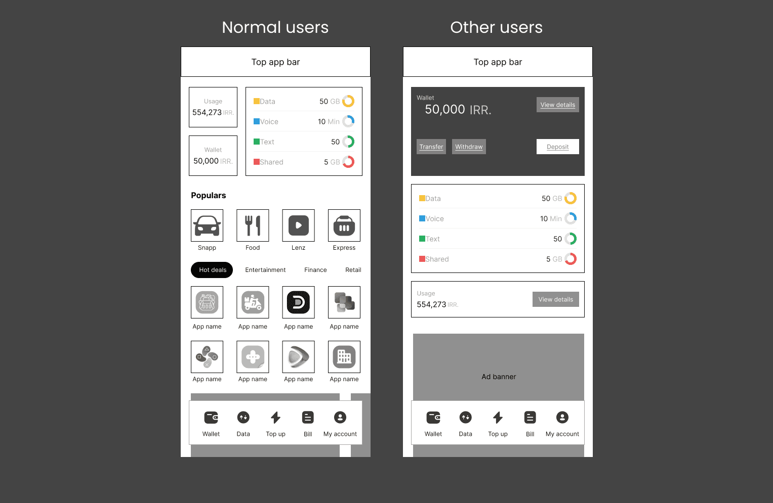
One of the challenges we were facing was that the new services were only available in 5 provinces. Therefore, we needed a different layout for the other users.
The business strategy was to scale the services to other cities as soon as possible, therefore, after alignment with the head of product, I decided not to do heavy research. Based on our assessments, the risk was low. Therefore, I made the following customizations:
Reflowed the orientation of the balance inquiry, to fill the space, emptied after hiding 3rd party services
Transformed the design of the Digital Wallet and account balance (usage) from a simple informative card
This wasn't a risky decision, since I had initially tested different segments of this page (Balance inquiry, Core Services, and Other Services) separately.
Testing the final UI
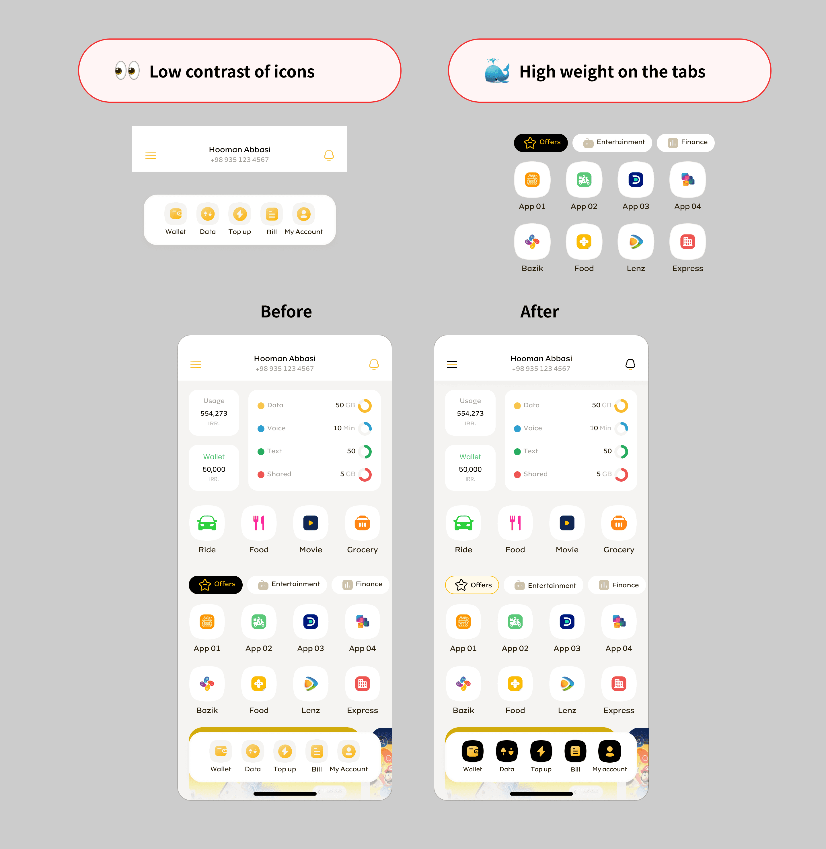
I tested the high-fidelity prototype of the Super app in 3 different screen sizes with 12 real users. It is worth mentioning that the usability testing of the Wallet and SIM-Service app was done by their designers and I led the process for integrity and alignment. As a result, I made the following changes:
Increased contrast of icons and illustrations on white background for more visibility
Lowered the color weight from the marketplace filter chips since it was the next priority after the core services at the bottom bar
Increased contrast and color weight of items at the bottom bar to direct users attention
Results
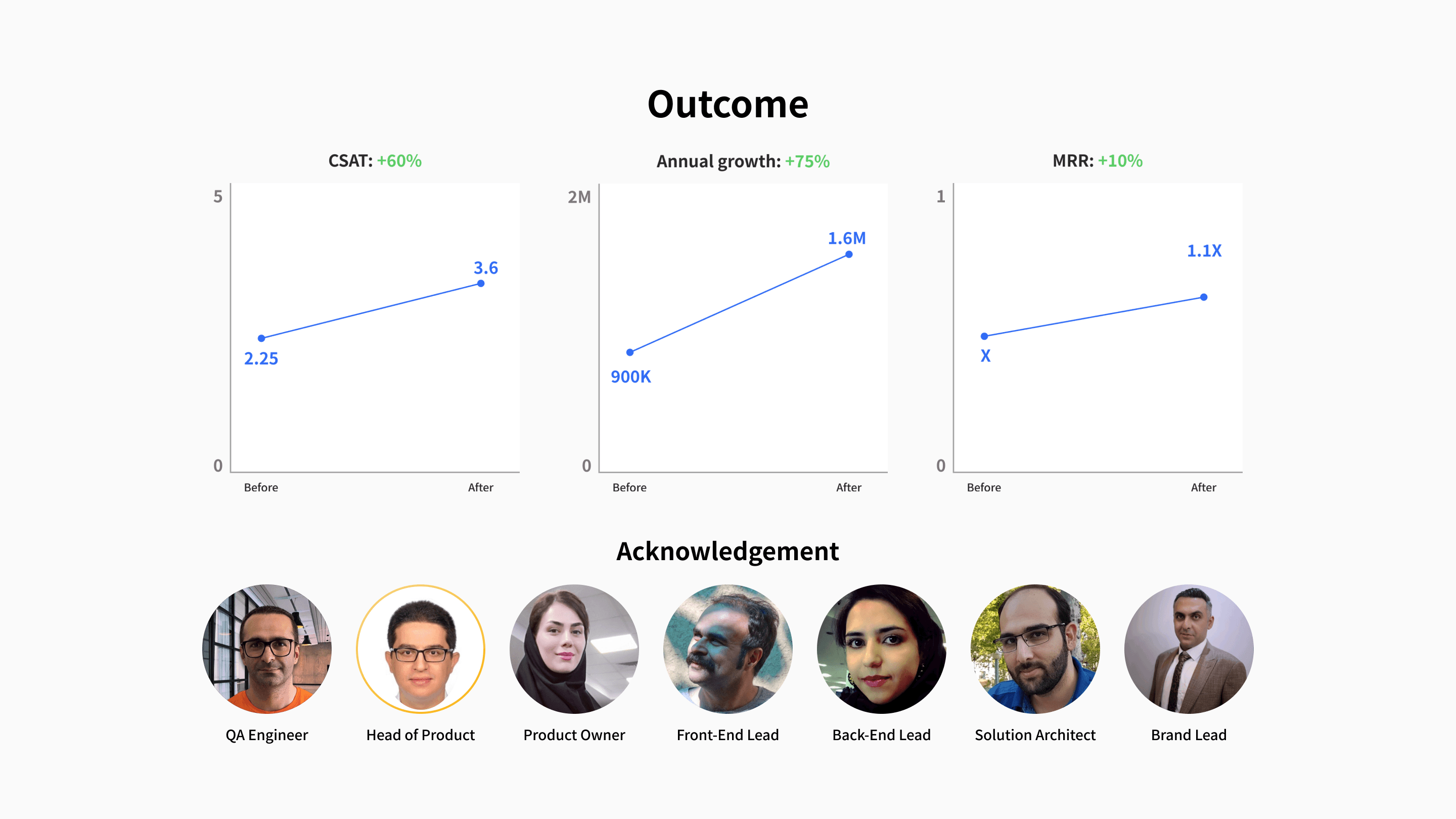
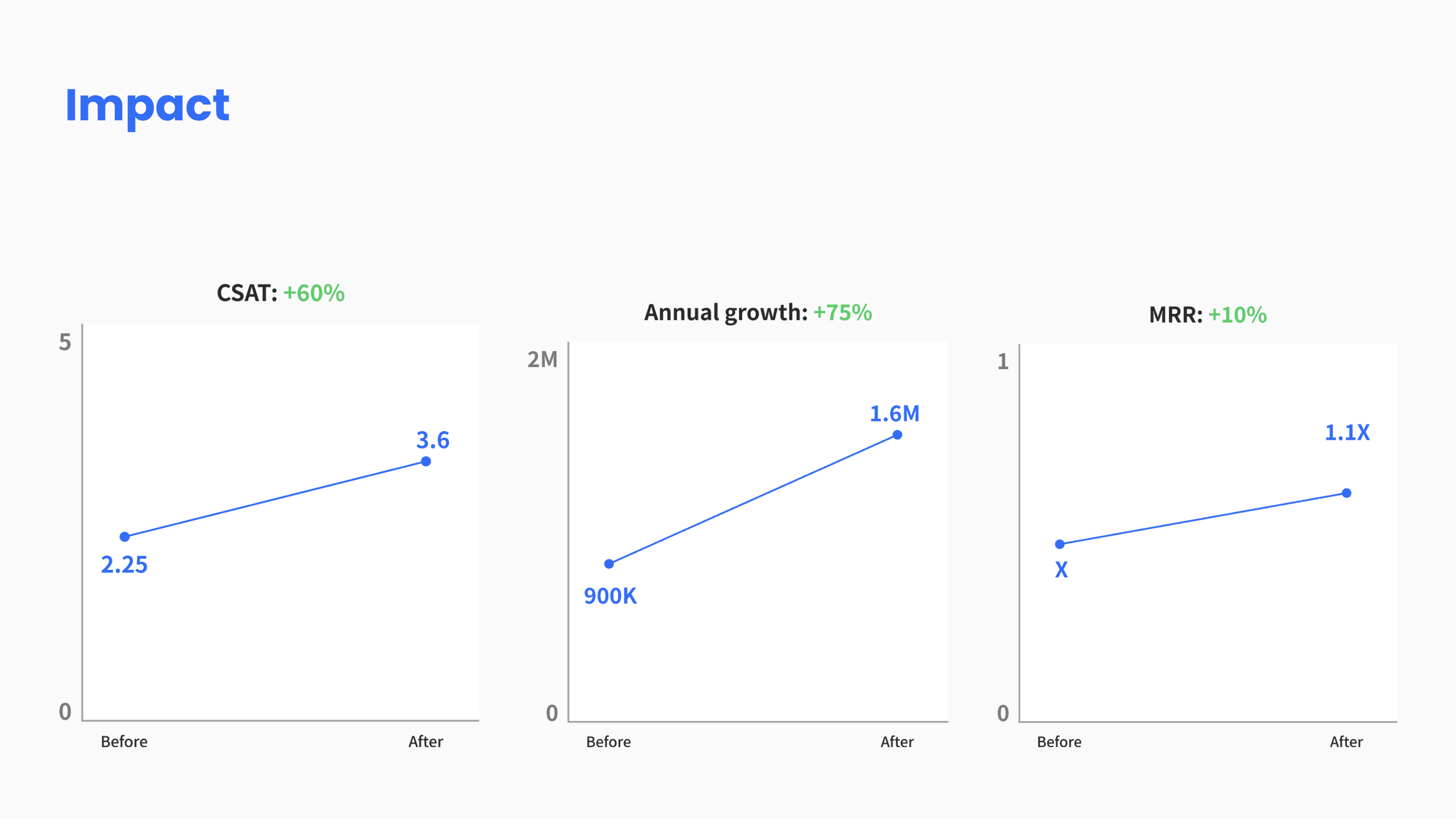
The release approach was through A/B testing of the new UI, before the final release. We initially showed the new UI to 30,000 active users on a Beta program release. They had an option to switch back to the previous UI. Over 75%, stayed with the new UI.
6 months after the full release, based on the results of an in-app survey, user satisfaction increased by 60%, compared to the old version.
There was a +700,000 increase in new pre-paid SIM users, who were switching from other competitors in a span of 6 months.
There was over 10% increase in the monthly revenue generated from the users who updated to the new UI, due to an increase in user engagement.
